In this example, I will show how to create and manage basic charts via Splunk web interface and chart command.
1. Introduction
A chart is a graphical representation of a statistical data with symbols like a line, bar, or area. It has two scaled axes. Here are three basic chart types:
- Bar chart – uses bar length to represent the value for a measured group.
- Line chart – shows the value over a period of time.
- Pie chart – presents the percentage value within a group.
2. Technologies Used
The example in this article was built and run using:
- Docker 19.03.8
- Splunk 8.1.1
- Google Chrome 87.0.4280.88
Click my other article to install Splunk.
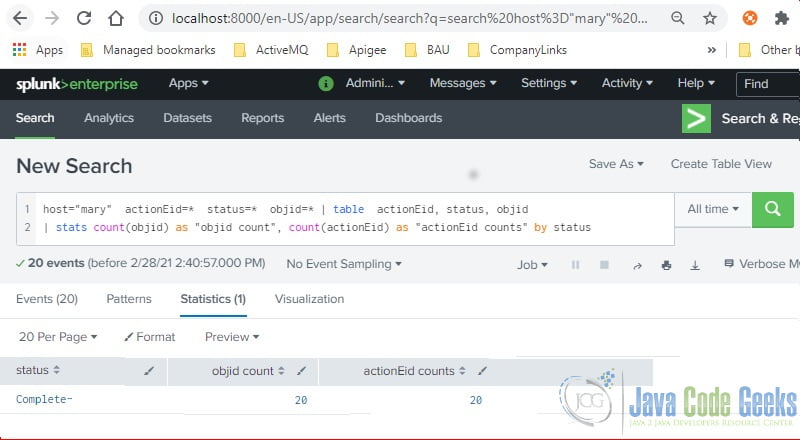
3. Stats Command
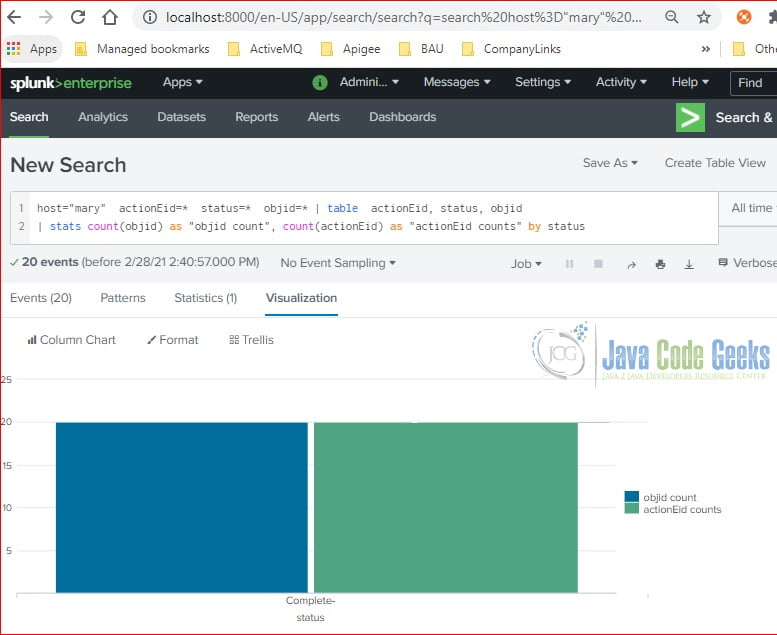
The stats command generates statistical data which can be used to draw a chart. In this step, I will use the following command to create a table with three columns: status, objid count, and actionEid counts and then calculate the count value by the status field.
stats command
host="mary"  actionEid=*  status=*  objid=* | table  actionEid, status, objid
| stats count(objid) as "objid count", count(actionEid) as "actionEid counts" by status
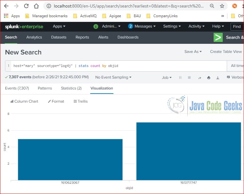
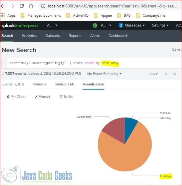
4. Chart Web Interface
In this step, I will use a simple stats command in the “New Search” area. I will click the Visualization tab to show available chart options and create “Column Chart” and “Pie Chart” examples.
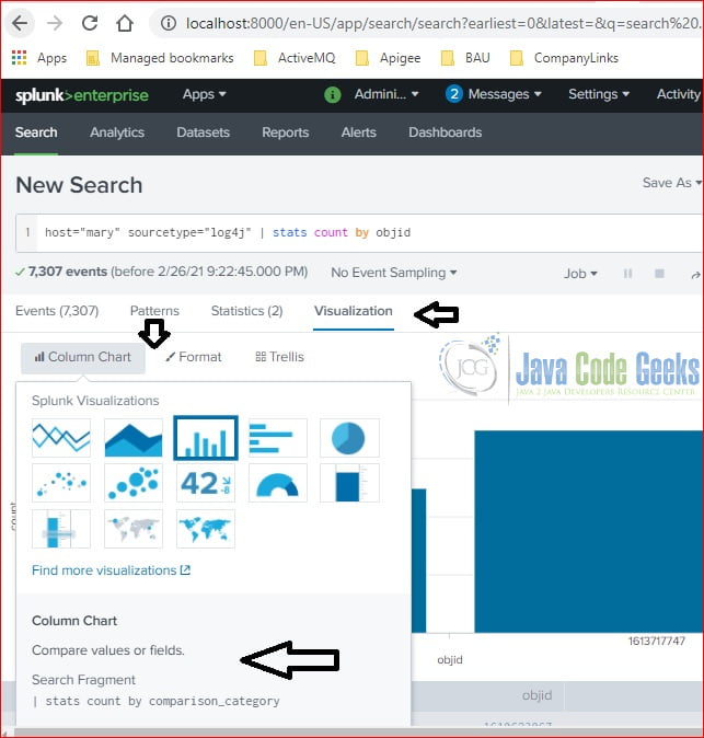
4.1 Column Chart
In this step, I will create a “Column Chart” with default settings.
4.2 Pie Chart
In this step, I will create a “Pie Chart” with default settings.
4.3 Format a Chart
You can click the “Format” button to customize the chart attributes.
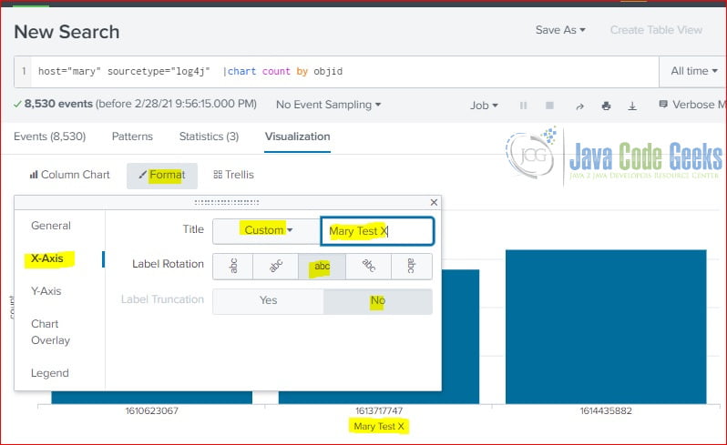
As you seen, the X-Axis label is changed to “Mary Test X“.
4.4 Chart in a Report
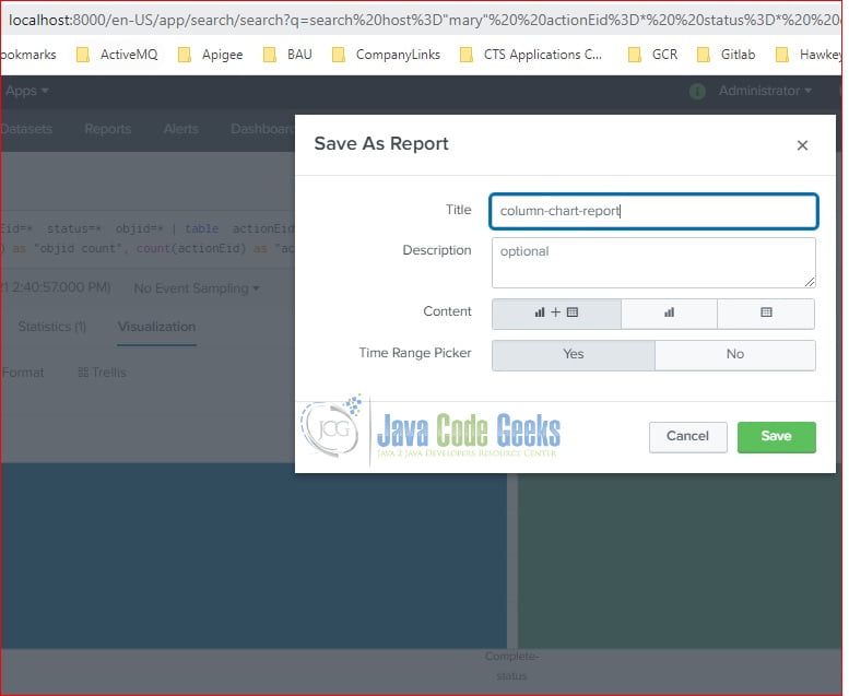
In this step, I will click the “Save As Report” button to add a chart to a report.
In the pop-up “Save As Report” screen, enter the Title description and select “Content” and “Time Range Picker” as Figure 6 showing then click the “Save” button.
Then, you will see a report with a column-chart included.

4.5 Chart in a Dashboard
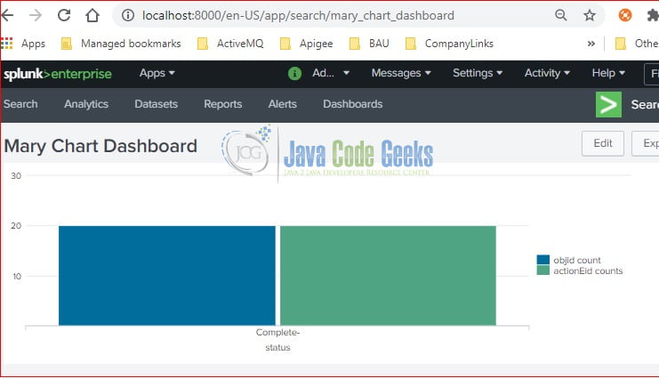
In this step, I will show how to add a chart to a dashboard by clicking the “Add to Dashboard” button. Enter the Dashboard Title and click the “Save” button.

Click the “View Dashboard” button and you will see the dashboard with a column chart.
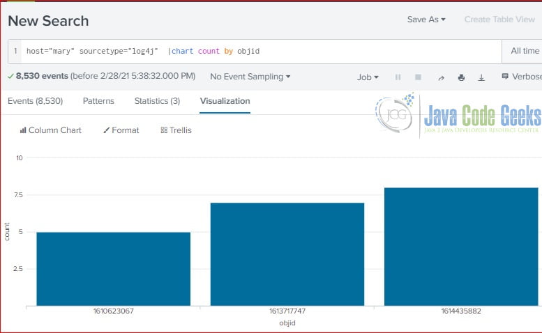
5. Chart Command
The chart command transforms the table data into a graph representation. In this step, I will use the chart command to show the count by objid:
chart command
host="mary" sourcetype="log4j" | chart count by objid
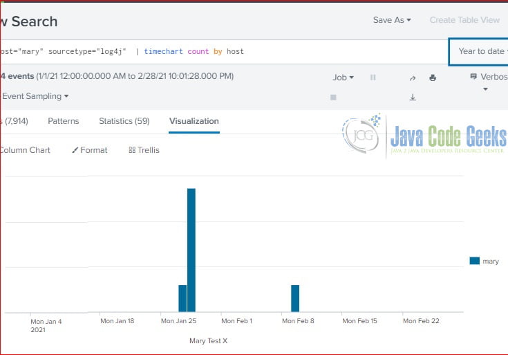
5.1 Timechart Command
The timechart command specifies the time as X-Axis. In this step, I will use a simple timechart command to show the events by host over the time.
timechart command
host="mary" sourcetype="log4j" | timechart count by host
6. Summary
In this example, I showed how to create a chart with both stats and chart commands. I also showed how to add a chart to a report and dashboard via the Splunk web interface.
7. Download the Source Code
You can download the full source code of this example here: Splunk Basic Chart Example