Input Controls are the View components in the user interface that the user can interact with. You can add as many as you want in your application, by declaring the appropriate XML elements in a XML layout file, which is placed in the res/layout directory of your project.
In this example we are going to show the most common controls and how we can use them in our app.
For this tutorial, we will use the following tools in a Windows 64-bit platform:
- JDK 1.7
- Eclipse 4.2 Juno
- Android SDK 4.4
1. Create a New Android Application Project
Open Eclipse IDE and go to File → New → Project → Android Application Project.
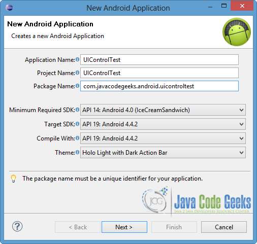
Specify the name of the application, the project and the package. Also, set 14 API or larger as the minimum Required SDK, in order to support the UI Controls, that we are going to use. Then press Next button.
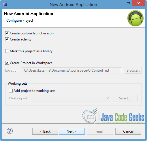
In the next window, the “Create Activity” option should be checked. The new created activity will be the main activity of your project. Then click Next.
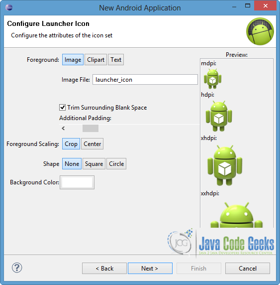
In “Configure Launcher Icon” window you should choose the icon you want to have in your app. We will use the default icon of android, so click Next.
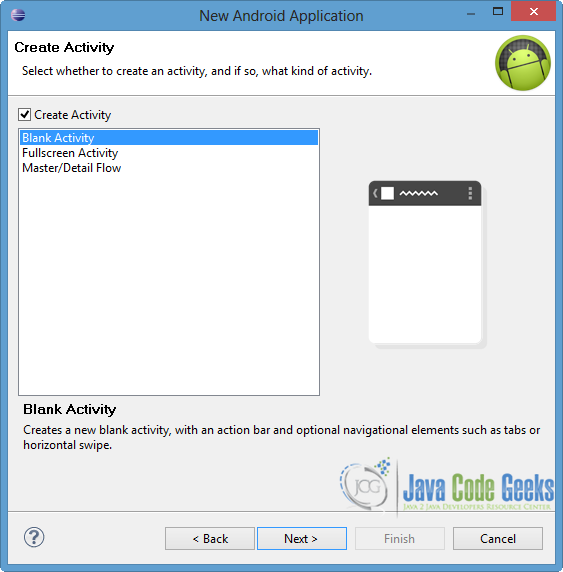
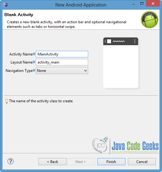
Select the “Blank Activity” option and press Next.
You have to specify a name for the new Activity and a name for the layout description of your app. The .xml file for the layout will automatically be created in the res/layout folder. Finally, press Finish.
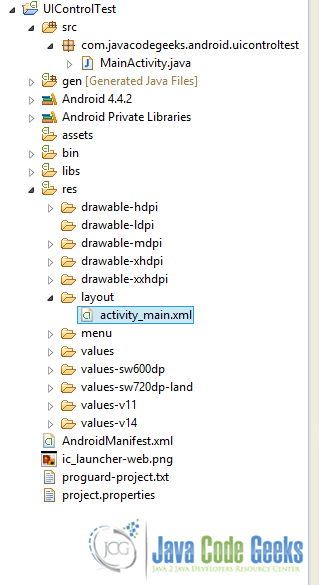
You can see the final structure of the created project in the image below.
2. Create the layouts
Android provides us many input controls, in order to built the more suitable graphical interface for our app. Some of them are described below:
TextViewis a component where we can display a text on the screen and edit it from ourActivitysource.android:textattribute is to set the displayed text, whileandroid:textIsSelectableallow users to copy and paste the specific text.EditTextrepresents an editable text field and is a subclass ofTextView. We can specify the type of the data that the user can fill in theEditText, by setting the suitable value in theandroid:inputTypeattribute. For example if we want to provide anEditTextfor password,android:inputTypehas to be set totextPassword. Other attributes such asandroid:hintandandroid:emscan be used, in order to define the a default text and the wide of theEditTextrespectively. Another option isAutoCompleteTextVieworMultiAutoCompleteTextView, which are text entry widgets that show a list of suggestions automatically.CheckBoxis another UI component where you can provide a group (or not) of a two-states option (checked or unchecked).android:checkedattribute can be set to true or false, in order to define the default selection.RadioButtonsallow the user to choose only one option from a set. To define the set, we put theRadioButtonsinto aRadioGroup. Alsoandroid:checkedattribute is used, in order to declare the default option.Buttonis another UI control, where an action launches when it is pressed. We can useandroid:onClickattribute to define the calling function of theActivity, when the user clicks it. Otherwise we can handle the click event by using the appropriate listener.ImageButtonis a subclass ofImageView, which displays a button with an image instead of a text. To set the image,android:srcXML element is used.ProgressBarcomponent is used to show the progress state of an operation. We can define the style of the progress bar, by setting the respective XML element.Switchrepresents an on/off option that can be toggled by the user.Switchrequires API 14 or larger and it is like aToggleButton, so if the targeting SDKs are less than 14 it is recommended to useToggleButton.android:textOnandandroid:textOffattributes are used to define the text in on and off states respectively.Pickeris a ready-to-use dialog where the user can select a value via swipe gesture. There is aDatePicker(month, day, year) and aTimePicker(hour, minute, AM/PM) for date and time respectively.Spinneris a drop-down list of selection set, where the user can pick one. To handle theSpinner,ArrayAdaptershould be called in the source code of theActivity.RatingBaris an extension ofSeekBarandProgressBarand provides rating with stars. We can use some attributes likeandroid:numStars,android:stepSizeandandroid:rating, in order to define the number of the rating stars, the rating step and the default rating of the displayedRatingBar.
We are going to add the most of the above input controls to the XML layout of our project. For this reason, we are going to make two different layout files.
Firstly right click on res/layout folder → New → Android XML File, in order to create the one layout XML file. Specify the name and choose LinearLayout as Root Element. Finally, press Finish.
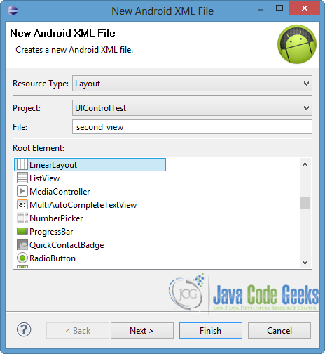
Then open res/layout/second_view.xml, go to the respective xml tab and paste the following.
second_view.xml:
<?xml version="1.0" encoding="utf-8"?>
<LinearLayout xmlns:android="http://schemas.android.com/apk/res/android"
    android:layout_width="match_parent"
    android:layout_height="match_parent"
    android:orientation="vertical" >

     <TimePicker
        android:id="@+id/timePicker1"
        android:layout_width="wrap_content"
        android:layout_height="wrap_content" />

     <RatingBar
        android:id="@+id/ratingBar1"
        android:layout_width="wrap_content"
        android:layout_height="wrap_content"
        android:layout_marginTop="10dp"
        android:numStars="5"
        android:stepSize="0.5"
        android:rating="2.5" />

</LinearLayout>
Now open res/layout/activity_main.xml file and go to the xml tab. Then paste the code below.
activity_main.xml:
<RelativeLayout xmlns:android="http://schemas.android.com/apk/res/android"
    xmlns:tools="http://schemas.android.com/tools"
    android:layout_width="match_parent"
    android:layout_height="match_parent"
    tools:context=".MainActivity" >

    <LinearLayout
        android:layout_width="match_parent"
        android:layout_height="wrap_content"
        android:orientation="horizontal"
        android:id="@+id/linearlayout1" >
	    <TextView
	        android:id="@+id/textView1"
	        android:layout_width="wrap_content"
	        android:layout_height="wrap_content"
	        android:textIsSelectable="false"
	        android:text="TextView" />

	    <EditText
	        android:id="@+id/editText1"
	        android:layout_width="wrap_content"
	        android:layout_height="wrap_content"
	        android:hint="Simple EditText"
	        android:ems="8" >
	    </EditText>

    </LinearLayout>

     <LinearLayout
        android:layout_width="match_parent"
        android:layout_height="wrap_content"
        android:layout_below="@id/linearlayout1"
        android:orientation="horizontal"
        android:layout_marginTop="15dp"
        android:id="@+id/linearlayout2" >

        <CheckBox
	        android:id="@+id/checkBox1"
	        android:layout_width="wrap_content"
	        android:layout_height="wrap_content"
	        android:checked="false"
	        android:text="CheckBox" />

        <RadioGroup
	        android:id="@+id/radioGroup1"
	        android:layout_width="wrap_content"
	        android:layout_height="wrap_content" >

		   <RadioButton
		       android:id="@+id/radioButton1"
		       android:layout_width="wrap_content"
		       android:layout_height="wrap_content"
		       android:checked="true"
		       android:text="radio1" />

		    <RadioButton
		        android:id="@+id/radioButton2"
		        android:layout_width="wrap_content"
		        android:layout_height="wrap_content"
		        android:text="radio2" />
	    </RadioGroup>

    </LinearLayout>

    <LinearLayout
        android:layout_width="match_parent"
        android:layout_height="wrap_content"
        android:layout_below="@id/linearlayout2"
        android:orientation="horizontal"
        android:layout_marginTop="15dp"
        android:id="@+id/linearlayout3" >

        <Button
	        android:id="@+id/button1"
	        android:layout_width="wrap_content"
	        android:layout_height="wrap_content"
	        android:onClick="clickButton"
	        android:text="Click me..." />

        <ImageButton
            android:id="@+id/imageButton1"
            android:layout_width="wrap_content"
            android:layout_height="wrap_content"
            android:src="@drawable/ic_launcher" />

	</LinearLayout>

    <ProgressBar
        android:id="@+id/progressBar1"
        style="?android:attr/progressBarStyleHorizontal"
        android:layout_width="match_parent"
        android:layout_height="wrap_content"
        android:layout_below="@+id/linearlayout3"
        android:layout_marginTop="20dp"
        android:layout_marginRight="25dp" />

    <Switch
        android:id="@+id/switch1"
        android:layout_width="wrap_content"
        android:layout_height="wrap_content"
        android:layout_below="@+id/progressBar1"
        android:layout_marginTop="20dp"
        android:checked="true"
        android:textOn="Start"
        android:textOff="Stop"
        android:text="Switch" />

</RelativeLayout>
Notice that in every input control we set its width and height, as well as a unique identifier. Also, we can define the names of the UI components in the strings.xml file, by using @string tag.
3. Create the Activities
We can handle and manage the UI controls in the Activities. To do such a thing, we should create an instance of the input control and declare it, by calling findViewById() method and set the appropriate id as a parameter. Also, we should load the layout, so setContentView() is called.
We are going to use the activity_main layout for the MainActivity class so open src/com.javacodegeeks.android.uicontroltest/MainActivity.java and paste the following code.
MainActivity.java:
package com.javacodegeeks.android.uicontroltest;

import android.os.Bundle;
import android.app.Activity;
import android.content.Intent;
import android.view.View;
import android.widget.ImageButton;

public class MainActivity extends Activity {

	@Override
	protected void onCreate(Bundle savedInstanceState) {
		super.onCreate(savedInstanceState);
		setContentView(R.layout.activity_main);

		ImageButton imageBtn = (ImageButton) findViewById(R.id.imageButton1);

	}

	public void clickButton(View v) {
		Intent intent = new Intent(getApplicationContext(), ActivityTwo.class);
	    startActivity(intent);
	}

}
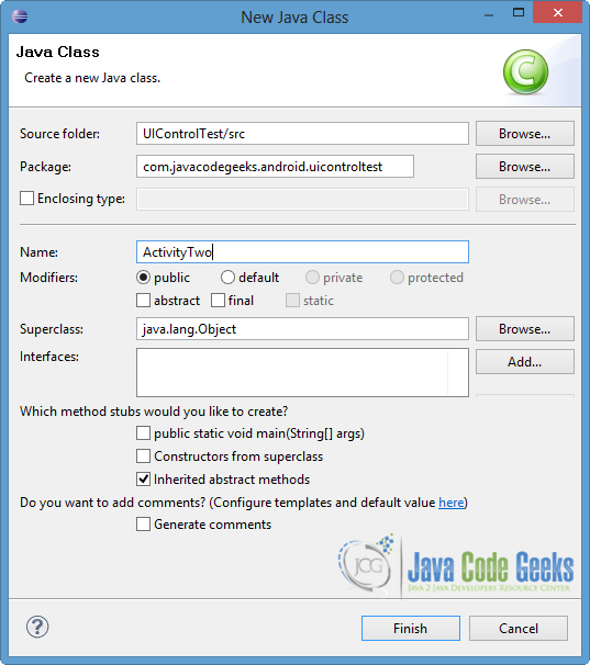
In addition, we will make a new Activity, in order to load the second_view layout. So, right click on com.javacodegeeks.android.uicontroltest package → New → Class. Specify the name of the new Class and put it into the same package, as you can see in the image below.
Then open src/com.javacodegeeks.android.uicontroltest/ActivityTwo.java and paste the following.
ActivityTwo.java:
package com.javacodegeeks.android.uicontroltest;

import android.app.Activity;
import android.os.Bundle;

public class ActivityTwo extends Activity {

	protected void onCreate(Bundle savedInstanceState) {
		super.onCreate(savedInstanceState);
		setContentView(R.layout.second_view);

	}

}
Notice that clickButton() function is instantiated in the MainActivity, in order to start the ActivityTwo class, when the button1 is pressed.
4. Define the new Activity
We should declare the new Activity that we created, so open AndroidManifest.xml file, go to the respective xml tab and paste the following code.
AndroidManifest.xml:
<?xml version="1.0" encoding="utf-8"?>
<manifest xmlns:android="http://schemas.android.com/apk/res/android"
    package="com.javacodegeeks.android.uicontroltest"
    android:versionCode="1"
    android:versionName="1.0" >

    <uses-sdk
        android:minSdkVersion="14"
        android:targetSdkVersion="19" />

    <application
        android:allowBackup="true"
        android:icon="@drawable/ic_launcher"
        android:label="@string/app_name"
        android:theme="@style/AppTheme" >
        <activity
            android:name="com.javacodegeeks.android.uicontroltest.MainActivity"
            android:label="@string/app_name" >
            <intent-filter>
                <action android:name="android.intent.action.MAIN" />

                <category android:name="android.intent.category.LAUNCHER" />
            </intent-filter>
        </activity>

        <activity
            android:name="com.javacodegeeks.android.uicontroltest.ActivityTwo"
            android:label="@string/app_name" >
        </activity>
    </application>

</manifest>
5. Run the application
Now we are ready to run our application, so right click on our project → Run as → Android Application. The AVD will appear with the app loaded, as you can see in the picture below.
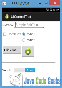
As you can notice, the activity_main layout is appeared, because it is loaded to the MainActivity of the project. Lets try to copy and paste the TextView. That can’t be done, because we set android:textIsSelectable to false. Also “Simple EditText” text is shown in the EditText as a hint. You can see that radio1 is checked, because we defined it in the layout, while CheckBox is not. Also notice that the Switch is set to “Start”. That is happening because we specified the text’s name and we defined to be switched on.
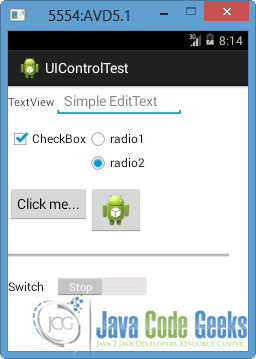
If we turn the Switch off, “Stop” text will be displayed, as you can see in the next image. In the picture below, you can also notice that we checked the CheckBox and we chose the radio2. The last action signs the uncheck of the radio1, because both of them are included in the same RadioGroup.
Now lets press the Button to launch ActivityTwo, which loads second_view layout.
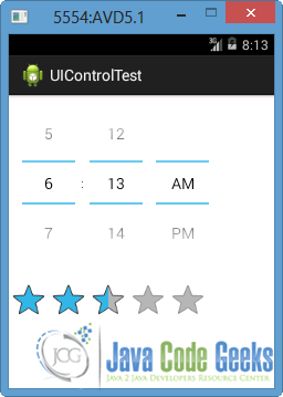
TimePicker is displayed, where we can change the time. Also, a RatingBar is appeared. Notice that there are 5 stars for rating and that the step rate is a half star its time. That is happening because of the values in the android:numStars and android:stepSize attributes.
Download Eclipse Project
This was an example of User Interface Controls in Android. Download the Eclipse Project of this example: UIControlTest.zip
