JavaFX is an open source Java-based framework for developing rich client applications. It is comparable to other frameworks on the market such as Adobe Flex and Microsoft Silverlight.
JavaFX is also seen as the successor of Swing in the arena of graphical user interface (GUI) development technology in Java platform. The JavaFX library is available as a public Java application programming interface (API).
The following table shows an overview of the whole tutorial:
Table Of Contents
The following examples uses Java SE 7 and JavaFX 2.2.
1. Introduction
The GUI in JavaFX is constructed as a scene graph. A scene graph is a collection of visual elements, called nodes, arranged in a hierarchical fashion. A scene graph is built using the public JavaFX API. Nodes in a scene graph can handle user inputs and user gestures. They can have effects, transformations, and states.
Types of nodes in a scene graph include simple UI controls such as buttons, text fields, two-dimensional (2D) and three-dimensional (3D) shapes, images, media (audio and video), web content, and charts.
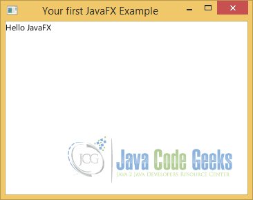
2. Your First JavaFX Application
2.1 The Code
FxFirstExample.java
import javafx.application.Application;
import javafx.scene.Scene;
import javafx.scene.layout.VBox;
import javafx.scene.text.Text;
import javafx.stage.Stage;

public class FxFirstExample extends Application
{
	public static void main(String[] args)
	{
		Application.launch(args);
	}

	@Override
	public void start(Stage stage)
	{
		// Create the Text
		Text text = new Text("Hello JavaFX");
		// Create the VBox
		VBox root = new VBox();
		// Add the Text to the VBox
		root.getChildren().add(text);
		// Set the Size of the VBox
		root.setMinSize(350, 250);

		// Create the Scene
		Scene scene = new Scene(root);

		// Set the Properties of the Stage
		stage.setX(100);
		stage.setY(200);
		stage.setMinHeight(300);
		stage.setMinWidth(400);

		// Add the scene to the Stage
		stage.setScene(scene);
		// Set the title of the Stage
		stage.setTitle("Your first JavaFX Example");
		// Display the Stage
		stage.show();
	}

}
2.2 Overriding the start() Method
A JavaFX application is a class that must inherit from the Application class that is in the javafx.application package. So it is necessary to override the start() method.
@Override
public void start(Stage stage)
{
	// do something
}
The start() method is the entry point for a JavaFX application. It is called by the JavaFX application launcher. Notice that the start() method is passed an instance of the Stage class, which is known as the primary stage of the application. You can create more stages as necessary in your application. However, the primary stage is always created by the JavaFX runtime.
2.3 Showing the Stage
Similar to a stage in the real world, a JavaFX stage is used to display a Scene. A scene has visuals, such as text, shapes, images, controls, animations, and effects, with which the user may interact, as is the case with all GUI-based applications.
A stage in JavaFX is a top-level container that hosts a scene, which consists of visual elements. The Stage class represents a stage in a JavaFX application. The primary stage is created by the platform and passed to the start(Stage s) method of the Application class.
@Override
public void start(Stage stage)
{
	// Display the Stage
	stage.show();
}
The bounds of a stage consist of four properties:
- X
- Y
- Width
- Height
The x and y properties determine the location of the upper-left corner of the stage. The width and height properties determine its size.
// Set the Properties of the Stage
stage.setX(100);
stage.setY(200);
stage.setMinHeight(300);
stage.setMinWidth(400);
The primary stage created by the application launcher does not have a scene. You have to create a scene for your stage. You must show the stage to see the visuals contained in its scene. Use the show() method to show the stage. Optionally, you can set a title for the stage using the setTitle() method.
// Create the Scene
Scene scene = new Scene(root);

// Add the scene to the Stage
stage.setScene(scene);
// Set the title of the Stage
stage.setTitle("Your first JavaFX Example");
// Display the Stage
stage.show();
2.4 Launching the Application
You can use one of the following two options to run a JavaFX Application:
It is not necessary to have a main() method in the class to start a JavaFX application. When you run a Java class that inherits from the Application class, the java command launches the JavaFX application if the class being run does not contain the main() method.
If you include a main() method in the JavaFX application class inside the main() method, call the launch() static method of the Application class to launch the application. The launch() method takes a String array as an argument, which are the parameters passed to the JavaFX application.
If you are using the first option, you do not need to write a main() method for the FxFirstExample class. If you are using the second option, the HelloFXApp class has to be enriched with the main() method.
public static void main(String[] args)
{
	Application.launch(args);
}
2.5 Adding a Scene to the Stage
An instance of the Scene class represents a scene. A stage contains one scene, and a scene contains visual contents. The contents of the scene are arranged in a tree-like hierarchy. At the top of the hierarchy is the root node. The root node may contain child nodes, which in turn may contain their child nodes, and so on. You must have a root node to create a scene. You can use a VBox or another node type as the root node. VBox stands for Vertical box, which arranges its children vertically in a column.
The following code snippet adds the scene to the stage:
// Add the scene to the Stage
stage.setScene(scene);
2.6 The GUI
3. Controls
3.1 Introduction
JavaFX lets you create applications using GUI components. An application with a GUI performs three tasks:
- Accepts inputs from the user through input devices such as a keyboard or a mouse
- Processes the inputs
- Displays outputs
The UI provides a means to exchange information in terms of input and output between an application and its users. Entering text using a keyboard, selecting a menu item using a mouse, clicking a button, or other actions are examples of providing input to a GUI application. The application displays outputs on a computer monitor using text, charts, dialog boxes, and so forth.
Users interact with a GUI application using graphical elements called controls or widgets. Buttons, labels, text fields, text area, radio buttons, and check boxes are a few examples of controls. Devices like a keyboard, a mouse, and a touch screen are used to provide input to controls. Controls can also display output to the users. Controls generate events that indicate an occurrence of some kind of interaction between the user and the control. For example, pressing a button using a mouse or a spacebar generates an action event indicating that the user has pressed the button.
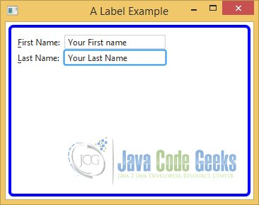
3.2 Label
An instance of the Label class represents a label control. As the name suggest, a Label is simply a label that is used to identify or describe another component on a screen. It can display a text, an icon, or both. Typically, a Label is placed next to (to the right or left) or at the top of the node it describes. A Label is not focus traversable. That is, you cannot set the focus to a Label using the Tab key. A Label control does not generate any interesting events that are typically used in an application.
3.2.1 The Code
FxLabelExample.java
import javafx.application.Application;
import javafx.scene.Scene;
import javafx.scene.control.Label;
import javafx.scene.control.TextField;
import javafx.scene.layout.GridPane;
import javafx.stage.Stage;

public class FxLabelExample extends Application
{
	public static void main(String[] args)
	{
		Application.launch(args);
	}

	@Override
	public void start(Stage stage)
	{
		// Create the Text Fields
		TextField firstNameFld = new TextField();
		TextField lastNameFld = new TextField();

		// Create the Labels
		Label firstNameLbl = new Label("_First Name:");
		Label lastNameLbl = new Label("_Last Name:");

		// Bind the Label to the according Field
		firstNameLbl.setLabelFor(firstNameFld);
		// Set mnemonic parsing to the Label
		firstNameLbl.setMnemonicParsing(true);

		// Bind the Label to the according Field
		lastNameLbl.setLabelFor(lastNameFld);
		// Set mnemonic parsing to the Label
		lastNameLbl.setMnemonicParsing(true);

		// Create the GridPane
		GridPane root = new GridPane();
		// Add the Labels and Fields to the GridPane
		root.addRow(0, firstNameLbl, firstNameFld);
		root.addRow(1, lastNameLbl, lastNameFld);
		// Set the Size of the GridPane
		root.setMinSize(350, 250);

		/*
		 * Set the padding of the GridPane
		 * Set the border-style of the GridPane
		 * Set the border-width of the GridPane
		 * Set the border-insets of the GridPane
		 * Set the border-radius of the GridPane
		 * Set the border-color of the GridPane
		*/
		root.setStyle("-fx-padding: 10;" +
				"-fx-border-style: solid inside;" +
				"-fx-border-width: 2;" +
				"-fx-border-insets: 5;" +
				"-fx-border-radius: 5;" +
				"-fx-border-color: blue;");

		// Create the Scene
		Scene scene = new Scene(root);
		// Add the scene to the Stage
		stage.setScene(scene);
		// Set the title of the Stage
		stage.setTitle("A Label Example");
		// Display the Stage
		stage.show();
	}
}
The above example shows a window with two Label controls with text First Name: and Last Name: The Label with the text First Name: is an indicator for the user that he should enter a first name in the field that is placed right next to it. A similar argument goes for the Last Name: Label control.
3.2.2 Adding a Mnemonic to a Label
A Label control can have a mnemonic. Mnemonic parsing for Label controls is set to false by default. When you press the mnemonic key for a Label, the focus is set to the labelFor node for that Label. The following snippet of code creates a TextField and a Label. The Label sets a mnemonic, enables mnemonic parsing, and sets the TextField as its labelFor property.
// Create the Text Fields
TextField firstNameFld = new TextField();
TextField lastNameFld = new TextField();

// Create the Labels
Label firstNameLbl = new Label("_First Name:");
Label lastNameLbl = new Label("_Last Name:");

// Bind the Label to the according Field
firstNameLbl.setLabelFor(firstNameFld);
// Set mnemonic parsing to the Label
firstNameLbl.setMnemonicParsing(true);

// Bind the Label to the according Field
lastNameLbl.setLabelFor(lastNameFld);
// Set mnemonic parsing to the Label
lastNameLbl.setMnemonicParsing(true);
The topic TextField will be discussed in the next section.
A GridPane contains all labels and text fields in the above example. A full description of the class GridPane, VBox and other panes, which are used in all examples is available in the article JavaFX Layout Example.
3.2.3 The GUI
3.3 TextField
A TextField is a text input control. It inherits from the A TextInputControl class. It lets the user enter a single line of plain text. If you need a control to enter multiline text, use TextArea instead. Newline and tab characters in the text are removed.
3.3.1 The Code
FxTextFieldExample.java
import javafx.application.Application;
import javafx.event.ActionEvent;
import javafx.event.EventHandler;
import javafx.scene.Scene;
import javafx.scene.control.Label;
import javafx.scene.control.TextField;
import javafx.scene.layout.GridPane;
import javafx.stage.Stage;

public class FxTextFieldExample extends Application
{
	// Create the Message Label
	Label messageLbl = new Label("Enter your Name into the Text Fields.");

	public static void main(String[] args)
	{
		Application.launch(args);
	}

	@Override
	public void start(Stage stage)
	{
		// Create the TextFields
		TextField firstNameFld = new TextField();
		TextField lastNameFld = new TextField();

		// Both fields should be wide enough to display 15 chars
		firstNameFld.setPrefColumnCount(15);
		lastNameFld.setPrefColumnCount(15);

		// Set ActionEvent handlers for both fields
		firstNameFld.setOnAction(new EventHandler<ActionEvent>()
		{
            @Override public void handle(ActionEvent e)
            {
            	printMessage("You have changed the First Name!");
            }
        });
		lastNameFld.setOnAction(new EventHandler<ActionEvent>()
		{
            @Override public void handle(ActionEvent e)
            {
            	printMessage("You have changed the Last Name !");
            }
        });

		GridPane root = new GridPane();
		// Set the horizontal spacing to 10px
		root.setHgap(10);
		// Set the vertical spacing to 5px
		root.setVgap(5);

		// Add Labels and Fields to the GridPane
		root.addRow(0, messageLbl);
		root.addRow(1, new Label("First Name:"), firstNameFld);
		root.addRow(2, new Label("Last Name:"), lastNameFld);

		// Set the Size of the GridPane
		root.setMinSize(350, 250);

		/*
		 * Set the padding of the GridPane
		 * Set the border-style of the GridPane
		 * Set the border-width of the GridPane
		 * Set the border-insets of the GridPane
		 * Set the border-radius of the GridPane
		 * Set the border-color of the GridPane
		*/
		root.setStyle("-fx-padding: 10;" +
				"-fx-border-style: solid inside;" +
				"-fx-border-width: 2;" +
				"-fx-border-insets: 5;" +
				"-fx-border-radius: 5;" +
				"-fx-border-color: blue;");

		// Create the Scene
		Scene scene = new Scene(root);
		// Add the scene to the Stage
		stage.setScene(scene);
		// Set the title of the Stage
		stage.setTitle("A TextField Example");
		// Display the Stage
		stage.show();
	}

	// Helper Method
	public void printMessage(String message)
	{
		// Set the Text of the Label
		messageLbl.setText(message);
	}

}
3.3.2 Setting the width of a TextField
The prefColumnCount property determines the width of the control. The TextField in ur example is wide enough
to display fiteen letters
// Both fields should be wide enough to display 15 chars
firstNameFld.setPrefColumnCount(15);
lastNameFld.setPrefColumnCount(15);
3.3.3 Adding ActionEvent Handler to a TextField
The onAction property is an ActionEvent handler, which is called when the Enter key is pressed in the TextField, as shown in the following code:
// Set ActionEvent handlers for both fields
firstNameFld.setOnAction(new EventHandler<ActionEvent>()
{
	@Override public void handle(ActionEvent e)
	{
		printMessage("You have changed the First Name!");
	}
});
lastNameFld.setOnAction(new EventHandler<ActionEvent>()
{
	@Override public void handle(ActionEvent e)
	{
		printMessage("You have changed the Last Name !");
	}
});
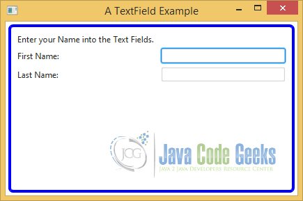
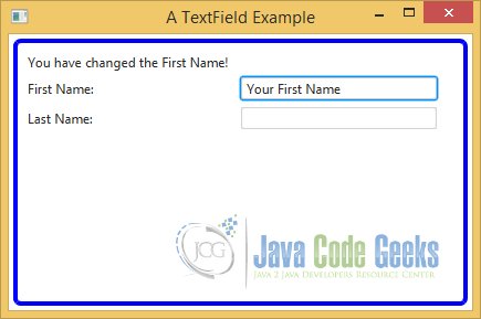
3.3.4 The GUI
After starting the application, the following window appears:
After inserting text into the TextField, the message will be changed:
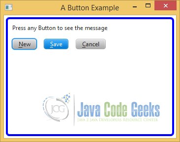
3.4 Button
A button that executes a command when activated is known as a command button. The Button, Hyperlink, and MenuButton classes represent command buttons. A MenuButton lets the user execute a command from a list of commands. Buttons used for presenting different choices to users are known as choice buttons. The ToggleButton, CheckBox, and RadioButton classes represent choice buttons. The third kind of button is a hybrid of the first two kinds. They let users execute a command or make choices.
3.4.1 The Code
FxButtonExample.java
import javafx.application.Application;
import javafx.event.ActionEvent;
import javafx.event.EventHandler;
import javafx.scene.Scene;
import javafx.scene.control.Button;
import javafx.scene.control.Label;
import javafx.scene.layout.HBox;
import javafx.scene.layout.VBox;
import javafx.stage.Stage;

public class FxButtonExample extends Application
{
	// Create the Message Label
	Label messageLbl = new Label("Press any Button to see the message");

	public static void main(String[] args)
	{
		Application.launch(args);
	}

	@Override
	public void start(Stage stage)
	{
		// Create a normal button with N as its mnemonic
		Button newBtn = new Button("_New");
		// Add EventHandler to the Button
		newBtn.setOnAction(new EventHandler<ActionEvent>()
		{
            @Override public void handle(ActionEvent e)
            {
            	printMessage("You have pressed the new Button");
            }
        });

		// Create a default button with S as its mnemonic
		Button saveBtn = new Button("_Save");
		// Set this Button as the Default
		saveBtn.setDefaultButton(true);
		// Add EventHandler to the Button
		saveBtn.setOnAction(new EventHandler<ActionEvent>()
		{
            @Override public void handle(ActionEvent e)
            {
            	printMessage("You have pressed the save Button");
            }
        });

		// Create a cancel button with C as its mnemonic
		Button cancelBtn = new Button("_Cancel");
		cancelBtn.setCancelButton(true);
		// Add EventHandler to the Button
		cancelBtn.setOnAction(new EventHandler<ActionEvent>()
		{
            @Override public void handle(ActionEvent e)
            {
            	printMessage("You have pressed the cancel Button");
            }
        });

		// Create the HBox
		HBox buttonBox = new HBox();
		// Add the children to the HBox
		buttonBox.getChildren().addAll(newBtn, saveBtn, cancelBtn);
		// Set the vertical spacing between children to 15px
		buttonBox.setSpacing(15);

		// Create the VBox
		VBox root = new VBox();
		// Add the children to the VBox
		root.getChildren().addAll(messageLbl, buttonBox);
		// Set the vertical spacing between children to 15px
		root.setSpacing(15);
		// Set the Size of the VBox
		root.setMinSize(350, 250);

		/*
		 * Set the padding of the VBox
		 * Set the border-style of the VBox
		 * Set the border-width of the VBox
		 * Set the border-insets of the VBox
		 * Set the border-radius of the VBox
		 * Set the border-color of the VBox
		*/
		root.setStyle("-fx-padding: 10;" +
				"-fx-border-style: solid inside;" +
				"-fx-border-width: 2;" +
				"-fx-border-insets: 5;" +
				"-fx-border-radius: 5;" +
				"-fx-border-color: blue;");

		// Create the Scene
		Scene scene = new Scene(root);
		// Add the scene to the Stage
		stage.setScene(scene);
		// Set the title of the Stage
		stage.setTitle("A Button Example");
		// Display the Stage
		stage.show();
	}

	// Helper Method
	public void printMessage(String message)
	{
		// Set the Text of the Label
		messageLbl.setText(message);
	}

}
3.4.2 Adding ActionEvent Handler to a Button
An instance of the Button class represents a command button. Typically, a Button has text as its label and an ActionEvent handler is registered to it. The mnemonicParsing property for the Button class is set to true by default.
// Create a normal button with N as its mnemonic
Button newBtn = new Button("_New");
// Add EventHandler to the Button
newBtn.setOnAction(new EventHandler<ActionEvent>()
{
	@Override public void handle(ActionEvent e)
	{
		printMessage("You have pressed the new Button");
	}
});
3.4.3 Setting the mode of a Button
A Button can be in one of three modes:
- A normal button
- A default button
- A cancel button
For a normal button, its ActionEvent is fired when the button is activated. For a default button, the ActionEvent is fired when the Enter key is pressed and no other node in the scene consumes the key press.
// Create a default button with S as its mnemonic
Button saveBtn = new Button("_Save");
// Set this Button as the Default
saveBtn.setDefaultButton(true);
// Add EventHandler to the Button
saveBtn.setOnAction(new EventHandler<ActionEvent>()
{
	@Override public void handle(ActionEvent e)
	{
		printMessage("You have pressed the save Button");
	}
});
For a cancel button, the ActionEvent is fired when the Esc key is pressed and no other node in the scene consumes the key press. By default, a Button is a normal button. The default and cancel modes are represented by the defaultButton and cancelButton properties. You would set one of these properties to true to make a button a default or cancel button. By default, both properties are set to false.
// Create a cancel button with C as its mnemonic
Button cancelBtn = new Button("_Cancel");
cancelBtn.setCancelButton(true);
// Add EventHandler to the Button
cancelBtn.setOnAction(new EventHandler<ActionEvent>()
{
	@Override public void handle(ActionEvent e)
	{
		printMessage("You have pressed the cancel Button");
	}
});
The following snippet of code creates a normal button and adds an ActionEvent handler. When the button is activated, for example, by clicking using a mouse, the printMessage() method is called:
// Create a normal button with N as its mnemonic
Button newBtn = new Button("_New");
// Add EventHandler to the Button
newBtn.setOnAction(new EventHandler<ActionEvent>()
{
	@Override public void handle(ActionEvent e)
	{
		printMessage("You have pressed the new Button");
	}
});
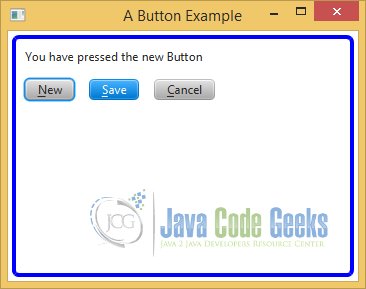
3.4.4 The GUI
After starting the application, the following window appears:
After pressing any Button, the message will be changed:
3.5 MenuButton
A MenuButton control looks like a button and behaves like a menu. When it is activated, it shows a list of options in the form of a pop-up menu. The list of options in the menu is maintained in an ObservableList<MenuItem> whose reference is returned by the getItems() method. To execute a command when a menu option is selected, you need to add the ActionEvent handler to the MenuItem.
3.5.1 The Code
FxMenuButtonExample.java
import javafx.application.Application;
import javafx.event.ActionEvent;
import javafx.event.EventHandler;
import javafx.scene.Scene;
import javafx.scene.control.Label;
import javafx.scene.control.MenuButton;
import javafx.scene.control.MenuItem;
import javafx.scene.layout.VBox;
import javafx.stage.Stage;

public class FxMenuButtonExample extends Application
{
	// Create the Message Label
	Label messageLbl = new Label("Choose your car!");

	public static void main(String[] args)
	{
		Application.launch(args);
	}

	@Override
	public void start(Stage stage)
	{
		// Create the MenuItem ford
		MenuItem ford = new MenuItem("Ford");
		// Add EventHandler to the MenuItem
		ford.setOnAction(new EventHandler<ActionEvent>()
		{
            @Override public void handle(ActionEvent e)
            {
            	printMessage("You have selected: Ford");
            }
        });

		// Create the MenuItem audi
		MenuItem audi = new MenuItem("Audi");
		// Add EventHandler to the MenuItem
		audi.setOnAction(new EventHandler<ActionEvent>()
		{
            @Override public void handle(ActionEvent e)
            {
            	printMessage("You have selected: Audi");
            }
        });

		// Create the MenuItem ferrari
		MenuItem ferrari = new MenuItem("Ferrari");
		// Add EventHandler to the MenuItem
		ferrari.setOnAction(new EventHandler<ActionEvent>()
		{
            @Override public void handle(ActionEvent e)
            {
            	printMessage("You have selected: Ferrari");
            }
        });

		// Create the MenuItem porsche
		MenuItem porsche = new MenuItem("Porsche");
		// Add EventHandler to the MenuItem
		porsche.setOnAction(new EventHandler<ActionEvent>()
		{
            @Override public void handle(ActionEvent e)
            {
            	printMessage("You have selected: Porsche");
            }
        });

		// Create the MenuButton
		MenuButton cars = new MenuButton("Select");
		// Add menu items to the MenuButton
		cars.getItems().addAll(ford, audi, ferrari, porsche);

		// Create the VBox
		VBox root = new VBox();
		// Add the children to the VBox
		root.getChildren().addAll(cars, messageLbl);
		// Set the Size of the VBox
		root.setMinSize(350, 250);

		/*
		 * Set the padding of the VBox
		 * Set the border-style of the VBox
		 * Set the border-width of the VBox
		 * Set the border-insets of the VBox
		 * Set the border-radius of the VBox
		 * Set the border-color of the VBox
		*/
		root.setStyle("-fx-padding: 10;" +
				"-fx-border-style: solid inside;" +
				"-fx-border-width: 2;" +
				"-fx-border-insets: 5;" +
				"-fx-border-radius: 5;" +
				"-fx-border-color: blue;");

		// Create the Scene
		Scene scene = new Scene(root);
		// Add the scene to the Stage
		stage.setScene(scene);
		// Set the title of the Stage
		stage.setTitle("A MenuButton Example");
		// Display the Stage
		stage.show();
	}

	// Helper Method
	public void printMessage(String message)
	{
		// Set the Text of the Label
		messageLbl.setText(message);
	}
}
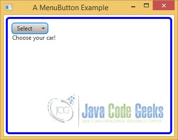
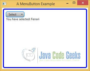
3.5.2 The GUI
After starting the application, the following window appears:
After pressing any MenuButton, the message will be changed:
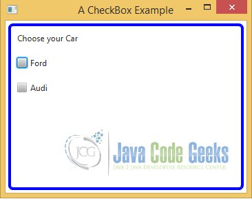
3.6 CheckBox
A CheckBox is a three-state selection control:
- Checked
- Unchecked
- Undefined
The undefined state is also known as an indeterminate state. A CheckBox supports a selection of three choices:
- True
- False
- Unknown
or
- Yes
- No
- Unknown
Usually, a CheckBox has text as a label. Clicking a CheckBox transitions it from one state to another cycling through three states. A box is drawn for a CheckBox. In the unchecked state, the box is empty. A tick mark is present in the box when it is in the checked state. In the undefined state, a horizontal line is present in the box.
3.6.1 The Code
FxCheckBoxExample.java
import javafx.application.Application;
import javafx.beans.value.ChangeListener;
import javafx.beans.value.ObservableValue;
import javafx.scene.Scene;
import javafx.scene.control.CheckBox;
import javafx.scene.control.Label;
import javafx.scene.layout.VBox;
import javafx.stage.Stage;
public class FxCheckBoxExample extends Application
{
// Create the Selection Label
Label selectionMsg = new Label("Choose your Car");
public static void main(String[] args)
{
Application.launch(args);
}
@Override
public void start(Stage stage)
{
// Create a CheckBox to support only two states
CheckBox fordCbx = new CheckBox("Ford");
// Create a CheckBox to support three states
CheckBox audiCbx = new CheckBox("Audi");
audiCbx.setAllowIndeterminate(true);
// Add a ChangeListener to the CheckBox fordCbx
fordCbx.selectedProperty().addListener(new ChangeListener<Boolean>()
{
public void changed(ObservableValue<? extends Boolean> ov,
final Boolean value, final Boolean newValue)
{
if(newValue != null && newValue)
{
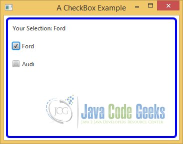
printMessage("Your Selection: Ford");
}
}
});
// Add a ChangeListener to the CheckBox audiCbx
audiCbx.selectedProperty().addListener(new ChangeListener<Boolean>()
{
public void changed(ObservableValue<? extends Boolean> ov,
final Boolean value, final Boolean newValue)
{
if(newValue != null && newValue)
{
printMessage("Your Selection: Audi");
}
}
});
// Add a ChangeListener to the CheckBox audiCbx
audiCbx.indeterminateProperty().addListener(new ChangeListener<Boolean>()
{
public void changed(ObservableValue<? extends Boolean> ov,
final Boolean value, final Boolean newValue)
{
if(newValue != null && newValue)
{
printMessage("Your indeterminate Selection: Audi");
}
}
});
// Create the VBox
VBox root = new VBox();
// Add the children to the VBox
root.getChildren().addAll(selectionMsg, fordCbx, audiCbx);
// Set the vertical spacing between children to 20px
root.setSpacing(20);
// Set the Size of the VBox
root.setMinSize(350, 250);
/*
* Set the padding of the VBox
* Set the border-style of the VBox
* Set the border-width of the VBox
* Set the border-insets of the VBox
* Set the border-radius of the VBox
* Set the border-color of the VBox
*/
root.setStyle("-fx-padding: 10;" +
"-fx-border-style: solid inside;" +
"-fx-border-width: 2;" +
"-fx-border-insets: 5;" +
"-fx-border-radius: 5;" +
"-fx-border-color: blue;");
// Create the Scene
Scene scene = new Scene(root);
// Add the scene to the Stage
stage.setScene(scene);
// Set the title of the Stage
stage.setTitle("A CheckBox Example");
// Display the Stage
stage.show();
}
// Helper Method
public void printMessage(String message)
{
// Set the Text of the Label
selectionMsg.setText(message);
}
}
By default, the CheckBox control supports only the two states checked and unchecked. The allowIndeterminate property specifies whether the third state (the undefined state) is available for selection. By default, it is set to false.
// Create a CheckBox to support three states
CheckBox audiCbx = new CheckBox("Audi");
audiCbx.setAllowIndeterminate(true);
3.6.2 The ObservableValue Class
The ObservableValue interface inherits from the Observable interface. An ObservableValue wraps a value, which can be observed for changes. It has a getValue() method that returns the value it wraps. It generates invalidation events and change events. Invalidation events are generated when the value in the ObservableValue is no longer valid. Change events are generated when the value changes. You can register a ChangeListener to an ObservableValue. The changed() method of the ChangeListener is called every time the value of its value changes. The changed() method receives three arguments:
- The reference of the ObservableValue
- The old value
- The new value
The following code snippet shows an example of the usage of an ObservableValue:
// Add a ChangeListener to the CheckBox audiCbx
audiCbx.indeterminateProperty().addListener(new ChangeListener<Boolean>()
{
	public void changed(ObservableValue<? extends Boolean> ov,
			final Boolean value, final Boolean newValue)
	{
		if(newValue != null && newValue)
		{
			printMessage("Your indeterminate Selection: Audi");
		}
	}
});
3.6.3 The GUI
After starting the application, the following window appears:
If you make a click on a specific CheckBox, the following message apperas in our example:
3.7 ToggleButton
ToggleButton is a two-state button control. The two states are:
- Selected
- Unselected
Its selected property indicates whether it is selected. The selected property is true when it is in the selected state. Otherwise, it is false. When it is in the selected state, it stays depressed. You can toggle between the selected and unselected states by pressing it, and hence it got the name ToggleButton. For ToggleButtons, mnemonic parsing is enabled by default.
3.7.1 The Code
FxToggleButtonExample.java
import javafx.application.Application;
import javafx.beans.value.ChangeListener;
import javafx.beans.value.ObservableValue;
import javafx.scene.Scene;
import javafx.scene.control.Label;
import javafx.scene.control.Toggle;
import javafx.scene.control.ToggleButton;
import javafx.scene.control.ToggleGroup;
import javafx.scene.layout.HBox;
import javafx.scene.layout.VBox;
import javafx.stage.Stage;
public class FxToggleButtonExample extends Application
{
// Create the Message Label
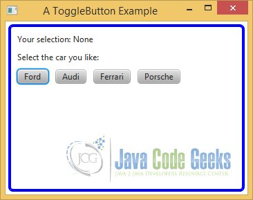
Label selectionMsg = new Label("Your selection: None");
public static void main(String[] args)
{
Application.launch(args);
}
@Override
public void start(Stage stage)
{
// Create four ToggleButtons
ToggleButton fordBtn = new ToggleButton("Ford");
ToggleButton audiBtn = new ToggleButton("Audi");
ToggleButton ferrariBtn = new ToggleButton("Ferrari");
ToggleButton porscheBtn = new ToggleButton("Porsche");
// Create a ToggleGroup
final ToggleGroup group = new ToggleGroup();
// Add all ToggleButtons to a ToggleGroup
group.getToggles().addAll(fordBtn, audiBtn, ferrariBtn, porscheBtn);
// Create a ChangeListener for the ToggleGroup
group.selectedToggleProperty().addListener(new ChangeListener<Toggle>(){
public void changed(ObservableValue<? extends Toggle> ov,
final Toggle toggle, final Toggle new_toggle)
{
String toggleBtn = ((ToggleButton)new_toggle).getText();
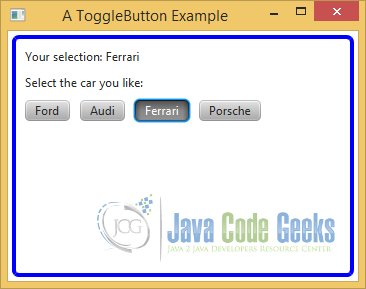
selectionMsg.setText("Your selection: " + toggleBtn);
}});
// Create the Label for the Selection
Label selectLbl = new Label("Select the car you like:");
// Create a HBox
HBox buttonBox = new HBox();
// Add ToggleButtons to an HBox
buttonBox.getChildren().addAll(fordBtn, audiBtn, ferrariBtn, porscheBtn);
// Set the spacing between children to 10px
buttonBox.setSpacing(10);
// Create the VBox
VBox root = new VBox();
// Add the Labels and HBox to the VBox
root.getChildren().addAll(selectionMsg, selectLbl, buttonBox);
// Set the spacing between children to 10px
root.setSpacing(10);
// Set the Size of the VBox
root.setMinSize(350, 250);
/*
* Set the padding of the VBox
* Set the border-style of the VBox
* Set the border-width of the VBox
* Set the border-insets of the VBox
* Set the border-radius of the VBox
* Set the border-color of the VBox
*/
root.setStyle("-fx-padding: 10;" +
"-fx-border-style: solid inside;" +
"-fx-border-width: 2;" +
"-fx-border-insets: 5;" +
"-fx-border-radius: 5;" +
"-fx-border-color: blue;");
// Create the Scene
Scene scene = new Scene(root);
// Add the scene to the Stage
stage.setScene(scene);
// Set the title of the Stage
stage.setTitle("A ToggleButton Example");
// Display the Stage
stage.show();
}
}
3.7.2 The GUI
After starting the application, the following window appears:
After pressing any ToggleButton, the message will be changed:
3.8 RadioButton
An instance of the RadioButton class represents a radio button. It inherits from the ToggleButton class. Therefore, it has all of the features of a toggle button. A radio button is rendered differently compared to a toggle button. Like a toggle button, a radio button can be in one of the two states:
- Selected
- Unselected
Its selected property indicates its current state. Like a toggle button, its mnemonic parsing is enabled by default. Like a toggle button, it also sends an ActionEvent when it is selected and unselected.
3.8.1 The Code
FxRadioButtonExample.java
import javafx.application.Application;
import javafx.beans.value.ChangeListener;
import javafx.beans.value.ObservableValue;
import javafx.scene.Scene;
import javafx.scene.control.Label;
import javafx.scene.control.RadioButton;
import javafx.scene.control.Toggle;
import javafx.scene.control.ToggleButton;
import javafx.scene.control.ToggleGroup;
import javafx.scene.layout.HBox;
import javafx.scene.layout.VBox;
import javafx.stage.Stage;

public class FxRadioButtonExample extends Application
{
	// Create the Selection Label
	Label selectionMsg = new Label("Your selection: None");

	public static void main(String[] args)
	{
		Application.launch(args);
	}

	@Override
	public void start(Stage stage)
	{
		// Create the RadioButtons
		RadioButton fordBtn = new RadioButton("Ford");
		RadioButton audiBtn = new RadioButton("Audi");
		RadioButton ferrariBtn = new RadioButton("Ferrari");
		RadioButton porscheBtn = new RadioButton("Porsche");

		// Create a ToggleGroup
		ToggleGroup group = new ToggleGroup();
		// Add all RadioButtons to a ToggleGroup
		group.getToggles().addAll(fordBtn, audiBtn, ferrariBtn, porscheBtn);

		// Add a listener to the ToggleGroup
		group.selectedToggleProperty().addListener(new ChangeListener<Toggle>(){
		    public void changed(ObservableValue<? extends Toggle> ov,
		            final Toggle toggle, final Toggle new_toggle)
		    {
		    	String toggleBtn = ((ToggleButton)new_toggle).getText();
		    	selectionMsg.setText("Your selection: " + toggleBtn);
            }});

		// Select the default car as ferrari
		ferrariBtn.setSelected(true);

		// Create the Selection Label
		Label msg = new Label("Select the car you like the most:");

		// Create a HBox
		HBox buttonBox = new HBox();
		// Add RadioButtons to an HBox
		buttonBox.getChildren().addAll(fordBtn, audiBtn, ferrariBtn, porscheBtn);
		// Set the spacing between children to 10px
		buttonBox.setSpacing(10);

		// Create the VBox
		VBox root = new VBox();
		// Add Labels and RadioButtons to an VBox
		root.getChildren().addAll(selectionMsg, msg, buttonBox);
		// Set the spacing between children to 10px
		root.setSpacing(10);
		// Set the Size of the VBox
		root.setMinSize(350, 250);

		/*
		 * Set the padding of the VBox
		 * Set the border-style of the VBox
		 * Set the border-width of the VBox
		 * Set the border-insets of the VBox
		 * Set the border-radius of the VBox
		 * Set the border-color of the VBox
		*/
		root.setStyle("-fx-padding: 10;" +
				"-fx-border-style: solid inside;" +
				"-fx-border-width: 2;" +
				"-fx-border-insets: 5;" +
				"-fx-border-radius: 5;" +
				"-fx-border-color: blue;");

		// Create the Scene
		Scene scene = new Scene(root);
		// Add the scene to the Stage
		stage.setScene(scene);
		// Set the title of the Stage
		stage.setTitle("A RadioButton Example");
		// Display the Stage
		stage.show();
	}
}
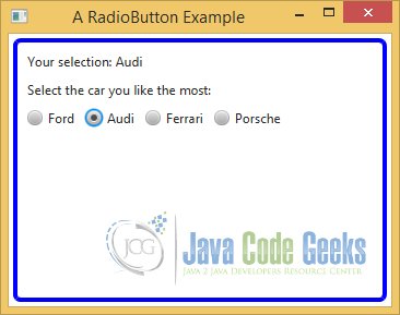
There is a significant difference in the use of radio buttons compared to the use of toggle buttons. Recall that when toggle buttons are used in a group, there may not be any selected toggle button in the group. When radio buttons are used in a group, there must be one selected radio button in the group. Unlike a toggle button, clicking a selected radio button in a group does not unselect it. To enforce the rule that one radio button must be selected in a group of radio buttons, one radio button from the group is selected programmatically by default.
3.8.2 The GUI
After starting the application, the following window appears:
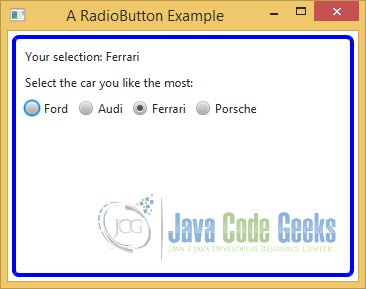
After pressing any RadioButton, the message will be changed:
3.9 ChoiceBox
A ChoiceBox is used to let a user select an item from a small list of items. The items may be any type of objects. A ChoiceBox is a parameterized class. The parameter type is the type of the items in its list. If you want to store mixed types of items in a ChoiceBox, you can use its raw type, as shown in the following code:
3.9.1 The Code
FxChoiceBoxExample.java
import javafx.application.Application;
import javafx.scene.Scene;
import javafx.scene.control.ChoiceBox;
import javafx.scene.control.Label;
import javafx.scene.layout.GridPane;
import javafx.stage.Stage;

public class FxChoiceBoxExample extends Application
{
	public static void main(String[] args)
	{
		Application.launch(args);
	}

	@Override
	public void start(Stage stage)
	{
		// Create the Label for the Car
		Label carLbl = new Label("Car:");

		// Create a ChoiceBox for cars
		ChoiceBox<String> cars = new ChoiceBox<>();
		// Add the items to the ChoiceBox
		cars.getItems().addAll("Ford", "Audi", "Ferrari", "Porsche");

		// Create the Selection Message Label
		Label selectionMsgLbl = new Label("Your selection:");

		// Create the Selection Value Label
		Label selectedValueLbl = new Label();
		// Bind the value property to the text property of the Label
		selectedValueLbl.textProperty().bind(cars.valueProperty());

		// Display controls in a GridPane
		GridPane root = new GridPane();
		// Set the spacing between columns and rows
		root.setVgap(10);
		root.setHgap(10);

		// Add the Labels and the ChoiceBox to the GridPane
		root.addRow(0, carLbl, cars);
		root.addRow(1, selectionMsgLbl, selectedValueLbl);

		// Set the Size of the GridPane
		root.setMinSize(350, 250);

		/*
		 * Set the padding of the GridPane
		 * Set the border-style of the GridPane
		 * Set the border-width of the GridPane
		 * Set the border-insets of the GridPane
		 * Set the border-radius of the GridPane
		 * Set the border-color of the GridPane
		*/
		root.setStyle("-fx-padding: 10;" +
				"-fx-border-style: solid inside;" +
				"-fx-border-width: 2;" +
				"-fx-border-insets: 5;" +
				"-fx-border-radius: 5;" +
				"-fx-border-color: blue;");

		// Create the Scene
		Scene scene = new Scene(root);
		// Add the scene to the Stage
		stage.setScene(scene);
		// Set the title of the Stage
		stage.setTitle("A ChoiceBox Example");
		// Display the Stage
		stage.show();
	}
}
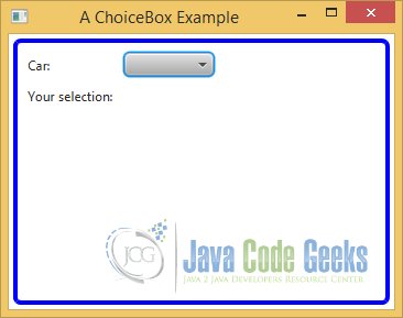
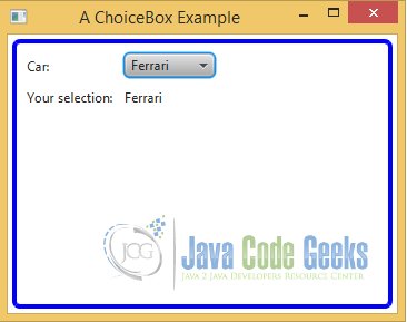
3.9.2 The GUI
After starting the application, the following window appears:
After selecting an item, the message will be changed:
3.10 ComboBox
A ComboBox is used to let a user select an item from a list of items. You can think of ComboBox as an advanced version of ChoiceBox. A ComboBox is highly customizable. The ComboBox class inherits from ComboBoxBase class, which provides the common functionality for all ComboBox-like controls, such as ComboBox, ColorPicker, and DatePicker. If you want to create a custom control that will allow users to select an item from a pop-up list, you need to inherit your control from the ComboBoxBase class.
3.10.1 The Code
FxComboBoxExample.java
import javafx.application.Application;
import javafx.beans.value.ChangeListener;
import javafx.beans.value.ObservableValue;
import javafx.scene.Scene;
import javafx.scene.control.ComboBox;
import javafx.scene.control.Label;
import javafx.scene.layout.HBox;
import javafx.scene.layout.VBox;
import javafx.stage.Stage;

public class FxComboBoxExample extends Application
{
	// Create the Selection Label
	Label selectionLbl = new Label("Your selection: None");

	public static void main(String[] args)
	{
		Application.launch(args);
	}

	@Override
	public void start(Stage stage)
	{
		// Create the Label for the Car
		Label carLbl = new Label("Car:");

		// Create a ComboBox for cars
		ComboBox<String> cars = new ComboBox<>();
		// Add the items to the ComboBox
		cars.getItems().addAll("Ford", "Audi", "Ferrari", "Porsche");
		// Select the first car from the list
		cars.getSelectionModel().selectFirst();

		// Add a ChangeListener to the ComboBox
		cars.getSelectionModel().selectedItemProperty().addListener(new ChangeListener<String>()
		{
		    public void changed(ObservableValue<? extends String> ov, final String oldValue, final String newValue)
		    {
		    	selectionLbl.setText("Your selection: " + newValue);
		    }
		});

		// Create the HBox
		HBox carbox = new HBox();
		// Add the children to the HBox
		carbox.getChildren().addAll(carLbl, cars);
		// Set the vertical spacing between children to 10px
		carbox.setSpacing(10);

		// Create the VBox
		VBox root = new VBox();
		// Add the children to the VBox
		root.getChildren().addAll(carbox, selectionLbl);
		// Set the vertical spacing between children to 10px
		root.setSpacing(10);
		// Set the Size of the VBox
		root.setMinSize(350, 250);

		/*
		 * Set the padding of the VBox
		 * Set the border-style of the VBox
		 * Set the border-width of the VBox
		 * Set the border-insets of the VBox
		 * Set the border-radius of the VBox
		 * Set the border-color of the VBox
		*/
		root.setStyle("-fx-padding: 10;" +
				"-fx-border-style: solid inside;" +
				"-fx-border-width: 2;" +
				"-fx-border-insets: 5;" +
				"-fx-border-radius: 5;" +
				"-fx-border-color: blue;");

		// Create the Scene
		Scene scene = new Scene(root);
		// Add the scene to the Stage
		stage.setScene(scene);
		// Set the title of the Stage
		stage.setTitle("A ComboBox Example");
		// Display the Stage
		stage.show();
	}

}
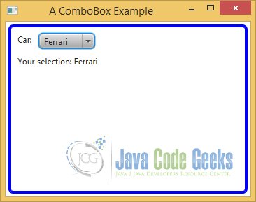
3.10.2 The GUI
After starting the application, the following window appears:
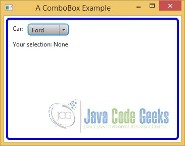
After selectang an item, the message will be changed:
3.11 ListView
A ListView is used to allow a user to select one item or multiple items from a list of items. Each item in ListView is represented by an instance of the ListCell class, which can be customized. The items list in a ListView may contain any type of objects. ListView is a parameterized class. The parameter type is the type of the items in the list.
3.11.1 The Code
FxListViewExample.java
import javafx.application.Application;
import javafx.beans.value.ChangeListener;
import javafx.beans.value.ObservableValue;
import javafx.scene.Scene;
import javafx.scene.control.Label;
import javafx.scene.control.ListView;
import javafx.scene.layout.GridPane;
import javafx.stage.Stage;

public class FxListViewExample extends Application
{
	// Create the Selection Label
	Label selectionLbl = new Label("Your selection: None");

	public static void main(String[] args)
	{
		Application.launch(args);
	}

	@Override
	public void start(Stage stage)
	{
		// Create the ListView
		ListView<String> cars = new ListView<String>();
		// Add Items to the ListView
		cars.getItems().addAll("Ford", "Audi", "Ferrari", "Porsche");
		// Select the first car from the list
		cars.getSelectionModel().selectFirst();
		// Add ChangeListener to the ListView
		cars.getSelectionModel().selectedItemProperty().addListener(new ChangeListener<String>()
		{
		    public void changed(ObservableValue<? extends String> ov, final String oldValue, final String newValue)
		    {
		    	selectionLbl.setText("Your selection: " + newValue);
		    }
		});

		// Create the GridPane
		GridPane root = new GridPane();
		// Set the horizontal and vertical spacing between columns and rows
		root.setVgap(10);
		root.setHgap(10);
		// Add ListView and Label to the GridPane
		root.addRow(0, cars);
		root.addRow(1, selectionLbl);
		// Set the Size of the GridPane
		root.setMinSize(300, 200);

		/*
		 * Set the padding of the GridPane
		 * Set the border-style of the GridPane
		 * Set the border-width of the GridPane
		 * Set the border-insets of the GridPane
		 * Set the border-radius of the GridPane
		 * Set the border-color of the GridPane
		*/
		root.setStyle("-fx-padding: 10;" +
				"-fx-border-style: solid inside;" +
				"-fx-border-width: 2;" +
				"-fx-border-insets: 5;" +
				"-fx-border-radius: 5;" +
				"-fx-border-color: blue;");

		// Create the Scene
		Scene scene = new Scene(root);
		// Add the scene to the Stage
		stage.setScene(scene);
		// Set the title of the Stage
		stage.setTitle("A ListView Example");
		// Display the Stage
		stage.show();
	}

}
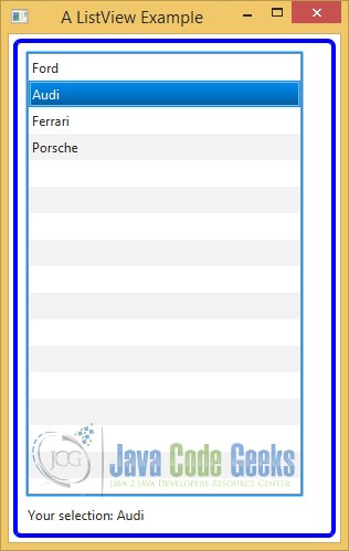
3.11.2 The GUI
After starting the application, the following window appears:
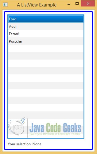
After selecting an item in the list, the message will be changed:
3.12 TextArea
A TextArea is a text input control. It inherits from the A TextInputControl class. It lets the user enter multiline plain text. If you need a control to enter a single line of plain text, use TextField instead. If you want to use rich text, use the HTMLEditor control. Unlike the TextField, newline and tab characters in the text are preserved. A newline character starts a new paragraph in a TextArea.
3.12.1 The Code
FxComboBoxExample.java
import javafx.application.Application;
import javafx.event.ActionEvent;
import javafx.event.EventHandler;
import javafx.scene.Scene;
import javafx.scene.control.Button;
import javafx.scene.control.Label;
import javafx.scene.control.TextArea;
import javafx.scene.control.TextField;
import javafx.scene.layout.VBox;
import javafx.stage.Stage;

public class FxTextAreaExample extends Application
{
	// Create the Message TextArea
	TextArea messageArea = new TextArea();

	public static void main(String[] args)
	{
		Application.launch(args);
	}

	@Override
	public void start(Stage stage)
	{
		// Create the TextField for the Input
		final TextField input = new TextField();
		input.setPromptText("Input your message here");

		// Set the Prompt and Size of the TextArea
		messageArea.setPromptText("Your Message:");
		messageArea.setPrefColumnCount(20);
		messageArea.setPrefRowCount(10);

		// Create the Print Button
		Button printBtn = new Button("Print Message");
		// Add an EvenetHandler to the Button
		printBtn.setOnAction(new EventHandler<ActionEvent>()
		{
            @Override public void handle(ActionEvent e)
            {
            	messageArea.appendText(input.getText()+ "\n");
            }
        });

		// Create the VBox
		VBox root = new VBox();
		// Add Labels, TextArea and TextField to the VBox
		root.getChildren().addAll(new Label("Input:"), input, new Label("Messages:"), messageArea, printBtn);
		// Set the Size of the VBox
		root.setMinSize(350, 250);

		/*
		 * Set the padding of the VBox
		 * Set the border-style of the VBox
		 * Set the border-width of the VBox
		 * Set the border-insets of the VBox
		 * Set the border-radius of the VBox
		 * Set the border-color of the VBox
		*/
		root.setStyle("-fx-padding: 10;" +
				"-fx-border-style: solid inside;" +
				"-fx-border-width: 2;" +
				"-fx-border-insets: 5;" +
				"-fx-border-radius: 5;" +
				"-fx-border-color: blue;");

		// Create the Scene
		Scene scene = new Scene(root);
		// Add the scene to the Stage
		stage.setScene(scene);
		// Set the title of the Stage
		stage.setTitle("A TextArea Example");
		// Display the Stage
		stage.show();
	}
}
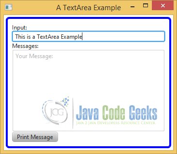
3.12.2 The GUI
After starting the application, the following window appears:
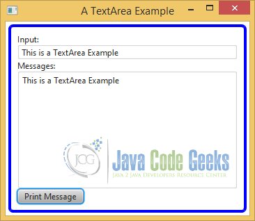
After inserting a text in the TextField, the TextArea contains the inserted data:
3.13 Menu
A Menu is used to provide a list of actionable items to the user in a compact form. You can also provide the same list of items using a group of buttons, where each button represents an actionable item. It is a matter of preference which one you use: a menu or a group of buttons.
There is a noticeable advantage of a using a menu. It uses much less space on the screen, compared to a group of buttons, by folding (or nesting) the group of items under another item.
For example, if you have used a file editor, the menu items such as New, Open, Save, and Print are nested under a top-level File menu.
A user needs to click the File menu to see the list of items that are available under it. Typically, in cases of a group of buttons, all items are visible to the user all the time, and it is easy for users to know what actions are available. Therefore, there is little tradeoff between the amount of space and usability when you decide to use a menu or buttons. Typically, a menu bar is displayed at the top of a window.
Using a menu is a multistep process. The following sections describe the steps in detail. The following is the summary of steps:
- 1. Create a menu bar and add it to a container.
- 2. Create menus and add them to the menu bar.
- 3. Create menu items and add them to the menus.
- 4. Add ActionEvent handlers to the menu items to perform actions when they are clicked.
3.13.1 The Code
FxMenuExample.java
import javafx.application.Application;
import javafx.event.ActionEvent;
import javafx.event.EventHandler;
import javafx.scene.Scene;
import javafx.scene.control.Label;
import javafx.scene.control.Menu;
import javafx.scene.control.MenuBar;
import javafx.scene.control.MenuItem;
import javafx.scene.layout.HBox;
import javafx.scene.layout.VBox;
import javafx.stage.Stage;

public class FxMenuExample extends Application
{
	// Create the Message Label
	Label messageLbl = new Label("Press any Menu Item to see the message");

	public static void main(String[] args)
	{
		Application.launch(args);
	}

	@Override
	public void start(Stage stage)
	{
		// Create some menus
		Menu fileMenu = new Menu("File");
		Menu editMenu = new Menu("Edit");

		// Create the MenuItem New
		MenuItem newItem = new MenuItem("New");
		newItem.setOnAction(new EventHandler<ActionEvent>()
		{
            @Override public void handle(ActionEvent e)
            {
            	printMessage("You have pressed the New Menu Item");
            }
        });

		// Create the MenuItem Open
		MenuItem openItem = new MenuItem("Open");
		openItem.setOnAction(new EventHandler<ActionEvent>()
		{
            @Override public void handle(ActionEvent e)
            {
            	printMessage("You have pressed the Open Menu Item");
            }
        });

		// Add menu items to the File menu
		fileMenu.getItems().addAll(newItem, openItem);

		// Create the MenuItem Copy
		MenuItem copyItem = new MenuItem("Copy");
		copyItem.setOnAction(new EventHandler<ActionEvent>()
		{
            @Override public void handle(ActionEvent e)
            {
            	printMessage("You have pressed the Copy Menu Item");
            }
        });

		// Create the MenuItem Paste
		MenuItem pasteItem = new MenuItem("Paste");
		pasteItem.setOnAction(new EventHandler<ActionEvent>()
		{
            @Override public void handle(ActionEvent e)
            {
            	printMessage("You have pressed the Paste Menu Item");
            }
        });

		// Add menu items to the Edit menu
		editMenu.getItems().addAll(copyItem, pasteItem);

		// Create a menu bar
		MenuBar menuBar = new MenuBar();
		// Add menus to a menu bar
		menuBar.getMenus().addAll(fileMenu, editMenu);

		// Create the Menu Box
		HBox menu = new HBox();
		// Add the MenuBar to the Menu Box
		menu.getChildren().add(menuBar);

		// Create the VBox
		VBox root = new VBox();
		// Add the children to the VBox
		root.getChildren().addAll(menu,messageLbl);
		// Set the Size of the VBox
		root.setMinSize(350, 250);

		/*
		 * Set the padding of the VBox
		 * Set the border-style of the VBox
		 * Set the border-width of the VBox
		 * Set the border-insets of the VBox
		 * Set the border-radius of the VBox
		 * Set the border-color of the VBox
		*/
		root.setStyle("-fx-padding: 10;" +
				"-fx-border-style: solid inside;" +
				"-fx-border-width: 2;" +
				"-fx-border-insets: 5;" +
				"-fx-border-radius: 5;" +
				"-fx-border-color: blue;");

		// Create the Scene
		Scene scene = new Scene(root);
		// Add the scene to the Stage
		stage.setScene(scene);
		// Set the title of the Stage
		stage.setTitle("A Menu Example");
		// Display the Stage
		stage.show();
	}

	// Helper Method
	public void printMessage(String message)
	{
		// Set the Text of the Label
		messageLbl.setText(message);
	}

}
3.13.2 Using Menu Bars
A menu bar is a horizontal bar that acts as a container for menus. An instance of the MenuBar class represents a menu bar. You can create a MenuBar using its default constructor:
// Create a menu bar
MenuBar menuBar = new MenuBar();
// Add menus to a menu bar
menuBar.getMenus().addAll(fileMenu, editMenu);
3.13.3 Using Menus
A menu contains a list of actionable items, which are displayed on demand, for example, by clicking it. The list of menu items is hidden when the user selects an item or moves the mouse pointer outside the list. A menu is typically added to a menu bar or another menu as a submenu. An instance of the Menu class represents a menu. A menu displays text and a graphic.
// Create some menus
Menu fileMenu = new Menu("File");
Menu editMenu = new Menu("Edit");
3.13.4 Using Menu Items
A MenuItem represents an actionable option. When it is clicked, the registered ActionEvent handlers are called.
The following snippet of code creates an New MenuItem and adds an ActionEvent handler that prints out the message:
// Create the MenuItem New
MenuItem newItem = new MenuItem("New");
newItem.setOnAction(new EventHandler<ActionEvent>()
{
	@Override public void handle(ActionEvent e)
	{
		printMessage("You have pressed the New Menu Item");
	}
});
A MenuItem is added to a menu. A menu stores the reference of its items in an ObservableList whose reference can be obtained using the getItems() method:
// Add menu items to the Edit menu
editMenu.getItems().addAll(copyItem, pasteItem);
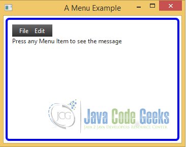
3.13.5 The GUI
After starting the application, the following window appears:
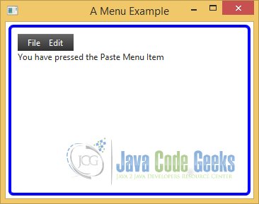
After selecting a specific MenuItem, the message will be changed:
4. Download Java Source Code
This was a JavaFX tutorial with a short Inroduction and an Example about the most important classes.
You can download the full source code of this tutorial here: JavaFxTutorial.zip

Great tutorial thanks :)