This is a JavaFX Layout example. JavaFX contains several layout-related classes, which are the topic of discussion in this example. It is divided into the following sections:
Each topic contains a description of the according layout class and a simple example. The layout classes are very powerfull and so you can create complex GUIs and objects by combine them.
The following table shows an overview of the whole article:
Table Of Contents
- 1. Layout Pane
- 2. Group
- 3. Region
- 4. Pane
- 5. HBox
- 6. VBox
- 7. FlowPane
- 8. BorderPane
- 9. StackPane
- 10. TilePane
- 11. GridPane
- 12. AnchorPane
The following examples uses Java SE 7 and JavaFX 2.2.
1. Layout Pane
A layout pane is a Node that contains other nodes, which are known as its children (or child nodes). You can use two types of layouts to arrange nodes in a Scene graph. A layout pane is also known as a container or a layout container. You can use two types of layouts to arrange nodes in a Scene Graph:
- Static Layout
- Dynamic Layout
In a static layout, the position and size of a node is calculated once, and they stay the same as the window is resized. In a dynamic layout, a node in a Scene Graph is laid out every time a user action necessitates a change in their position, size, or both. Typically, changing the position or size of one Node affects the position and size of all other nodes in the Scene Graph. The dynamic layout forces the recomputation of the position and size of some or all nodes as the window is resized. A layout pane performs two things:
- It computes the position (the x and y coordinates) of the node within its parent.
- It computes the size (the width and height) of the node.
2. Group
A Group has features of a container. It has its own layout policy, which does not provide any specific layout to its children, except giving them their preferred size. A Group does not have a size of its own. It is not resizable directly. Its size is the collective bounds of its children.
- It renders nodes in the order they are added.
- It does not position its children. All children are positioned at (0, 0) by default.
- By default, it resizes all its children to their preferred size.
2.1 The Code
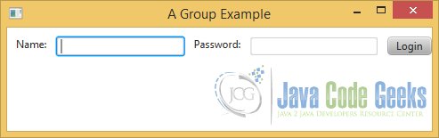
The following example shows a simple login dialog, which was realized under usage of the class Group.
FxLayoutGroupExample.java
import javafx.application.Application;
import javafx.beans.binding.NumberBinding;
import javafx.scene.Scene;
import javafx.scene.control.Button;
import javafx.scene.control.Label;
import javafx.scene.control.TextField;
import javafx.scene.Group;
import javafx.stage.Stage;

public class FxLayoutGroupExample extends Application
{
	public static void main(String[] args)
	{
		Application.launch(args);
	}

	@Override
	public void start(Stage stage)
	{
		// Create the Label for the Name
		Label nameLbl = new Label("Name:");
		// Set the location for the Label
		nameLbl.setLayoutX(10);
		nameLbl.setLayoutY(10);

		// Create the TextField for the Name
		TextField nameFld = new TextField();

		// Set the location of the Name TextField relative to the Name Label
		NumberBinding nameFldXBinding =
			nameLbl.layoutXProperty().add(nameLbl.widthProperty().add(10));
			nameFld.layoutXProperty().bind(nameFldXBinding);
			nameFld.layoutYProperty().bind(nameLbl.layoutYProperty());

		// Create the Label for the Password
		Label passwordLbl = new Label("Password:");

		// Set the location of the Password Label relative to the Name TextField
		NumberBinding passwordLblXBinding =
			nameFld.layoutXProperty().add(nameFld.widthProperty().add(10));
			passwordLbl.layoutXProperty().bind(passwordLblXBinding);
			passwordLbl.layoutYProperty().bind(nameFld.layoutYProperty());

		// Create the TextField for the Password
		TextField passwordFld = new TextField();

		// Set the location of the Password TextField relative to the Password Label
		NumberBinding passwordFldXBinding =
			passwordLbl.layoutXProperty().add(passwordLbl.widthProperty().add(10));
			passwordFld.layoutXProperty().bind(passwordFldXBinding);
			passwordFld.layoutYProperty().bind(passwordLbl.layoutYProperty());

		// Create the Login-Button
		Button loginBtn = new Button("Login");

		// Set the location of the Login Button relative to the Password TextField
		NumberBinding loginBtnXBinding =
			passwordFld.layoutXProperty().add(passwordFld.widthProperty().add(10));
			loginBtn.layoutXProperty().bind(loginBtnXBinding);
			loginBtn.layoutYProperty().bind(passwordFld.layoutYProperty());

		// Create the Group
		Group root = new Group();
		// Add the children to the Group
		root.getChildren().addAll(nameLbl, nameFld, passwordLbl, passwordFld, loginBtn);

		// Create the Scene
		Scene scene = new Scene(root);
		// Add the scene to the Stage
		stage.setScene(scene);
		// Set the title of the Stage
		stage.setTitle("A Group Example");
		// Display the Stage
		stage.show();
	}
}
2.2 Positioning Nodes in a Group
You can position child nodes in a Group by assigning them absolute positions using the layoutX and layoutY properties of the nodes. Alternatively, you can use binding API to position them relative to other nodes in the Group.
In our example, the Label nameLbl will be positioned absolutely at (10,10).
Label nameLbl = new Label("Name:");
// Set the location for the Label
nameLbl.setLayoutX(10);
nameLbl.setLayoutY(10);
All other child nodes will be positioned relative to the previous node. In the following code snippet the TextField nameFld will be positioned relative to the previous node nameLbl.
// Create the TextField for the Name
TextField nameFld = new TextField();

// Set the location of the Name TextField relative to the Name Label
NumberBinding nameFldXBinding =
	nameLbl.layoutXProperty().add(nameLbl.widthProperty().add(10));
	nameFld.layoutXProperty().bind(nameFldXBinding);
	nameFld.layoutYProperty().bind(nameLbl.layoutYProperty());
2.3 The GUI
3. Region
The class Region is the base class for all layout panes. Unlike Group, it has its own size. It is resizable. It can have a visual appearance, for example, with padding, multiple backgrounds, and multiple borders. By default, a Region defines a rectangular area. It can be changed to any shape. The drawing area of a Region is divided into several parts. Depending on the property settings, a Region may draw outside of its layout bounds. A Region consists of the following parts:
- Backgrounds (fills and images)
- Content Area
- Padding
- Borders (strokes and images)
- Margin
- Region Insets
The following figure shows the details of a Region:
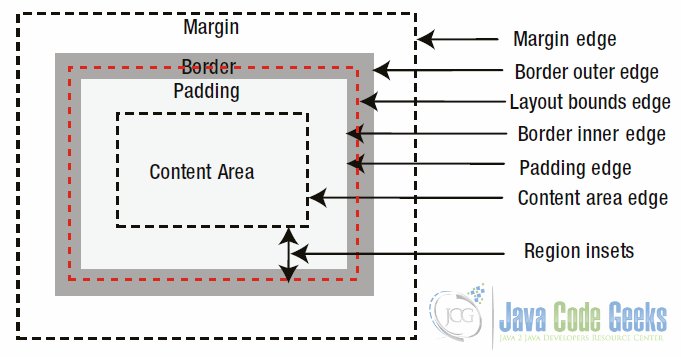
A Region may have a background that is drawn first. The content area is the area where the content of the Region (e.g., controls) are drawn. Padding is an optional space around the content area. If the padding has a zero width, the padding edge and the content area edge are the same. The border area is the space around the padding. If the border has a zero width, the border edge and the padding edge are the same. Margin is the space around the border. Padding and margin are very similar. The only difference between them is that the margin defines the space around the outside edge of the border, whereas the padding defines the space around the inside edge of the border. Margins are supported for controls when they are added to panes, for example, HBox, VBox, etc.
The usage of the parts of a Region will be discussed in the following topics.
4. Pane
The class Pane is a subclass class of the Region class. A Pane provides the following layout features:
- It can be used when absolute positioning is needed. By default, it positions all its children at (0, 0).
- It resizes all resizable children to their preferred sizes.
By default, a Pane has minimum, preferred, and maximum sizes. Its minimum width is the sum of the left and right insets; its minimum height is the sum of the top and bottom insets. Its preferred width is the width required to display all its children at their current x location with their preferred widths; its preferred height is the height required to display all its children at their current y location with their preferred heights.
4.1 The Code
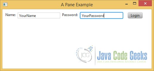
The following example shows a simple login dialog, which was realized under usage of the class Pane.
FxLayoutPaneExample.java
import javafx.application.Application;
import javafx.scene.Scene;
import javafx.scene.control.Button;
import javafx.scene.control.Label;
import javafx.scene.control.TextField;
import javafx.scene.layout.Pane;
import javafx.stage.Stage;

public class FxLayoutPaneExample extends Application
{
	public static void main(String[] args)
	{
		Application.launch(args);
	}

	@Override
	public void start(Stage stage)
	{
		// Create the Label for the Name
		Label nameLbl = new Label("Name:");
		// Set the position of the Label
		nameLbl.relocate(10, 10);
		// Create the TextField for the Name
		TextField nameFld = new TextField();
		// Set the position of the TextField
		nameFld.relocate(50, 10);
		// Create the Label for the Password
		Label passwordLbl = new Label("Password:");
		// Set the position of the Label
		passwordLbl.relocate(200, 10);
		// Create the TextField for the Password
		TextField passwordFld = new TextField();
		// Set the position of the TextField
		passwordFld.relocate(260, 10);
		// Create the Login Button
		Button loginBtn = new Button("Login");
		// Set the position of the Button
		loginBtn.relocate(420, 10);

		// Create the Pane
		Pane root = new Pane();

		// Set the background-color of the Pane
		root.setStyle("-fx-background-color: blue, lightgray;");
		// Set the background-insets of the Pane
		root.setStyle("-fx-background-insets: 0, 4;");
		// Set the background-radius of the Pane
		root.setStyle("-fx-background-radius: 4, 2;");

		// Set the size of the Pane
		root.setPrefSize(500, 200);
		// Add the children to the Pane
		root.getChildren().addAll(nameLbl, nameFld, passwordLbl, passwordFld, loginBtn);

		// Create the Scene
		Scene scene = new Scene(root);
		// Add the scene to the Stage
		stage.setScene(scene);
		// Set the title of the Stage
		stage.setTitle("A Pane Example");
		// Display the Stage
		stage.show();
	}
}
4.2 Adding Children to a Layout Pane
A container is meant to contain children. You can add children to a container at any time after the container is created. Containers store their children in an observable list, which can be retrieved using the getChildren() method. Adding a Node to a container is as simple as adding a node to that observable list.
The following snippet of code shows how to add children to a Pane when after it is created.
root.getChildren().addAll(nameLbl, nameFld, passwordLbl, passwordFld, loginBtn);
In this example, a Label and a TextField for the Name and Password and a Button for the Login will be added.
4.3 Setting Backgrounds
A Region and all their corresponding subclasses can have a background that consists of fills, images, or both. A fill consists of a color, radius for four corners, and insets on four sides. Fills are applied in the order they are specified. The color defines the color to be used for painting the background. The radius define the radius to be used for corners. The insets define the distance between the sides of the Region and the outer edges of the background fill.
The following CSS properties define the background fill for a Region.
- -fx-background-color
- -fx-background-radius
- -fx-background-insets
In our example, the CSS properties use two fills:
// Set the background-color of the Pane
root.setStyle("-fx-background-color: blue, lightgray;");
// Set the background-insets of the Pane
root.setStyle("-fx-background-insets: 0, 4;");
// Set the background-radius of the Pane
root.setStyle("-fx-background-radius: 4, 2;");
The first fill covers the entire Region with a blue color; it uses a 4px radius for all four corners, making the Region look like a rounded rectangle. The second fill covers the Region with a light gray color; it uses a 4px inset on all four sides, which means that 4px from the edges of the Region are not painted by this fill, and that area will still have the light gray color used by the first fill. A 2px radius for all four corners is used by the second fill.
4.4 The GUI
5. HBox
A HBox lays out its children in a single horizontal row. It lets you set the horizontal spacing between adjacent children, margins for any children, resizing behavior of children, etc. The default width of the content area and HBox is wide enough to display all its children at their preferred widths, and the default height is the largest of the heights of all its children.
You cannot set the locations for children in an HBox, because they are automatically computed by the HBox itself. You can control the locations of children to some extent by customizing the properties of the HBox and setting constraints on the children.
5.1 The Code
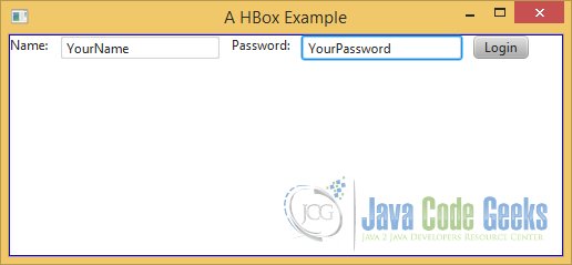
The following example shows a simple login dialog, which was realized under usage of the class HBox.
FxLayoutHBoxExample.java
import javafx.application.Application;
import javafx.geometry.Pos;
import javafx.scene.Scene;
import javafx.scene.control.Button;
import javafx.scene.control.Label;
import javafx.scene.control.TextField;
import javafx.scene.layout.HBox;
import javafx.stage.Stage;

public class FxLayoutHBoxExample extends Application
{
	public static void main(String[] args)
	{
		Application.launch(args);
	}

	@Override
	public void start(Stage stage)
	{
		// Create the Label for the Name
		Label nameLbl = new Label("Name:");
		// Create the TextField for the Name
		TextField nameFld = new TextField();
		// Create the Label for the Password
		Label passwordLbl = new Label("Password:");
		// Create the TextField for the Password
		TextField passwordFld = new TextField();
		// Create the Login-Button
		Button loginBtn = new Button("Login");

		// Create the HBox with a 10px spacing
		HBox root = new HBox(10);
		// Set the Alignment for the HBox
		root.setAlignment(Pos.TOP_LEFT);
		// Set the padding of the HBox
		root.setStyle("-fx-padding: 10;");
		// Set the border-style of the HBox
		root.setStyle("-fx-border-style: solid inside;");
		// Set the border-width of the HBox
		root.setStyle("-fx-border-width: 2;");
		// Set the border-insets of the HBox
		root.setStyle("-fx-border-insets: 5;");
		// Set the border-radius of the HBox
		root.setStyle("-fx-border-radius: 5;");
		// Set the border-color of the HBox
		root.setStyle("-fx-border-color: blue;");
		// Set the size of the HBox
		root.setPrefSize(500, 200);
		// Add the children to the HBox
		root.getChildren().addAll(nameLbl, nameFld, passwordLbl, passwordFld, loginBtn);

		// Create the Scene
		Scene scene = new Scene(root);
		// Add the scene to the Stage
		stage.setScene(scene);
		// Set the title of the Stage
		stage.setTitle("A HBox Example");
		// Display the Stage
		stage.show();
	}
}
5.2 Setting Padding
The padding of a Region is the space around its content area. The Region class contains a padding property. You can set separate padding widths for each of the four sides.
The following CSS properties define the background fill for the class Region and all subclasses:
- -fx-padding
In our example, a uniform padding of 10px around all edges will be defined.
root.setStyle("-fx-padding: 10;");
5.3 Setting Borders
A Region can have a border, which consists of strokes, images, or both. If strokes and images are not present, the border is considered empty. Strokes and images are applied in the order they are specified; all strokes are applied before images.
A stroke consists of five properties:
- A Color
- A Style
- A Width
- A Radius for four Corners
- Insets on four sides
The color defines the color to be used for the stroke. The style defines the style for the stroke: for example, solid, dashed, etc. The style also defines the location of the border relative to its insets: for example, inside, outside, or centered. The radius defines the radius for the corners; set them to zero if you want rectangular corners. The width of the stroke defines its thickness. The insets of a stroke define the distance from the sides of the layout bounds of the Region where the border is drawn.
The following CSS properties define border strokes for the class Region and all subclasses:
- -fx-border-color
- -fx-border-style
- -fx-border-width
- -fx-border-radius
- -fx-border-insets
The CSS properties in our example draw a border with a stroke of 2px in width and blue in color. The Insets are set to 5px. The border will be rounded on the corners as we have set the radius for all corners to 5px.
// Set the border-style of the HBox
root.setStyle("-fx-border-style: solid inside;");
// Set the border-width of the HBox
root.setStyle("-fx-border-width: 2;");
// Set the border-insets of the HBox
root.setStyle("-fx-border-insets: 5;");
// Set the border-radius of the HBox
root.setStyle("-fx-border-radius: 5;");
// Set the border-color of the HBox
root.setStyle("-fx-border-color: blue;");
5.4 The Alignment Property
The alignment property specifies how children are aligned within the content area of the HBox. By default, an HBox allocates just enough space for its content to lay out all children at their preferred size. The effect of the alignment property is noticeable when the HBox grows bigger than its preferred size.
The following code snippet shows the usage of the property. It sets the alignment of the HBox to Pos.TOP_LEFT.
// Set the Alignment for the HBox
root.setAlignment(Pos.TOP_LEFT);
5.5 The GUI
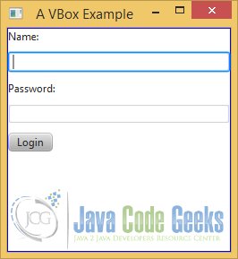
6. VBox
A VBox lays out its children in a single vertical column. It lets you set the vertical spacing between adjacent children, margins for any children, resizing behavior of children, etc. The default height of the content area of a VBox is tall enough to display all its children at their preferred heights, and the default width is the largest of the widths of all its children. You cannot set the locations for children in a VBox. They are automatically computed by the VBox. You can control the locations of children to some extent by customizing the properties of the VBox and setting constraints on the children.
Working with a VBox is similar to working with an HBox with a difference that they work in opposite directions. For example, in an HBox, the children fills the height of the content area by default, and in a VBox, children fill the width of the content by default.
6.1 The Code
The following example shows a simple login dialog, which was realized under usage of the class VBox.
FxLayoutVBoxExample.java
import javafx.application.Application;
import javafx.scene.Scene;
import javafx.scene.control.Button;
import javafx.scene.control.Label;
import javafx.scene.control.TextField;
import javafx.scene.layout.VBox;
import javafx.stage.Stage;

public class FxLayoutVBoxExample extends Application
{
	public static void main(String[] args)
	{
		Application.launch(args);
	}

	@Override
	public void start(Stage stage)
	{
		// Create the Label for the Name
		Label nameLbl = new Label("Name:");
		// Create the TextField for the Name
		TextField nameFld = new TextField();
		// Create the Label for the Password
		Label passwordLbl = new Label("Password:");
		// Create the TextField for the Password
		TextField passwordFld = new TextField();
		// Create the Login-Button
		Button loginBtn = new Button("Login");

		// Create the VBox with a 10px spacing
		VBox root = new VBox(10);
		// Set the padding of the VBox
		root.setStyle("-fx-padding: 10;");
		// Set the border-style of the VBox
		root.setStyle("-fx-border-style: solid inside;");
		// Set the border-width of the VBox
		root.setStyle("-fx-border-width: 2;");
		// Set the border-insets of the VBox
		root.setStyle("-fx-border-insets: 5;");
		// Set the border-radius of the VBox
		root.setStyle("-fx-border-radius: 5;");
		// Set the border-color of the VBox
		root.setStyle("-fx-border-color: blue;");
		// Set the size of the VBox
		root.setPrefSize(250, 250);
		// Add the children to the VBox
		root.getChildren().addAll(nameLbl, nameFld, passwordLbl, passwordFld, loginBtn);

		// Create the Scene
		Scene scene = new Scene(root);
		// Add the scene to the Stage
		stage.setScene(scene);
		// Set the title of the Stage
		stage.setTitle("A VBox Example");
		// Display the Stage
		stage.show();
	}
}
6.2 The GUI
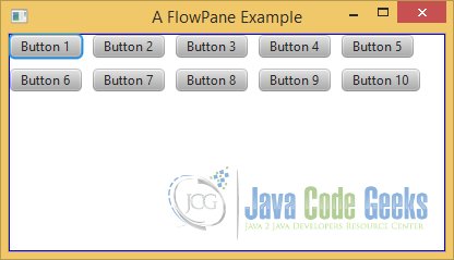
7. FlowPane
A FlowPane is a simple layout pane that lays out its children in rows or columns wrapping at a specified width or height. It lets its children flow horizontally or vertically, and hence the name “flow pane.” You can specify a preferred wrap length, which is the preferred width for a horizontal flow and the preferred height for a vertical flow, where the content is wrapped.
A FlowPane is used in situations where the relative locations of children are not important: for example, displaying a series of pictures or buttons. It gives all its children their preferred sizes. Rows and columns may be of different heights and widths. You can customize the vertical alignments of children in rows and the horizontal alignments of children in columns.
The orientation of a FlowPane, which can be set to horizontal or vertical, determines the direction of the flow for its content. In a horizontal FlowPane, the content flows in rows. In a vertical FlowPane, the content flows in columns.
7.1 The Code
The following example shows a FlowPane, which contains ten nodes of the class Button.
FxLayoutFlowPaneExample.java
import javafx.application.Application;
import javafx.geometry.Orientation;
import javafx.scene.Scene;
import javafx.scene.control.Button;
import javafx.scene.layout.FlowPane;
import javafx.stage.Stage;

public class FxLayoutFlowPaneExample extends Application
{
	public static void main(String[] args)
	{
		Application.launch(args);
	}

	@Override
	public void start(Stage stage)
	{
		// Set the hgap property to 10 pixels
		double hgap = 10;
		// Set the vgap property to 10 pixels
		double vgap = 10;

		// Create the horizontal FlowPane with a 10px spacing
		FlowPane root = new FlowPane(Orientation.HORIZONTAL,hgap, vgap);

		// Add the children (ten buttons) to the flow pane
		for(int i = 1; i <= 10; i++)
		{
			root.getChildren().add(new Button("Button " + i));
		}

		// Set the padding of the FlowPane
		root.setStyle("-fx-padding: 10;");
		// Set the border-style of the FlowPane
		root.setStyle("-fx-border-style: solid inside;");
		// Set the border-width of the FlowPane
		root.setStyle("-fx-border-width: 2;");
		// Set the border-insets of the FlowPane
		root.setStyle("-fx-border-insets: 5;");
		// Set the border-radius of the FlowPane
		root.setStyle("-fx-border-radius: 5;");
		// Set the border-color of the FlowPane
		root.setStyle("-fx-border-color: blue;");
		// Set the size of the FlowPane
		root.setPrefSize(400, 200);

		// Create the Scene
		Scene scene = new Scene(root);
		// Add the scene to the Stage
		stage.setScene(scene);
		// Set the title of the Stage
		stage.setTitle("A FlowPane Example");
		// Display the Stage
		stage.show();
	}
}
7.2 The hgap and vgap Properties
Using the hgap and vgap properties is straightforward. In a horizontal FlowPane, the hgap property specifies the horizontal spacing between adjacent children in a row. The vgap property specifies the spacing between adjacent rows. In a vertical FlowPane, the hgap property specifies the horizontal spacing between adjacent columns and the vgap property specifies the spacing between adjacent children in a column.
In our example, we set the hgap and vgap properties to 10 pixels.
// Set the hgap property to 10 pixels
double hgap = 10;
// Set the vgap property to 10 pixels
double vgap = 10;
7.3 The Orientation Property
The Orientation property specifies the flow of content in a FlowPane. If it is set to Orientation.HORIZONTAL, which is the default value, the content flows in rows. If it is set to Orientation.VERTICAL, the content flows in columns. You can specify the orientation in the constructors or using the setter method.
In the above example, we create a FlowPane with a horizontal orientation.
// Create the horizontal FlowPane with a 10px spacing
FlowPane root = new FlowPane(Orientation.HORIZONTAL,hgap, vgap);
7.4 The GUI
8. BorderPane
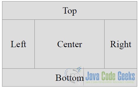
A BorderPane divides its layout area into five regions:
- Top
- Right
- Bottom
- Left
- Center
You can place at most one node in each of the five regions. Any of the regions may be null. If a region is null, no space is allocated for it. The children are drawn in the order they are added. This means that a child node may overlap all child nodes added prior to it. Suppose regions are populated in the order of right, center, and left. The left region may overlap the center and right regions, and the center region may overlap the right region.
8.1 The Code
FxLayoutBorderPaneExample.java
import javafx.application.Application;
import javafx.event.ActionEvent;
import javafx.event.EventHandler;
import javafx.geometry.Pos;
import javafx.scene.Scene;
import javafx.scene.control.Button;
import javafx.scene.control.Label;
import javafx.scene.control.TextArea;
import javafx.scene.control.TextField;
import javafx.scene.layout.BorderPane;
import javafx.stage.Stage;

public class FxLayoutBorderPaneExample extends Application
{
	// Create the TextField for the input
	private TextField inputArea = new TextField();
	// Create the TextArea for the Output
	private TextArea outputArea = new TextArea();

	public static void main(String[] args)
	{
		Application.launch(args);
	}

	@Override
	public void start(Stage stage)
	{
		// Create the Label for the Header
		Label headerLbl = new Label("Please insert your Message in the TextArea!");
		// Create the Label for the Input
		Label inputLbl = new Label("Input: ");
		// Create the OK-Button
		Button okBtn = new Button("OK");

		// add an EventHandler to the OK-Button
		okBtn.setOnAction(new EventHandler()
		{
			@Override
			public void handle(ActionEvent event)
			{
				writeOutput(inputArea.getText());
			}
		});

		// Create the BorderPane
		BorderPane root = new BorderPane();
		// Store the Header Label in the Top Region
		root.setTop(headerLbl);
		// Store the OK Button in the Top Region
		root.setRight(okBtn);
		// Store the Output Area in the Right Region
		root.setBottom(outputArea);
		// Store the Input Label in the Bottom Region
		root.setLeft(inputLbl);
		// Store the Input Area in the Center Region
		root.setCenter(inputArea);

		// Set the alignment of the Header Label to bottom center
		BorderPane.setAlignment(headerLbl,Pos.BOTTOM_CENTER);
		// Set the alignment of the Input Label to center left
		BorderPane.setAlignment(inputLbl,Pos.CENTER_LEFT);
		// Set the alignment of the OK Button to center right
		BorderPane.setAlignment(okBtn,Pos.CENTER_RIGHT);

		// Set the padding of the VBox
		root.setStyle("-fx-padding: 10;");
		// Set the border-style of the VBox
		root.setStyle("-fx-border-style: solid inside;");
		// Set the border-width of the VBox
		root.setStyle("-fx-border-width: 2;");
		// Set the border-insets of the VBox
		root.setStyle("-fx-border-insets: 5;");
		// Set the border-radius of the VBox
		root.setStyle("-fx-border-radius: 5;");
		// Set the border-color of the VBox
		root.setStyle("-fx-border-color: blue;");

		// Create the Scene
		Scene scene = new Scene(root);
		// Add the scene to the Stage
		stage.setScene(scene);
		// Set the title of the Stage
		stage.setTitle("A BorderPane Example");
		// Display the Stage
		stage.show();
	}

	// Method to log the Message to the Output-Area
	private void writeOutput(String msg)
	{
		this.outputArea.appendText("Your Input: " + msg + "\n");
	}
}
8.2 The BorderPane Properties
The BorderPane class declares five properties: top, right, bottom, left, and center. They store the reference of the child nodes in the five regions of the BorderPane.
The following figure shows the five parts of a BorderPane:
Use the setters of these properties to add children to the BorderPane.
// Store the Header Label in the Top Region
root.setTop(headerLbl);
// Store the OK Button in the Top Region
root.setRight(okBtn);
// Store the Output Area in the Right Region
root.setBottom(outputArea);
// Store the Input Label in the Bottom Region
root.setLeft(inputLbl);
// Store the Input Area in the Center Region
root.setCenter(inputArea);
8.3 Setting Constraints for Children in BorderPane
A BorderPane allows you to set alignment and margin constraints on individual children. The alignment for a child node is defined relative to its region. Examples of the most used alignments are:
- Pos.TOP_LEFT for the top child node
- Pos.BOTTOM_LEFT for the bottom child node
- Pos.TOP_LEFT for the left child node
- Pos.TOP_RIGHT for the right child node
- Pos.CENTER for the center child node
- …
Use the setAlignment(Node child, Pos value) static method of the BorderPane class to set the alignment for children.
// Set the alignment of the Header Label to bottom center
BorderPane.setAlignment(headerLbl,Pos.BOTTOM_CENTER);
// Set the alignment of the Input Label to center left
BorderPane.setAlignment(inputLbl,Pos.CENTER_LEFT);
// Set the alignment of the OK Button to center right
BorderPane.setAlignment(okBtn,Pos.CENTER_RIGHT);
8.4 The GUI
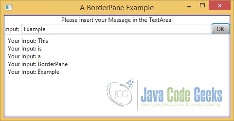
The following example shows a BorderPane, which contains a Label in the top and left region, a Button in the right region, a TextField in the center region and finally a TextArea in the bottom region.
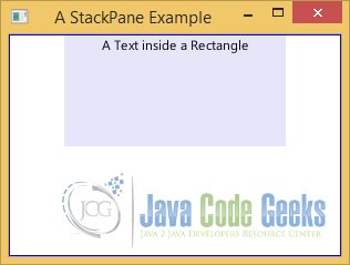
9. StackPane
A StackPane lays out its children in a stack of nodes. Children are drawn in the order they are added. That is, the first child node is drawn first; the second child node is drawn next, etc. The preferred width of a StackPane is the width of its widest children. Its preferred height is the height of its tallest children. StackPane does clip its content. Therefore, its children may be drawn outside its bounds. A StackPane resizes its resizable children to fill its content area, provided their maximum size allows them to expand beyond their preferred size. By default, a StackPane aligns all its children to the center of its content area. You can change the alignment for a child node individually or for all children to use the same alignment.
9.1 The Code
The following example shows how to create a StackPane. It adds a Rectangle and a Text to a StackPane. The Rectangle is added first, and therefore it is overlaid with the Text.
FxLayoutStackPaneExample.java
import javafx.application.Application;
import javafx.geometry.Pos;
import javafx.scene.Scene;
import javafx.scene.layout.StackPane;
import javafx.scene.paint.Color;
import javafx.scene.shape.Rectangle;
import javafx.scene.text.Text;
import javafx.stage.Stage;

public class FxLayoutStackPaneExample extends Application
{
	public static void main(String[] args)
	{
		Application.launch(args);
	}

	@Override
	public void start(Stage stage)
	{
		// Create a Rectangle with Width 200 and Height 100
		Rectangle rect = new Rectangle(200,100);
		// Set the color of the Rectangle to Lavendar
		rect.setFill(Color.LAVENDER);
		// Create the Text
		Text text = new Text("A Text inside a Rectangle");

		// Create the StackPane
		StackPane root = new StackPane();
		// Add the children to the StackPane
		root.getChildren().addAll(rect, text);
		// Set the Alignment of the Children to top center
		root.setAlignment(Pos.TOP_CENTER);
		// Set the size of the StackPane
		root.setPrefSize(300, 200);
		// Set the padding of the StackPane
		root.setStyle("-fx-padding: 10;");
		// Set the border-style of the StackPane
		root.setStyle("-fx-border-style: solid inside;");
		// Set the border-width of the StackPane
		root.setStyle("-fx-border-width: 2;");
		// Set the border-insets of the StackPane
		root.setStyle("-fx-border-insets: 5;");
		// Set the border-radius of the StackPane
		root.setStyle("-fx-border-radius: 5;");
		// Set the border-color of the StackPane
		root.setStyle("-fx-border-color: blue;");

		// Create the Scene
		Scene scene = new Scene(root);
		// Add the scene to the Stage
		stage.setScene(scene);
		// Set the title of the Stage
		stage.setTitle("A StackPane Example");
		// Display the Stage
		stage.show();
	}
}
9.2 The GUI
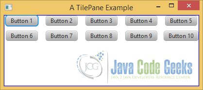
10. TilePane
A TilePane lays out its children in a grid of uniformly sized cells, known as tiles. TilePanes work similar to FlowPanes with one difference:
In a FlowPane, rows and columns can be of different heights and widths, whereas in a TilePane, all rows have the same heights and all columns have the same widths.
The width of the widest child node and the height of the tallest child node are the default widths and heights of all tiles in a TilePane. The <codeOrientation of a TilePane, which can be set to horizontal or vertical, determines the direction of the flow for its content. By default, a TilePane has a horizontal orientation. In a horizontal TilePane, the content flows in rows. The content in rows may flow from left to right (the default) or from right to left. In a vertical TilePane, the content flow in columns.
10.1 The Code
The following example shows a TilePane, which contains ten nodes of the class Button.
FxLayoutTilePaneExample.java
import javafx.application.Application;
import javafx.geometry.Orientation;
import javafx.scene.Scene;
import javafx.scene.control.Button;
import javafx.scene.layout.TilePane;
import javafx.stage.Stage;

public class FxLayoutTilePaneExample extends Application
{
	public static void main(String[] args)
	{
		Application.launch(args);
	}

	@Override
	public void start(Stage stage)
	{
		// Set the hgap property to 10 pixels
		double hgap = 10;
		// Set the vgap property to 10 pixels
		double vgap = 10;

		// Create the horizontal TilePane with a 10px spacing
		TilePane root = new TilePane(Orientation.HORIZONTAL,hgap, vgap);
		// Set the preferred number of columns
		root.setPrefColumns(5);

		// Add the children (ten buttons) to the TilePane
		for(int i = 1; i <= 10; i++)
		{
			root.getChildren().add(new Button("Button " + i));
		}

		// Set the padding of the TilePane
		root.setStyle("-fx-padding: 10;");
		// Set the border-style of the TilePane
		root.setStyle("-fx-border-style: solid inside;");
		// Set the border-width of the TilePane
		root.setStyle("-fx-border-width: 2;");
		// Set the border-insets of the TilePane
		root.setStyle("-fx-border-insets: 5;");
		// Set the border-radius of the TilePane
		root.setStyle("-fx-border-radius: 5;");
		// Set the border-color of the TilePane
		root.setStyle("-fx-border-color: blue;");

		// Create the Scene
		Scene scene = new Scene(root);
		// Add the scene to the Stage
		stage.setScene(scene);
		// Set the title of the Stage
		stage.setTitle("A TilePane Example");
		// Display the Stage
		stage.show();
	}
}
10.2 The GUI
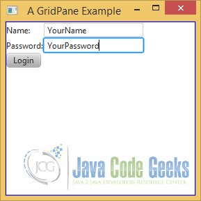
11. GridPane
The GridPane is one of the most powerful layout panes. A GridPane lays out its children in a dynamic grid of cells arranged in rows and columns. The grid is dynamic because the number and size of cells in the grid are determined based on the number of children. They depend on the constraints set on children. Each cell in the grid is identified by its position in the column and row.
The indexes for columns and rows start at 0. A child node may be placed anywhere in the grid spanning more than one cell. All cells in a row are of the same height. Cells in different rows may have different heights. All cells in a column are of the same width. Cells in different columns may have different widths. By default, a row is tall enough to accommodate the tallest child node in it. A column is wide enough to accommodate the widest child node in it. You can customize the size of each row and column.
11.1 The Code
The following example shows a login dialog under usage of a GridPane.
FxLayoutGridPaneExample.java
import javafx.application.Application;
import javafx.scene.Scene;
import javafx.scene.control.Button;
import javafx.scene.control.Label;
import javafx.scene.control.TextField;
import javafx.scene.layout.GridPane;
import javafx.stage.Stage;

public class FxLayoutGridPaneExample extends Application
{
	public static void main(String[] args)
	{
		Application.launch(args);
	}

	@Override
	public void start(Stage stage)
	{
		// Create the Label for the Name
		Label nameLbl = new Label("Name:");
		// Set the position of the Label
		nameLbl.relocate(10, 10);
		// Create the TextField for the Name
		TextField nameFld = new TextField();
		// Set the position of the TextField
		nameFld.relocate(50, 10);
		// Create the Label for the Password
		Label passwordLbl = new Label("Password:");
		// Set the position of the Label
		passwordLbl.relocate(200, 10);
		// Create the TextField for the Password
		TextField passwordFld = new TextField();
		// Set the position of the TextField
		passwordFld.relocate(260, 10);
		// Create the Login Button
		Button loginBtn = new Button("Login");
		// Set the position of the Button
		loginBtn.relocate(420, 10);

		// Create the GridPane
		GridPane root = new GridPane();
		// Add the Name Label at column 0 and row 0
		root.add(nameLbl, 0, 0);
		// Add the Name Field at column 1 and row 0
		root.add(nameFld, 1, 0);
		// Add the Password Label at column 0 and row 1
		root.add(passwordLbl, 0, 1);
		// Add the Password Field at column 1 and row 1
		root.add(passwordFld, 1, 1);
		// Add the Login Button at column 0 and row 2
		root.add(loginBtn, 0, 2);

		// Set the padding of the GridPane
		root.setStyle("-fx-padding: 10;");
		// Set the border-style of the GridPane
		root.setStyle("-fx-border-style: solid inside;");
		// Set the border-width of the GridPane
		root.setStyle("-fx-border-width: 2;");
		// Set the border-insets of the GridPane
		root.setStyle("-fx-border-insets: 5;");
		// Set the border-radius of the GridPane
		root.setStyle("-fx-border-radius: 5;");
		// Set the border-color of the GridPane
		root.setStyle("-fx-border-color: blue;");
		// Set the size of the GridPane
		root.setPrefSize(250, 250);

		// Create the Scene
		Scene scene = new Scene(root);
		// Add the scene to the Stage
		stage.setScene(scene);
		// Set the title of the Stage
		stage.setTitle("A GridPane Example");
		// Display the Stage
		stage.show();
	}
}
11.2 Adding Children to GridPane
The add() method let you add a child node specifying the column index, row index, column span, and row span.
// Add the Name Label at column 0 and row 0
root.add(nameLbl, 0, 0);
// Add the Name Field at column 1 and row 0
root.add(nameFld, 1, 0);
// Add the Password Label at column 0 and row 1
root.add(passwordLbl, 0, 1);
// Add the Password Field at column 1 and row 1
root.add(passwordFld, 1, 1);
// Add the Login Button at column 0 and row 2
root.add(loginBtn, 0, 2);
11.3 The GUI
12. AnchorPane
An AnchorPane lays out its children by anchoring the four edges of its children to its own four edges at a specified distance. The following figure shows a child node inside an AnchorPane with an anchor distance specified on all four sides.
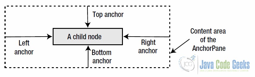
The specified distance between the edges of the children and the edges of the AnchorPane is called the anchor constraint for the sides it is specified. For example, the distance between the top edge of the children and the top edge of the AnchorPane is called topAnchor constraint, etc. You can specify at most four anchor constraints for a child node: topAnchor, rightAnchor, bottomAnchor, and leftAnchor.
When you anchor a child node to the two opposite edges (top/bottom or left/right), the children are resized to maintain the specified anchor distance as the AnchorPane is resized.
12.1 The Code
The following example shows a login dialog under usage of a AnchorPane.
FxLayoutAnchorPaneExample.java
import javafx.application.Application;
import javafx.scene.Scene;
import javafx.scene.control.Button;
import javafx.scene.control.Label;
import javafx.scene.control.TextField;
import javafx.scene.layout.AnchorPane;
import javafx.stage.Stage;

public class FxLayoutAnchorPaneExample extends Application
{
	public static void main(String[] args)
	{
		Application.launch(args);
	}

	@Override
	public void start(Stage stage)
	{
		// Create the Label for the Name
		Label nameLbl = new Label("Name:");
		// Set the position of the Label
		nameLbl.relocate(10, 10);
		// Create the TextField for the Name
		TextField nameFld = new TextField();
		// Set the position of the TextField
		nameFld.relocate(50, 10);
		// Create the Label for the Password
		Label passwordLbl = new Label("Password:");
		// Set the position of the Label
		passwordLbl.relocate(200, 10);
		// Create the TextField for the Password
		TextField passwordFld = new TextField();
		// Set the position of the TextField
		passwordFld.relocate(260, 10);
		// Create the Login Button
		Button loginBtn = new Button("Login");
		// Set the position of the Button
		loginBtn.relocate(420, 10);

		// Anchor the Name Label to the Left Edge
		AnchorPane.setLeftAnchor(nameLbl, 0.0);
		// Anchor the Name Field 50px from the Left Edge
		AnchorPane.setLeftAnchor(nameFld, 50.0);
		// Anchor the Password Label 150px from the Right Edge
		AnchorPane.setRightAnchor(passwordLbl, 150.0);
		// Anchor the Password Field to the Right Edge
		AnchorPane.setRightAnchor(passwordFld, 0.0);
		// Anchor the Login Button 50px from the Bottom Edge
		AnchorPane.setBottomAnchor(loginBtn, 10.0);
		// Create the AnchorPane
		AnchorPane root = new AnchorPane();

		// Set the padding of the AnchorPane
		root.setStyle("-fx-padding: 10;");
		// Set the border-style of the AnchorPane
		root.setStyle("-fx-border-style: solid inside;");
		// Set the border-width of the AnchorPane
		root.setStyle("-fx-border-width: 2;");
		// Set the border-insets of the AnchorPane
		root.setStyle("-fx-border-insets: 5;");
		// Set the border-radius of the AnchorPane
		root.setStyle("-fx-border-radius: 5;");
		// Set the border-color of the AnchorPane
		root.setStyle("-fx-border-color: blue;");
		// Set the size of the AnchorPane
		root.setPrefSize(500, 200);
		// Add the children to the AnchorPane
		root.getChildren().addAll(nameLbl, nameFld, passwordLbl, passwordFld, loginBtn);

		// Create the Scene
		Scene scene = new Scene(root);
		// Add the scene to the Stage
		stage.setScene(scene);
		// Set the title of the Stage
		stage.setTitle("An AnchorPane Example");
		// Display the Stage
		stage.show();
	}
}
12.2 Setting Constraints for Children in AnchorPane
As above discussed, the AnchorPane defines the following constraints for a child node:
- topAnchor
- rightAnchor
- bottomAnchor
- leftAnchor
The topAnchor value specifies the distance between the top edge of the content area of the AnchorPane and the top edge of the child node. The rightAnchor value specifies the distance between the right edge of the content area of the AnchorPane and the right edge of the child node. The bottomAnchor value specifies the distance between the bottom edge of the content area of the AnchorPane and the bottom edge of the child node. The leftAnchor value specifies the distance between the left edge of the content area of the AnchorPane and the left edge of the child node.
// Anchor the Name Label to the Left Edge
AnchorPane.setLeftAnchor(nameLbl, 0.0);
// Anchor the Name Field 50px from the Left Edge
AnchorPane.setLeftAnchor(nameFld, 50.0);
// Anchor the Password Label 150px from the Right Edge
AnchorPane.setRightAnchor(passwordLbl, 150.0);
// Anchor the Password Field to the Right Edge
AnchorPane.setRightAnchor(passwordFld, 0.0);
// Anchor the Login Button 50px from the Bottom Edge
AnchorPane.setBottomAnchor(loginBtn, 10.0);
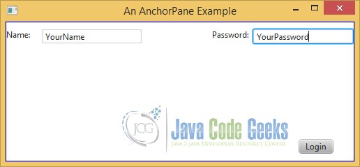
12.3 The GUI
13. Download Java Source Code
This was an example of javafx.scene.layout
You can download the full source code of this example here: FxLayoutExample.zip
