In this tutorial we will learn about the Eclipse WindowBuilder which is a powerful and easy to use bi-directional Java GUI designer. WindowBuilder is composed of SWT Designer and Swing Designer and makes it very easy to create Java GUI applications without spending a lot of time writing code.
Use the WYSIWYG visual designer and layout tools to create simple forms to complex windows; the Java code will be generated for you. Easily add controls using drag-and-drop, add event handlers to your controls, change various properties of controls using a property editor, internationalize your app and much more.
Table Of Contents
1. Introduction
The WindowBuilder is available at Eclipse WindowBuilder. It is composed of WindowBuilder Engine, SWT, eRCP, XWT & Swing Designer. WindowBuilder Engine provides a rich API for creating UI designers. It is very modular with dozens of extension points. It provides pluggable support for different languages and parsers. It provides both Java (Swing, SWT/RCP, eRCP, GWT) and XML (XWT, GWT UiBinder, Android) based UI frameworks.
WindowBuilder is built as a plug-in to Eclipse and the various Eclipse-based IDEs (RAD, RSA, MyEclipse, JBuilder, etc.). The plug-in builds an abstract syntax tree (AST) to navigate the source code and uses GEF to display and manage the visual presentation. The generated code doesn’t require any additional custom libraries to compile and run: all of the generated code can be used without having WindowBuilder Pro installed. WindowBuilder Pro can read and write almost any format and reverse-engineer most hand-written Java GUI code. It also supports free-form code editing (make changes anywhere…not just in special areas) and most user re-factorings (you can move, rename and subdivide methods without a problem).
2. Overview
In this section we will provide some overview of WindowBuilder.
2.1 History of WindowBuilder
In this section we will see the history of WindowBuilder
- 1991 – Original release from Smalltalk/V by Cooper & Peters
- 1993 – VisualSmalltalk release by ObjectShare
- 1994 – VisualAge Smalltalk release by ObjectShare
- 1997 – VisualAge Smalltalk release by Instantiations
- 2003 – New Eclipse/Java version for SWT/RCP (SWT Designer)
- 2004 – Swing support added (Swing Designer)
- 2006 – Google Web Toolkit (GWT) support added (GWT Designer)
- 2009 – Eclipse community awarded for the best Commercial Add-on
- 2010 – Acquired by Google and released free to the world
2.2. Components
WindowBuilder is composed of the following major components:
- Source View: Embedded version of Eclipse Java editor provides all of the services you normally find in the Java editor
- Design View
- Component Tree
- Property Pane
- Palette
- Wizards
- Toolbars & Context Menus
2.3 Features
WindowBuilder supports WYSIWYG & Bi-directional Code Generation. It supports powerful & flexible Code parser. It supports Internationalization, Visual Inheritance and UI factories. It also supports Morphing, Widget & layout managers and graphical menu editing.
3. Install WindowBuilder
To install WindowBuilder, go to Help=>Eclipse Marketplace… In the Find text box enter WindowBuilder.
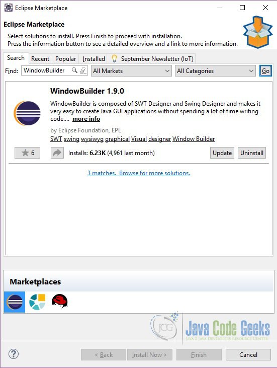
Since the WindowBuilder plugin is already installed we don’t get the Install button but instead we get the Update button.
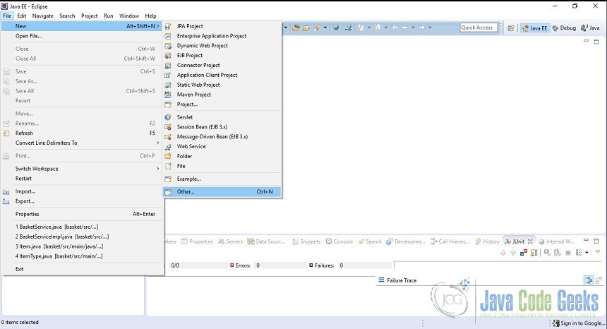
4. Create New Project
In this section we will see how we can create:
Click on File=>New=>Other
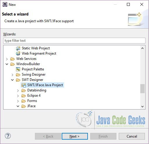
Browse to WindowBuilder=>SWT Designer and choose SWT/JFace Java Project. Click Next.
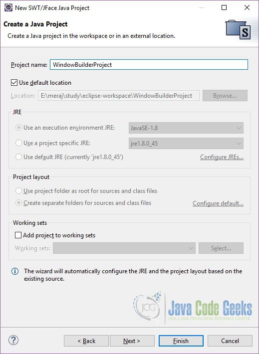
In the ‘Project name:’ text box give the project name. We will use WindowBuilderProject. Leave the other options as default and click Finish.
5. Create New SWT Application
In this section we will see how to create a new SWT application. Click on File=>New=>Other. Browse to WindowBuilder=>SWT Designer=>SWT and choose ‘Application Window’. Enter the Name and click on Finish.
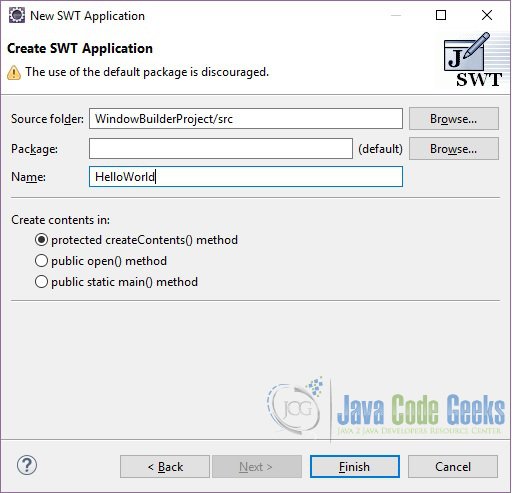
Eclipse will create a simple default version of the application. Below is the class which is created by Eclipse:
import org.eclipse.swt.widgets.Display;
import org.eclipse.swt.widgets.Shell;
public class HelloWorld {

  protected Shell shell;

  /**
  * Launch the application.
  * @param args
  */
  public static void main(String[] args) {
    try {
      HelloWorld window = new HelloWorld();
      window.open();
    } catch (Exception e) {
      e.printStackTrace();
    }
  }

  /**
  * Open the window.
  */
  public void open() {
    Display display = Display.getDefault();
    createContents();
    shell.open();
    shell.layout();
    while (!shell.isDisposed()) {
      if (!display.readAndDispatch()) {
        display.sleep();
      }
    }
  }

  /**
  * Create contents of the window.
  */
  protected void createContents() {
    shell = new Shell();
    shell.setSize(450, 300);
    shell.setText("SWT Application");
  }
}
5.1 Design View
The Design View is your virtual sketchpad. You can add or remove components, edit layout properties, direct edit labels, and see what your overall design looks like as it evolves. Select a component in the Design View to make it appear in the Property Pane, where you can edit its properties. This will also activate selection handles for the component. Selection handles allow you to change layout properties of the selected control and, for some layout managers, also layout properties of sibling controls. All properties that can be changed in the Design View can also be changed in the Property Pane. Depending on the layout manager in effect, row and column headers may be visible in the header area.
Right-click on component to access the same context menu available in the Component Tree. Components may be added by choosing them from the Palette and deleted using the Delete key.
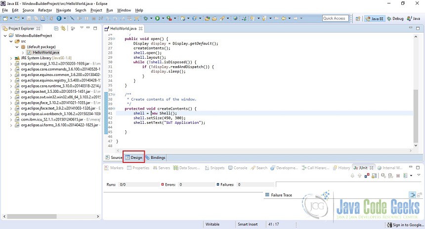
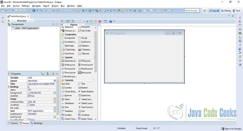
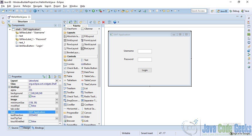
You can go to the design view by opening the HelloWorld class and clicking on the Design tab at the bottom.
This window is divided into three main parts. The first part is the Structure where you can see your components and there properties. The middle part is the Palette section where you can see lots of Composites, Layouts and Controls. This right most section is your main app window. You can add the items from the Palette window into this main window by dragging and dropping.
5.2 Running the application
This application can be run as a normal Java application. To run the application right click on the Main class (For this tutorial HelloWorld), choose Run As=>Java Application:
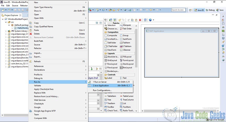
A pop-up will appear which will display the components of the application.
6. Adding Controls
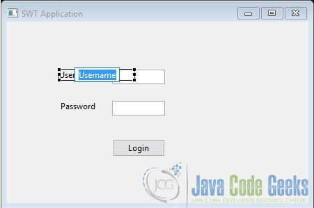
In this section we will see how we can add controls in our application. Let’s say we want to create a login form which will have two text boxes, Username and Password and one Login button. To create a Label drag the ‘Label’ item in the application window. Do the same for Textboxes and buttons. We can change the text which is displayed for the item from the Properties window. Once you have added the above mentioned items in the application window, your Design window will look something like below:
In the Structure window you can see the items which have been added in the application window. If you click on any item you can see the properties of that item in the Properties window. Now if you save your changes and go to the Source tab you will see that Eclipse has updated the source code to reflect the changes. The main changes are in the createContents() method. You will see that Eclipse had added code to add the newly added elements in the Design tab
Label lblNewLabel = new Label(shell, SWT.NONE);
lblNewLabel.setBounds(76, 69, 108, 15);
lblNewLabel.setText("Username");

text = new Text(shell, SWT.BORDER);
text.setBounds(152, 69, 76, 21);

Label lblNewLabel_1 = new Label(shell, SWT.NONE);
lblNewLabel_1.setBounds(78, 114, 55, 15);
lblNewLabel_1.setText("Password");

text_1 = new Text(shell, SWT.BORDER);
text_1.setBounds(152, 114, 76, 21);

Button btnNewButton = new Button(shell, SWT.NONE);
btnNewButton.setBounds(153, 169, 75, 25);
btnNewButton.setText("Login");
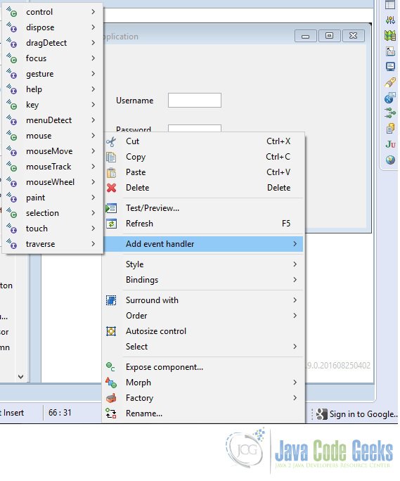
To add the action listener to the button press event, right click on the button and choose ‘Add Event Handler’. You will get lots of different types of events option from which you can choose.
6.1 Components
In this section we will see how we can perform actions on the components in Design view.
6.1.1 Component Selection
Use the Selection tool in the Palette to select one or more widgets. Hold the Shift or Ctrl key down to select multiple widgets. Use the Marquee tool in the Palette to rubber band select multiple widgets. Hold the Alt key and start dragging to automatically activate the Marquee tool.
6.1.2 Editing Components
There is a quick way to edit the text property of buttons (including check and radio buttons), labels, text fields, groups, and table columns. First select a component in the Design View, and then hit the Space key to reveal an edit box in which you can set the component’s text property.
6.1.3 Moving Components
Whenever a component is moved in the Design View, drag feedback is provided that is layout manager specific. In an x,y oriented layout like absolute layout, the live component is shown moving with a tooltip showing its current location. Dynamic snap / alignment points are provided to make it convenient to align the component with other components or the window margin. In grid oriented layouts different feedback is shown depending on which cell the cursor is over.
If the cursor is positioned over an open cell, the cell is highlighted in green and the cursor shows a green check mark. If the cursor is positioned over a row or column border, the row or column border is highlighted in yellow indicating that a new row or column will be inserted. If the cursor is positioned over an already populated cell, that cell is highlighted in red and the cursor shows a red minus sign.
6.1.4 Resizing Components
Whenever a component is resized in the Design View, size feedback is provided that is layout manager specific. In an x,y oriented layout like absolute layout, an outline of the new size is shown with a tooltip showing its current size. Dynamic snap / alignment points are provided to make it convenient to align the component with other components or the window margin.
Resizing a component also snaps to the preferred size of the resized component or to the size (vertical or horizontal) of any other component on the same parent. In grid oriented layouts, resizing a component will cause it to span more than one rows or columns. During the resize operation, the cells that will be occupied by the component are outlined in green.
6.2 Component Tree
The Component Tree shows the hierarchical relationship between all of the components in the Design View. Each component in the tree shows is icon (with potential decorators), its variable name and text label. Components may be represented as local variables or fields, and variable names must be unique within the scope in which the component is defined. Icon decorators are used to indicate whether a component defines and events or is exposed as a public component of a custom container.
Expand the components in the tree using the Expand All button, and collapse them using the Collapse All button. Right-click on an entry in the tree to access the same context menu available in the Design View. Components may be re-arranged in the tree via drag/drop and deleted using the Delete key. Multiple components may be selected in the tree by holding down the Ctrl key to add individual selections or the Shift key to add contiguous selections.

7. Property Pane
The Property Pane displays properties and events of the selected components and provides editable text fields, lists and other controls to allow you to edit properties and events. Select the control in the Component Tree or on the Design View to display its properties in the Property Pane. Once visible in the Property Pane, these values can be edited. When multiple controls are selected, all of their shared properties are listed in the Property Pane. If not all the selected controls have the same value for a property, the property editor in the Property Pane will be blank.
By default, the Property Pane displays normal properties. Preferred properties are shown in bold and expert properties are shown in italics (click the Show advanced properties button to reveal them). A grey background indicates a property set to its default value while a white background indicates a property that has been set to a non-default value. Click the Restore default value button to set a property back to its default value.
You can select a property by clicking on the property title or value. When a property is selected, an editor is displayed instead of the value, so you can change it value. In most property editors Enter should be used to apply the value, and Esc to return to the previous value. If you select some property, you can use the arrow keys to navigate between properties.
The Property Pane supports simple properties such as Strings and ints and complex properties that consist of several other properties, such as layouts and layout datas. Complex properties are displayed with a plus or minus sign before the title. You can expand/collapse complex properties in several different ways:
- double click on the property title or value
- single click on plus or minus sign
- select property and press (+) to expand, (-) to collapse
Some properties, such as strings, colors, fonts and images, provide a custom property editor which can be access by clicking the button.
The state of a property (expanded or collapsed) is preserved between selections of controls, so if you expand the property “style” for one control and then select another control, the property “style” will remain expanded, so you will able to quickly change the style value for several properties without needing to expand it again and again. Once you decide, that you don’t need to change the style, you can collapse the property “style” and save space for other properties.
The Property Pane supports selection properties, i.e. properties, whose values should be selected from some list. For example “type” property of complex “style” property for Buttons is such a property. You can change its value in the following ways:
- double click on the property value or for changing value to next value in list (or first value, if current value is the last);
- select property and press Space to expand list and then use arrows to change value;
- select property and press Delete to change value to default.
Right-click on the Property Pane to access the property pane context menu.
8. Event Handling
Events occur when the user interacts with the UI. The appropriate event-handling code is then executed. In order to know when events occur, event handlers must first be added to your components. The tool makes it very easy to add and remove event listeners to your components.
8.1 Add Event Handler
There are two ways to add an event handler with the the editor. The first way is through the Property Pane. First select a component in either the Component Tree or the Design View. Click the Show Events button to reveal the events list in the Property Pane. Expand an event and double-click or press Enter on the event handler you wish to implement.
The second way to add an event handler is to simply right-click on a component (either in the Design View or in the Component Tree), select Add event handler > [name of the event] > [name of the event handler to implement].
A quick way to add event listeners to buttons (including check and radio buttons) and menu items is to simply double-click on the button or menu item. When double-clicked, a selection event listener will be created.
There are two ways to quickly return to the event-handling code from the Design View. In the Property Pane, click the Show Events button and expand the event. Then double-click or press Enter on the event method to return to the code. The events’ list in the Property Pane is a list of all the events implemented, and each individual event’s property value is the list of methods implemented. If a method has been implemented, its property value is the line number in the source code where its event-handling code begins.
The other way to quickly return to the event-handling code is to right-click on a component (either in the Design View or in the Component Tree), and then select the menu item for the correct method that was implemented.
8.2 Deleting an Event Handler
There is only one way to delete an existing event handler in the editor. Select a component in either the Design View or in the Component Tree. In the Property Pane expand expand the event, click on the event method you wish to delete and then press Delete. If there are no other methods that have been implemented for that event, the tool will also delete the event listener for that event.
9. Layout Managers
A program written in Java may be deployed on multiple platforms. If you were to use standard UI design techniques, specifying absolute positions and sizes for your UI components, your UI won’t be portable. What looks fine on your development system might be unusable on another platform. To solve this problem, Java provides a system of portable layout managers. You use these layout managers to specify rules and constraints for the layout of your UI in a way that will be portable.
Layout managers can provide the following advantages:
- Correctly positioned components that are independent of fonts, screen resolutions, and platform differences.
- Intelligent component placement for containers that are dynamically resized at runtime.
- Ease of translation. If a string increases in length after translation, the associated components stay properly aligned.
When writing Java applications, you may need to use layouts to give your windows a specific look. A layout controls the position and size of children in a container. Layout classes are subclasses of the abstract class Layout. Both SWT and Swing provide several standard layout classes, and you can write custom layout classes. Other UI toolkits embed implicit layout managers in each panel type.
In Java, positioning and sizing does not happen automatically. Applications can decide to size and place a container’s children initially, or in a resize listener. Another option is to specify a layout class to position and size the children. If children are not given a size, they will have zero size and they cannot be seen.
The layout manager sets the sizes and locations of the components based on various factors such as:
- The layout manager’s layout rules.
- The layout manager’s property settings, if any.
- The layout datas associated with each component.
- The size of the container.
Each layout manager has characteristic strengths and drawbacks. Grid-based layouts and constraint-based layouts are the most useful and powerful of the standard layouts, but they are also the most complicated. When using the design view, you can change the layout whenever you like. The tool adjusts the code as needed on the fly. Change the layout either by explicitly adding a layout manager to the source code for the container, or by selecting a layout for the composite on the design surface.
10. Palette
The Palette provides quick access to toolkit-specific components as well as any custom components installed by the user. The Palette is organized into categories which may be expanded, collapsed or hidden. To add a components to the Design View, you can:
- Select it in the palette and drop it on the Design View or Component Tree by clicking in the desired location.
- Use the Choose Component command to select the widget type from Choose Component dialog.
Multiple widgets of the same type may be added to the Design View by holding down the Ctrl key when selecting the widget in the Palette. The palette may be customized by right-clicking anywhere in the palette to access the palette context menu or by opening the Palette Manager dialog. The position of the Palette may be configured via drag and drop or by right-clicking on the Palette header and selecting the Dock On command. The Palette may be docked to either the left or right side of the Design View.
The Palette Manager may be accessed from the palette context menu. The Palette Manager dialog allows the toolkit-specific palette to be fully configured. Categories and entries may be added, edited, rearranged and removed and JAR files imported. Items may be rearranged using the Up and Down buttons or via drag and drop. The Collapse All and Expand All buttons show or hide all of the elements in the list. Items may be hidden from the palette by unchecking the checkbox next to their category or component name.
10.1 Swing Designer Palette
Swing Designer provides the following palette for creating Swing applications. The palette may be fully configured using the Palette Manager.
10.1.1 Containers
JPanel – A generic lightweight container.
JScrollPane – Provides a scrollable view of a lightweight component. A JScrollPane manages a viewport, optional vertical and horizontal scroll bars, and optional row and column heading viewports.
JSplitPane – JSplitPane is used to divide two (and only two) Components. The two Components are graphically divided based on the look and feel implementation, and the two Components can then be interactively resized by the user.
JTabbedPane – A component that lets the user switch between a group of components by clicking on a tab with a given title and/or icon.
JToolBar – A component that is useful for displaying commonly used Action’s or controls.
JDesktopPane – A container used to create a multiple-document interface or a virtual desktop.
JInternalFrame – A lightweight object that provides many of the features of a native frame, including dragging, closing, becoming an icon, resizing, title display, and support for a menu bar.
10.1.2 Layouts
Absolute Layout – An absolute layout displays components with specified bounds.
FlowLayout – A flow layout arranges components in a left-to-right flow, much like lines of text in a paragraph. Flow layouts are typically used to arrange buttons in a panel. It will arrange buttons left to right until no more buttons fit on the same line.
BorderLayout – A border layout lays out a container, arranging and resizing its components to fit in five regions: north, south, east, west, and center. Each region may contain no more than one component.
GridLayout – The GridLayout class is a layout manager that lays out a container’s components in a rectangular grid. The container is divided into equal-sized rectangles, and one component is placed in each rectangle.
GridBagLayout – The GridBagLayout class is a flexible layout manager that aligns components vertically and horizontally, without requiring that the components be of the same size. Each GridBagLayout object maintains a dynamic, rectangular grid of cells, with each component occupying, one or more cells.
CardLayout – A CardLayout object is a layout manager for a container. It treats each component in the container as a card. Only one card is visible at a time, and the container acts as a stack of cards. The first component added to a CardLayout object is the visible component when the container is first displayed.
BoxLayout – A layout manager that allows multiple components to be laid out either vertically or horizontally. The components will not wrap so, for example, a vertical arrangement of components will stay vertically arranged when the frame is resized.
FormLayout – JGoodies FormLayout is a powerful, flexible and precise general purpose layout manager. It aligns components vertically and horizontally in a dynamic rectangular grid of cells, with each component occupying one or more cells.
SpringLayout – A SpringLayout lays out the children of its associated container according to a set of constraints for each side.
GroupLayout – GroupLayout mixes grid layout and free form layout.
10.1.3 Struts & Spring
Horizontal Box – Creates a panel that uses an implicit horizontal BoxLayout.
Vertical Box – Creates a panel that uses an implicit vertical BoxLayout.
Horizontal strut – Creates an invisible, fixed-width component .
Vertical strut – Creates an invisible, fixed-height component .
Horizontal glue – Creates a horizontal glue component .
Vertical glue – Creates a vertical glue component .
Rigid area – Creates an invisible component that’s always the specified size .
Glue – Creates an invisible glue component
10.1.4 Components
JLabel – A display area for a short text string or an image, or both. A label does not react to input events. As a result, it cannot get the keyboard focus. A label can, however, display a keyboard alternative as a convenience for a nearby component that has a keyboard alternative but can’t display it.
JTextField – A lightweight component that allows the editing of a single line of text.
JComboBox – A component that combines a button or editable field and a drop-down list. The user can select a value from the drop-down list, which appears at the user’s request. If you make the combo box editable, then the combo box includes an editable field into which the user can type a value.
JButton – An implementation of a “push” button.
JCheckBox – An implementation of a check box — an item that can be selected or deselected, and which displays its state to the user. By convention, any number of check boxes in a group can be selected.
JRadioButton – An implementation of a radio button — an item that can be selected or deselected, and which displays its state to the user. Used with a ButtonGroup object to create a group of buttons in which only one button at a time can be selected.
JToggleButton – An implementation of a two-state button — an item that can be selected or deselected, and which displays its state to the user.
JTextArea – A JTextArea is a multi-line area that displays plain text.
JFormattedTextField – A lightweight component that allows the editing of a single line of text using a predefined mask.
JPasswordField – A lightweight component that allows the editing of a single line of text where the view indicates something was typed, but does not show the original characters.
JTextPane – A text component that can be marked up with attributes that are represented graphically.
JEditorPane – A text component to edit various kinds of content.
JSpinner – A lightweight component that allows the lets the user select a number or an object value from an ordered sequence.
JList – A component that allows the user to select one or more objects from a list.
JTable – The JTable is used to display and edit regular two-dimensional tables of cells.
JTable on JScrollPane – A JTable placed within a JScrollPane.
Table model column – A JTable model column.
JTree – A control that displays a set of hierarchical data as an outline.
JProgressBar – A component that, by default, displays an integer value within a bounded interval. A progress bar typically communicates the progress of some work by displaying its percentage of completion and possibly a textual display of this percentage.
JScrollBar – An implementation of a scrollbar. The user positions the knob in the scrollbar to determine the contents of the viewing area. The program typically adjusts the display so that the end of the scrollbar represents the end of the displayable contents, or 100% of the contents.
JSeparator – A horizontal or vertical line used to separate other controls.
JSlider – A component that lets the user graphically select a value by sliding a knob within a bounded interval. The slider can show both major tick marks and minor tick marks between them. The number of values between the tick marks is controlled with setMajorTickSpacing and setMinorTickSpacing.
10.1.5 Menu
JMenuBar – A menu bar.
JPopupMenu – A popup menu.
JMenu – Either a pull-down or cascaded menu.
JMenuItem – A simple menu item.
JCheckBoxMenuItem – A checkbox menu item.
JRadioButtonMenuItem – A radio button menu item.
10.1.6 AWT Components
Panel – Panel is the simplest container class. A panel provides space in which an application can attach any other component, including other panels.
Canvas – A Canvas component represents a blank rectangular area of the screen onto which the application can draw or from which the application can trap input events from the user.
ScrollPane – A container class which implements automatic horizontal and/or vertical scrolling for a single child component.
Button – This class creates a labeled button. The application can cause some action to happen when the button is pushed.
Label – A Label object is a component for placing text in a container. A label displays a single line of read-only text. The text can be changed by the application, but a user cannot edit itdirectly.
Checkbox – A check box is a graphical component that can be in either an “on” (true) or “off” (false) state. Clicking on a check box changes its state from “on” to “off”, or from “off” to “on”.
Choice – The Choice class presents a pop-up menu of choices. The current choice is displayed as the title of the menu.
List – The List component presents the user with a scrolling list of text items. The list can be set up so that the user can choose either one item or multiple items.
Scrollbar – The Scrollbar class embodies a scroll bar, a familiar user-interface object. A scroll bar provides a convenient means for allowing a user to select from a range of values.
TextField – A TextField object is a text component that allows for the editing of a single line of text.
TextArea – A TextArea object is a multi-line region that displays text. It can be set to allow editing or to be read-only.
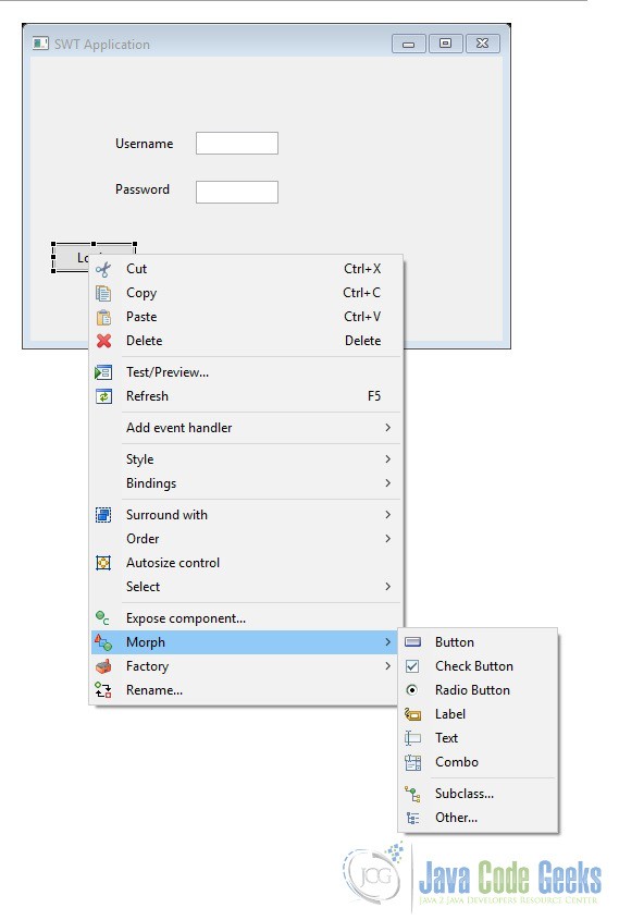
11. Morphing
It can be frustrating to suddenly want a Group instead of a Composite or a Combobox rather than a List after you have already completed the design of the composite. It is very easy to remedy this by using the tool.
The editor allows you to morph similar components from one type to another. When a component is morphed from one type to another, the properties that are the same between the two types are kept. This allows quick design changes without having to recreate all the components.
To morph a component from one type to another, right-click on the component and select a component type to morph to from the Morph cascading menu.
In addition to morphing to common sibling types, you can also morph a component into any subclass or into any other arbitrary component type.
12. Conclusion
In this tutorial we saw how we can make use of WindowBuilder plugin of Eclipse to make UI applications easily and quickly. We discussed the various sections of the Design View panel and also we discussed the usage of each on of them. We have also examined about various other features such as Event Handling, Morphing etc.
In short WindowBuilder is a very powerful tool to design and develop an interactive UI application from Scratch.