A button is a graphical element that provides the user a way to trigger an event. The appearance and behavior of buttons is similar across platforms and a button indicates a possible user action. You can easily use it, if you have a pointing device like a mouse, but a button can trigger the most complex action inside a computational system and is better to thing well where and when to put these.
1. The tools
- Java JDK 8
- Latest Eclipse Mars
- Vaadin 7.6.4
- Tomcat Server 8
2. Introduction
In this example I am going to show you how yo use the Vaadin button, the Button class is simple and straightforward, you create your button, place it on the UI and associate a click event to it, thats it!. Vaadin is a server side framework and traditional client side events like mouseover and mouseout event listeners create too much overhead just because every action performed have to reach the server, if you need additional functionality you can use a plugin or implement it for yourself.
3. Prerequisites
- JDK installed
- Eclipse Mars installed and working
- Vaadin 7.6.4 plugin installed
- Tomcat 8 installed and running
4. Set up the project
In the file menu choose File -> New -> Other
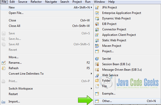
Now from the list choose Vaadin 7 project
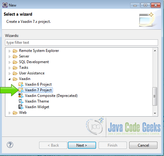
Hit next and name your project then hit finish.
5. Coding the example
5.1 The layout
Layout
		final VerticalLayout layout = new VerticalLayout();
		layout.setWidth("100%");
		layout.setMargin(true);
		setContent(layout);

		GridLayout gridLayout = new GridLayout(3 ,6);
		gridLayout.setSpacing(true);
A VerticalLayout is the main layout and inside of it I put a GridLayout to put the ui widgets, its a nested layout.
5.2 Information label
Information Label
		Label myLabel = new Label("No clicks yet...");
		myLabel.setCaption("Current Button");
		myLabel.addStyleName("h1");
		myLabel.addStyleName("mylabelstyle");
		myLabel.setWidth("100%");
I create a Label to show what button is clicked, I put on it some styles to change its look and feel, the h1 style is like a H1 html tag and is premade in Vaadin.
5.2.1 Label Style
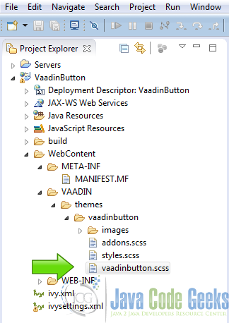
I created mylabelstyle, if your project is named VaadinButton then to create the style, open the file VaadinButton->WebContent->VAADIN->themes->vaadinbutton->vaadinbutton.scss
and add the following styles:
v-label-mylabelstyle
.v-label-mylabelstyle {
    color: white;
    text-align: center;
    background-color: black;
    border-color: white;
    font-weight: bold;
}
This change the color of the text to white, the background to black, center the text, make the font bold and the borders of the label white.
5.3 Button.ClickListener
Button.ClickListener
		Button.ClickListener myClickListener = new Button.ClickListener() {

			@Override
			public void buttonClick(ClickEvent event) {
				String btCaption = event.getButton().getCaption();
				myLabel.setValue(btCaption + " clicked");
			}
		};
I created a single click listener for all the buttons in the page, I get the button that fired the event with event.getButton() and then get the Caption to change the value of the label and show what button is firing the event.
5.4 Creating the buttons
5.4.1 Tiny Button
Tiny Button
		Button tinyButton = new Button("Tiny Button");
		tinyButton.addStyleName("tiny");
		tinyButton.addClickListener(myClickListener);
A very little button, just little enough to read the text, for these situations when you need more space in the screen. The kind of button is changed using a predefined Vaadin style for buttons, in this case the style is tinyButton.addStyleName("tiny");, I created the button then add the style, just add not replace and associate the generic button listener to it.
5.4.2 Small Button
Small Button
		Button smallButton = new Button("Small Button");
		smallButton.addStyleName("small");
		smallButton.addClickListener(myClickListener);
A button just a little more bigger than the tiny button the style name is small
5.4.3 Normal Button
Normal Button
		Button normalButton = new Button("Normal Button");
		normalButton.addClickListener(myClickListener);
The normal predefined Vaading normal button, this is the button that Vaadin uses when you didn’t specify any styles, is the next in size after the small button.
5.4.4 Large Button
Large Button
		Button largeButton = new Button("Large Button");
		largeButton.addStyleName("large");
		largeButton.addClickListener(myClickListener);
A large button a little bigger than the normal button, the style is large.
5.4.5 Huge Button
Huge Button
		Button hugeButton = new Button("Huge Button");
		hugeButton.addStyleName("huge");
		hugeButton.addClickListener(myClickListener);
The huge button is for these situation when you need to say “here is a button”, is the biggest premaded button and the style used is huge.
5.4.6 Disabled Button
Disabled Button
		Button disabledButton = new Button("Disabled Button");
		disabledButton.setDescription("This button cannot be clicked");
		disabledButton.setEnabled(false);
When you need to prevent that the user click on a button then you disable it, in this case no style is used and you can enable/disable a button with the method setEnabled(), using true to enable the button and false to disable it.
5.4.7 Danger Button
Danger Button
		Button dangerButton = new Button("Danger Button");
		dangerButton.addStyleName("danger");
		dangerButton.addClickListener(myClickListener);
The danger button is used when the intended action is important or potentially dangerous, is a red button and red means danger so use it when you are going to perform important tasks with a button click, to prevent the user that the action need special attention. the style danger is used in this case.
5.4.8 Friendly Button
Friendly Button
		Button friendlyButton = new Button("Friendly Button");
		friendlyButton.addStyleName("friendly");
		friendlyButton.addClickListener(myClickListener);
A green button when you need to give some color to a button to get the user attention in this case green means a friendly action that can be performed without any risks, friendly is the style used.
5.4.9 Primary Button
Primary Button
		Button primaryButton = new Button("Primary Button");
		primaryButton.addStyleName("primary");
		primaryButton.addClickListener(myClickListener);
The primary button generally is the default button an a page, the button that gets the focus when you press enter in your keyboard, primary style is used.
5.4.10 Native Button
Native Button
		NativeButton nativeButton = new NativeButton("Native Button");
		nativeButton.addClickListener(myClickListener);
The native button get the look and feel from the host machine running your application, in Windows you get Windows native buttons, in OSX you get OSx native buttons, in Linux you get GTK, KDE, … native buttons and so on. The native button have its own class and to create it you need to use instances of the NativeButton class.
5.4.11 Icon Right Button
Icon Right Button
		Button iconRightButton = new Button("Icon Align Right Button");
		iconRightButton.setIcon(FontAwesome.ALIGN_RIGHT);
		iconRightButton.setWidth("250px");
		iconRightButton.addStyleName("icon-align-right");
		iconRightButton.addClickListener(myClickListener);
You can add an icon to your button with the setIcon method, in this case I am using a FontAwesome icon, tho show the icon to the right the style icon-align-right is used.
5.4.12 Icon Left Button
Icon Left Button
		Button iconLeftButton = new Button("Icon Align Left Button");
		iconLeftButton.setIcon(FontAwesome.ALIGN_LEFT);
		iconLeftButton.addClickListener(myClickListener);
By default the icon is added to the left of the button so there is no need to add any extra style, just add the icon to the button and its added to the left of the text.
5.4.13 Icon Top Button
Icon Top Button
		Button iconTopButton = new Button("Icon Align Top Button");
		iconTopButton.setIcon(FontAwesome.STAR);
		iconTopButton.addStyleName("icon-align-top");
		iconTopButton.addClickListener(myClickListener);
When you need an icon on top of the text, the style used is icon-align-top
5.4.14 Border less Button
Border less Button
		Button borderlessButton = new Button("BorderLess Button");
		borderlessButton.addStyleName("borderless");
		borderlessButton.addClickListener(myClickListener);
A button without borders in those cases when you need to have a cleaner screen, it shows the borders when you click it, the style used is borderless.
5.4.15 Link Button
Link Button
		Button linkButton = new Button("Link Button");
		linkButton.addStyleName("link");
		linkButton.addClickListener(myClickListener);
A link button to simulate a traditional html link, the style used is link.
5.4.16 Quiet Button
Quiet Button
		Button quietButton = new Button("Quiet Button");
		quietButton.addStyleName("quiet");
		quietButton.addClickListener(myClickListener);
A button that show its borders when you hover the mouse over it, quiet style is used in this case.
5.4.17 Custom Button
Custom Button
		Button customButton = new Button("Custom Button");
		customButton.addStyleName("mystyle");
		customButton.addClickListener(myClickListener);
You can also create your own buttons with vaadin using styles, this button have the look and feel defined in the style mystyle, in the same file opened to make the label style, you define this style:
mystyle
.v-button-mystyle {
    background-color: lightblue;
    font-size: 12pt;
    font-weight: bold;
    color: red;
    border-color: black;
    border-radius: 0px;
    border-width: 4px;
    background-image: none;
}
The background color is lightblue, the font size is 12 pt and is a bold font of red color, I get rid of the border radius and the background image to get an square flat button, also increased the border to get an ugly retro button, In general I prefer to use Vaadin premade buttons that are made by designers and have a nice look an fill, but if you need more control in the application styles you can do it very easy.
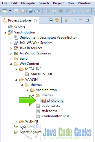
5.4.18 Custom Image Button
Custom Image Button
		Button customImageButton = new Button("Custom Image Button");
		customImageButton.setIcon(new ThemeResource("images/photo.png"));
		customImageButton.addClickListener(myClickListener);
Also you can make your own images and use it in the Vaadin buttons, loading the resource with the theme resource and using the setIcon method, the image is inside the WebContent->VAADIN->themes->vaadinbutton->images folder.
6. The complete source code
VaadinbuttonUI.java
package com.example.vaadinbutton;

import javax.servlet.annotation.WebServlet;

import com.vaadin.annotations.Theme;
import com.vaadin.annotations.VaadinServletConfiguration;
import com.vaadin.server.FontAwesome;
import com.vaadin.server.ThemeResource;
import com.vaadin.server.VaadinRequest;
import com.vaadin.server.VaadinServlet;
import com.vaadin.ui.Button;
import com.vaadin.ui.Button.ClickEvent;
import com.vaadin.ui.GridLayout;
import com.vaadin.ui.Label;
import com.vaadin.ui.NativeButton;
import com.vaadin.ui.UI;
import com.vaadin.ui.VerticalLayout;

@SuppressWarnings("serial")
@Theme("vaadinbutton")
public class VaadinbuttonUI extends UI {

	@WebServlet(value = "/*", asyncSupported = true)
	@VaadinServletConfiguration(productionMode = false, ui = VaadinbuttonUI.class)
	public static class Servlet extends VaadinServlet {
	}

	@Override
	protected void init(VaadinRequest request) {
		final VerticalLayout layout = new VerticalLayout();
		layout.setWidth("100%");
		layout.setMargin(true);
		setContent(layout);

		GridLayout gridLayout = new GridLayout(3 ,6);
		gridLayout.setSpacing(true);

		Label myLabel = new Label("No clicks yet...");
		myLabel.setCaption("Current Button");
		myLabel.addStyleName("h1");
		myLabel.addStyleName("mylabelstyle");
		myLabel.setWidth("100%");

		Button.ClickListener myClickListener = new Button.ClickListener() {

			@Override
			public void buttonClick(ClickEvent event) {
				String btCaption = event.getButton().getCaption();
				myLabel.setValue(btCaption + " clicked");
			}
		};


		Button tinyButton = new Button("Tiny Button");
		tinyButton.addStyleName("tiny");
		tinyButton.addClickListener(myClickListener);

		Button smallButton = new Button("Small Button");
		smallButton.addStyleName("small");
		smallButton.addClickListener(myClickListener);

		Button normalButton = new Button("Normal Button");
		normalButton.addClickListener(myClickListener);

		Button largeButton = new Button("Large Button");
		largeButton.addStyleName("large");
		largeButton.addClickListener(myClickListener);

		Button hugeButton = new Button("Huge Button");
		hugeButton.addStyleName("huge");
		hugeButton.addClickListener(myClickListener);

		Button disabledButton = new Button("Disabled Button");
		disabledButton.setDescription("This button cannot be clicked");
		disabledButton.setEnabled(false);

		Button dangerButton = new Button("Danger Button");
		dangerButton.addStyleName("danger");
		dangerButton.addClickListener(myClickListener);

		Button friendlyButton = new Button("Friendly Button");
		friendlyButton.addStyleName("friendly");
		friendlyButton.addClickListener(myClickListener);

		Button primaryButton = new Button("Primary Button");
		primaryButton.addStyleName("primary");
		primaryButton.addClickListener(myClickListener);

		NativeButton nativeButton = new NativeButton("Native Button");
		nativeButton.addClickListener(myClickListener);

		Button iconRightButton = new Button("Icon Align Right Button");
		iconRightButton.setIcon(FontAwesome.ALIGN_RIGHT);
		iconRightButton.setWidth("250px");
		iconRightButton.addStyleName("icon-align-right");
		iconRightButton.addClickListener(myClickListener);

		Button iconLeftButton = new Button("Icon Align Left Button");
		iconLeftButton.setIcon(FontAwesome.ALIGN_LEFT);
		iconLeftButton.addClickListener(myClickListener);

		Button iconTopButton = new Button("Icon Align Top Button");
		iconTopButton.setIcon(FontAwesome.STAR);
		iconTopButton.addStyleName("icon-align-top");
		iconTopButton.addClickListener(myClickListener);

		Button borderlessButton = new Button("BorderLess Button");
		borderlessButton.addStyleName("borderless");
		borderlessButton.addClickListener(myClickListener);

		Button linkButton = new Button("Link Button");
		linkButton.addStyleName("link");
		linkButton.addClickListener(myClickListener);

		Button quietButton = new Button("Quiet Button");
		quietButton.addStyleName("quiet");
		quietButton.addClickListener(myClickListener);

		Button customButton = new Button("Custom Button");
		customButton.addStyleName("mystyle");
		customButton.addClickListener(myClickListener);

		Button customImageButton = new Button("Custom Image Button");
		customImageButton.setIcon(new ThemeResource("images/photo.png"));
		customImageButton.addClickListener(myClickListener);

		gridLayout.addComponent(myLabel, 0, 0, 2, 0);
		gridLayout.addComponent(tinyButton);
		gridLayout.addComponent(smallButton);
		gridLayout.addComponent(normalButton);
		gridLayout.addComponent(largeButton);
		gridLayout.addComponent(hugeButton);
		gridLayout.addComponent(dangerButton);
		gridLayout.addComponent(friendlyButton);
		gridLayout.addComponent(primaryButton);
		gridLayout.addComponent(disabledButton);
		gridLayout.addComponent(nativeButton);
		gridLayout.addComponent(iconRightButton);
		gridLayout.addComponent(iconLeftButton);
		gridLayout.addComponent(iconTopButton);
		gridLayout.addComponent(borderlessButton);
		gridLayout.addComponent(linkButton);
		gridLayout.addComponent(quietButton);
		gridLayout.addComponent(customButton);
		gridLayout.addComponent(customImageButton);
		layout.addComponent(gridLayout);

	}

}
vaadinbutton.scss
@import "../valo/valo.scss";

@mixin vaadinbutton {
  @include valo;

  // Insert your own theme rules here

.v-label-mylabelstyle {
    color: white;
    text-align: center;
    background-color: black;
    border-color: white;
    font-weight: bold;
}

.v-button-mystyle {
    background-color: lightblue;
    font-size: 12pt;
    font-weight: bold;
    color: red;
    border-color: black;
	border-radius: 0px;
	border-width: 4px;
	background-image: none;
}


}
7. Running the example
Right click on the project folder and choose Run as -> Run on server choose Tomcat 8 server and hit finish.
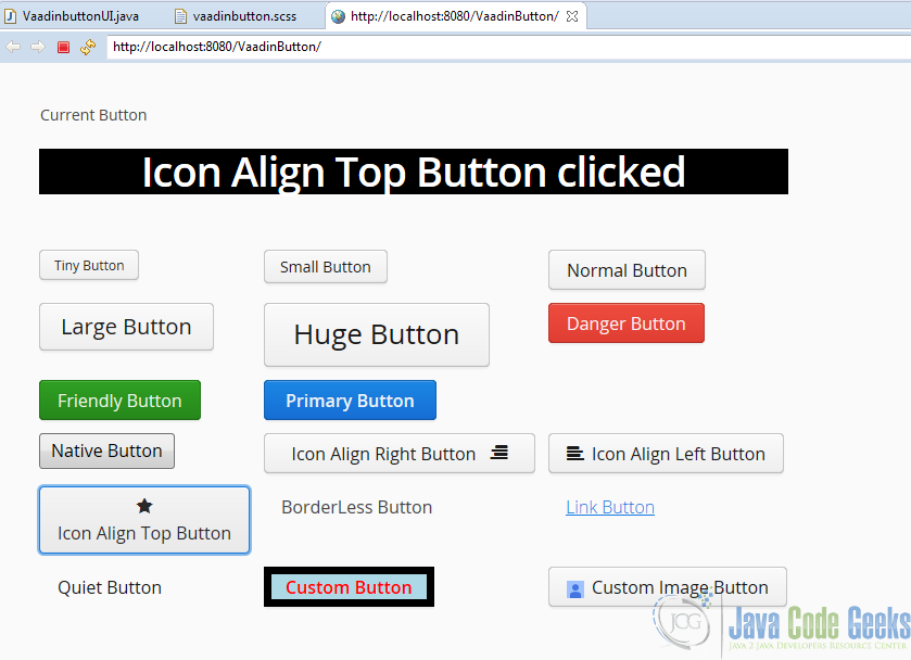
8. Results
As you can see in the image Vaading have any button you ever need:
9. Download the Source Code
This was an example of Vaadin Button.