Android system provides us TextView, from where we can display text into the screen. Although it contains text editing operations, the basic class does not allow editing, so EditText class is provided for this reason.
In this example we are going to show you some commonly used TextView attributes and how to embody and handle a TextView in our Android apps.
For this tutorial, we will use the following tools in a Windows 64-bit platform:
- JDK 1.7
- Eclipse 4.2 Juno
- Android SDK 4.4
You may skip project creation and jump directly to the beginning of the example below.
1. Create a New Android Application Project
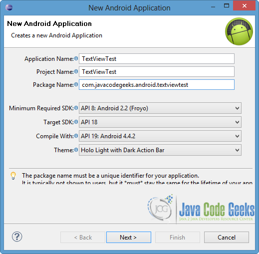
Open Eclipse IDE and go to File → New → Project → Android Application Project.
Fill in the name of the application, the project and the package in the appropriate fields and then click Next.
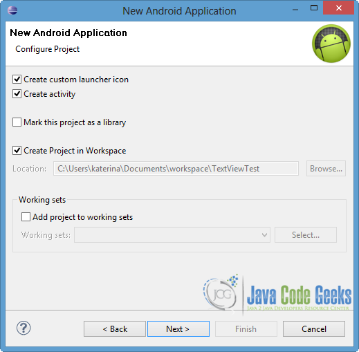
In the next window, the “Create Activity” option should be checked. The new created activity will be the main activity of your project. Then press Next button.
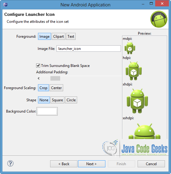
In “Configure Launcher Icon” window you should choose the icon you want to have in your app. We will use the default icon of android, so click Next.
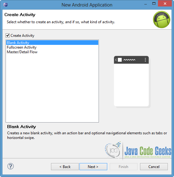
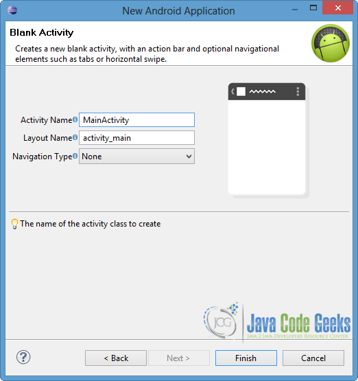
Select the “Blank Activity” option and press Next.
You have to specify a name for the new Activity and a name for the layout description of your app. The .xml file for the layout will automatically be created in the res/layout folder. Finally, press Finish.
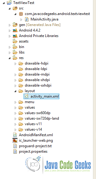
Now that the project is created, you can see the final structure of the project in the image below.
2. Create the layout of the Main Activity
In this example we are going to create a simple UI, that includes only TextView with different attributes.
Open res/layout/main_activity.xml, go to the respective xml tab and paste the following.
main_activity.xml:
<RelativeLayout xmlns:android="http://schemas.android.com/apk/res/android"
    xmlns:tools="http://schemas.android.com/tools"
    android:layout_width="match_parent"
    android:layout_height="match_parent"
    android:paddingBottom="@dimen/activity_vertical_margin"
    android:paddingLeft="@dimen/activity_horizontal_margin"
    android:paddingRight="@dimen/activity_horizontal_margin"
    android:paddingTop="@dimen/activity_vertical_margin"
    tools:context=".MainActivity" >

    <TextView
        android:layout_width="wrap_content"
        android:layout_height="wrap_content"
        android:id="@+id/text1"
        android:text="@string/hello_world"
        android:textStyle="bold"
        android:textColor="#ff00ff"
        android:background="#00ff00"
        android:textColorHighlight="#000000"
        android:textIsSelectable="true" />

    <TextView
        android:layout_width="fill_parent"
        android:layout_height="wrap_content"
        android:layout_below="@+id/text1"
        android:layout_marginTop="10dp"
        android:paddingLeft="10dp"
        android:lines="2"
        android:id="@+id/text2"
        android:clickable="true"
        android:text="Another TextView"
        android:autoLink="all"
        android:fontFamily="Arial"
        android:typeface="serif"
        android:textSize="20sp" />

</RelativeLayout>
Now lets explain the code above and the specific attributes that we defined in the XML file. It is worth to mention that the respective functions exist too, so we can call them in the activity source code in order to change the characteristics of the view.
text: defines the text that would be displayed on the screen.textStyle: sets the style of the text. The possible choices are bold, italic and normal.fontFamily: specifies the font family for the text.typeFace: as you can imagine it defines the typeface for the text. The possible values are normal, sans, serif and monospace.textSize: defines the size of the text. It is recommended to usespfor the size.textColor: sets the color of the text. The color has to be defined in hex encoding or as a reference to another resource.background: sets the background color of the text. Again the color should be defined in hex encoding or as a reference to another resource.textColorHighlight: defines the color when the text is marked as highlighted.textIsSelectable: indicates whether the text can be selected (true) or not (false). This attribute can be used in order to allow copy-paste controls.lines: defines the exact height of theTextViewin lines.clickable: indicates if the view reacts to click events.autoLink: identifies the links into the text and converts them into clickable ones. The available choices are web, email, phone, map or all of them.
Of course there are more attributes, where you can find them in the TextView of the android doc. Also in this example, we used more general components such as layout_width and layout_height or id, which uniquely identifies the respective view.
After the declaration of the components you can imagine that the text1 can be selected, copied and pasted, while the text2 can be clicked.
3. Code the Main Activity
Open src/com.javacodegeeks.android.textviewtest/MainActivity.java and paste the following code.
MainActivity.java:
package com.javacodegeeks.android.textviewtest;

import android.os.Bundle;
import android.app.Activity;
import android.graphics.Color;
import android.view.View;
import android.widget.TextView;
import android.widget.Toast;

public class MainActivity extends Activity {

	private TextView text2;

	@Override
	protected void onCreate(Bundle savedInstanceState) {
		super.onCreate(savedInstanceState);
		setContentView(R.layout.activity_main);

		text2 = (TextView) findViewById(R.id.text2);

		text2.setOnClickListener(new View.OnClickListener() {
			public void onClick(View v) {
				Toast.makeText(getApplicationContext(), "Text2 was clicked",
						Toast.LENGTH_LONG).show();
				text2.setText("Visit us: http://examples.javacodegeeks.com");

				if(text2.getLinksClickable() == true) {
					text2.setLinkTextColor(Color.BLUE);
				}
			}

		});
	}

}
As you can see in the code above in order to handle the click on the view we should define setOnClickListener. We can change the text by calling setText() method and we can declare the color of the links through setLinkTextColor() operation. So Android system provides us a more dynamic way of changing and handling the attributes of application views. Of course, as a prerequisite is to map the TextView with the unique id component of the XML. This can be done via findViewById() method.
4. Run the application
To run our application, right click on our project → Run as → Android Application. The AVD will appear with the app loaded.
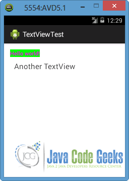
If we want to select with a gesture the first TextView we will observe that the color of the highlighted text changes, as we expect due to the definition of textColorHighlight attribute. Also, all the possible controls appear because we set textIsSelectable to true.
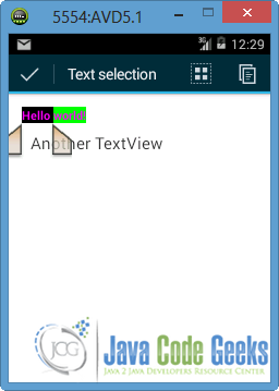
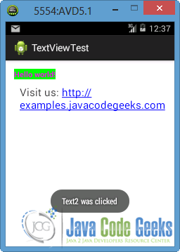
Now click the second text (“Another TextView”). As you can see in the image below, the click listener will be enabled so a Toast will appear and the text will change. In addition, notice that the link is clickable because we set autoLink component to all in XML file. Also we specified the color of the link via setLinkTextColor() method, so the link is marked as blue.
Download Eclipse Project
This was an example of TextView in Android. Download the Eclipse Project of this example: TextViewTest.zip
