Although Android provides us many built-in components, such as Button, TextView etc, it also offers us the opportunity to create our own custom widgets in order to adjust them to our needs and our requirements. Depending on the customization of the component, we can extend it to an existing built-in widget or to a class that we have created or generally to View class, that is the parent-class of all the components. Except from the use of the default attributes of the parent class, we can create our own attributes from scratch.
In this example we are going to show how to create our own custom component, that extends an existing subclass of View, and how to add some custom attributes in it.
For this tutorial, we will use the following tools in a Windows 64-bit platform:
- JDK 1.7
- Eclipse 4.2 Juno
- Android SDK 4.4
1. Create simple Custom Components
Before explaining every step of making our custom component that includes its special attributes, we should mention that we can make a simple custom widget without any new attribute set, by:
- Using code inside the
Activityclass. - Using the XML layout file.
To instantiate our custom widget into our Activity is like the creation of a built-in component. More specifically, we make a new instance of our custom component class and we pass it to setContentView(), in order to place it into the activity’s view hierarchy.
The second approach is to declare the component into the XML layout, as we usually instantiate the built-in widgets. In this situation, we declare our custom widget by its full path (the package that belongs to and the name of its class), as we explain later in more detail. The attributes of the component are the built-in elements of its parent-class.
In the tutorial below, there are all the steps for a more complete procedure of a custom component creation.
You may skip project creation and jump directly to the example code section below.
2. Create a New Android Application Project
Open Eclipse IDE and go to File → New → Project → Android Application Project.
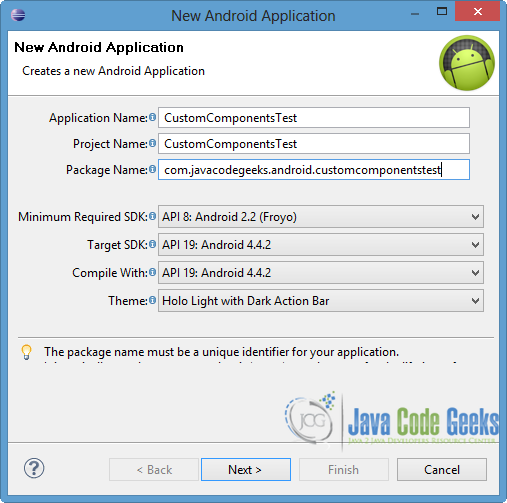
Specify the name of the application, the project and the package. Then press Next button.
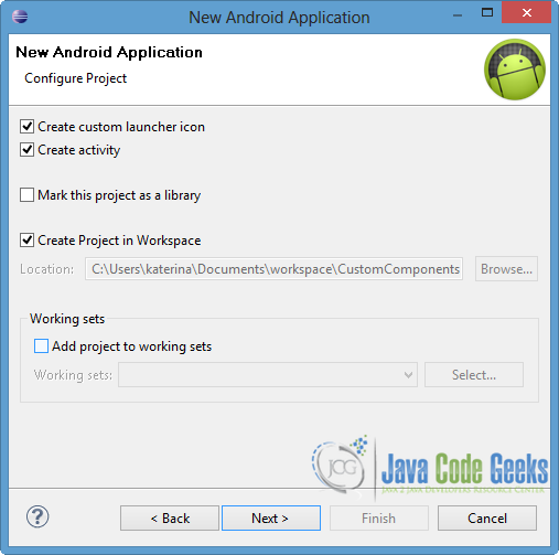
In the next window, the “Create Activity” option should be checked. The new created activity will be the main activity of your project. Then click Next.
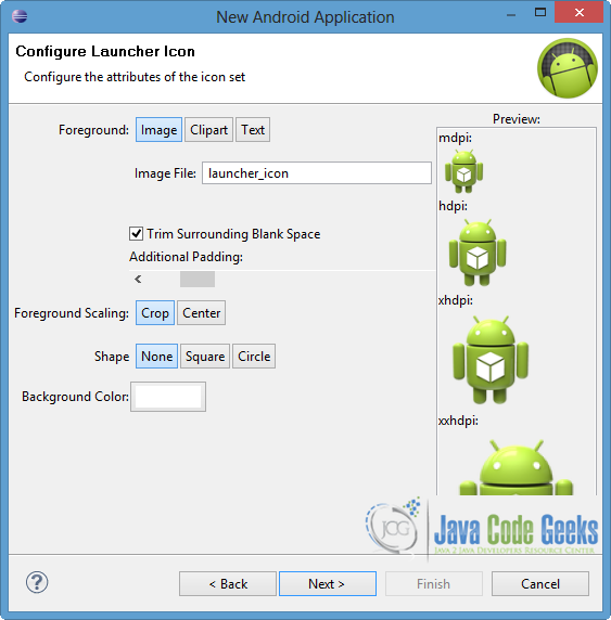
In “Configure Launcher Icon” window you should choose the icon you want to have in your app. We will use the default icon of android, so click Next.
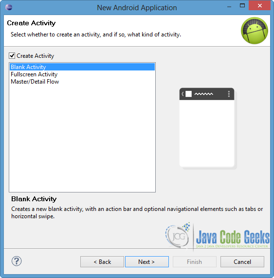
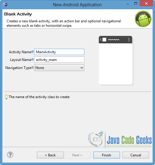
Select the “Blank Activity” option and press Next.
You have to specify a name for the new Activity and a name for the layout description of your app. The .xml file for the layout will automatically be created in the res/layout folder. Finally, press Finish.
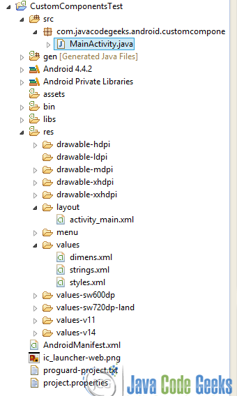
You can see the final structure of the created project in the image below.
3. Define Custom Attributes
Before the instantiation of our component, we should define its attributes that specify the appearance and the behavior of this component. These attributes are declared by XML elements in a <declare-styleable> resource. It is obligatory to put the resources into a new XML file named attrs, that is located into res/values directory.
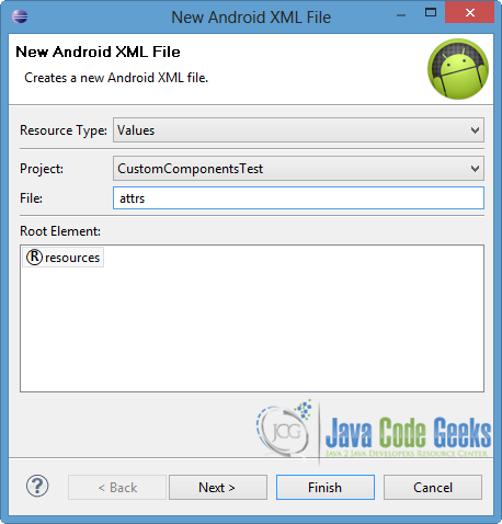
To create attrs file, right click on res/values folder → New → Android XML File.
Name the XML file as attrs, as you can see in the next picture, and press Finish.
Now open res/values/attrs.xml file and paste the following.
attrs.xml:
<?xml version="1.0" encoding="utf-8"?>
<resources>
    <declare-styleable name="TimeView">
   		<attr name="title" format="string" />
   		<attr name="setColor" format="boolean"/>
   	</declare-styleable>
</resources>
As you can notice, the value of name element suggests the attribute that we are going to use in the layout, while format declares the type of the respective attribute. The attributes that we are going to use in this tutorial are title and setColor. These attributes belong to a stylable, named TimeView, that has the same name as the name of the class that will define our custom view.
4. Add the Attributes into the XML Layout
After the declaration of the attributes into the attrs.xml file, we should specify their values into the XML layout. These attributes belong to a different namespace from the other android elements. So, although they can be added to the layout like built-in elements, we should specify the namespace too. The namespace has the following format:
http://schemas.android.com/apk/res/[package_name]
As the namespace URI is very long, we can use a xmlns directive to assign an alias for the namespace.
Now open res/layout/activity_main.xml, go to the respective xml tab and paste the code below.
activity_main.xml:
<RelativeLayout xmlns:android="http://schemas.android.com/apk/res/android"
    xmlns:tools="http://schemas.android.com/tools"
    xmlns:custom="http://schemas.android.com/apk/res/com.javacodegeeks.android.customcomponentstest"
    android:layout_width="match_parent"
    android:layout_height="match_parent"
    tools:context=".MainActivity" >

    <com.javacodegeeks.android.customcomponentstest.TimeView
        android:id="@+id/timeView"
        android:layout_width="match_parent"
        android:layout_height="wrap_content"
        android:textColor="#fff"
    	android:textSize="40sp"
        custom:title="my time view"
    	custom:setColor="true" />

    <TextView
        android:layout_width="match_parent"
        android:layout_height="wrap_content"
        android:id="@+id/simple"
        android:layout_below="@id/timeView"
        android:layout_marginTop="10dp" />

</RelativeLayout>
Notice the highlighted line 3, that suggests the namespace. The alias in our example is custom, so when these attributes are added they have custom as prefix (lines 14, 15). To add our custom component to the layout, we give the full path of the class that will define this custom view. As you can see in line 8, com.javacodegeeks.android.customcomponentstest is the package of the custom component’s class and TimeView is its name. We can also define built-in widgets in the same XML layout, like the TextView.
5. Apply Custom Attributes
After the addendum of the attributes in the XML layout, we have to read them and set them to the component. For this purpose, the XML attributes are passed into the constructor of the component through AttributeSet. More specifically, obtainStyledAttributes() method is called in order to return TypedArray, which is an array of referenced and styled values. Through TypedArray we can read the attributes we have defined and apply the style, as you can see in the code that follows. It is very important to recycle TypedArray in order to reuse it, as this array is a shared resource.
In this example we want to create a custom component to show time, so we will extend TextView. Three constructors will be created and we can have access to all the inherited attributes, methods and events of TextView class.
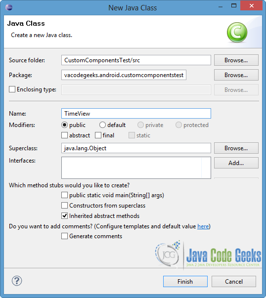
Now lets create our class. Right click on com.javacodegeeks.android.customcomponentstest package → New → Class.
Specify the name of the class and press Finish, as shown in the image below. Notice that the name of the class is TimeView, just like the name we defined in the declaration of the component in the XML layout, as well as the name we gave in the stylable of attrs.
Then open src/com.javacodegeeks.android.customcomponentstest/TimeView.java file and paste the following.
TimeView.java:
package com.javacodegeeks.android.customcomponentstest;

import java.text.SimpleDateFormat;
import java.util.Calendar;

import android.content.Context;
import android.content.res.TypedArray;
import android.graphics.Color;
import android.util.AttributeSet;
import android.widget.TextView;

public class TimeView extends TextView {

	private String titleText;
	private boolean color;

	public TimeView(Context context) {
		super(context);
		setTimeView();
	}

	public TimeView(Context context, AttributeSet attrs) {
		super(context, attrs);
		// retrieved values correspond to the positions of the attributes
		TypedArray typedArray = context.obtainStyledAttributes(attrs, R.styleable.TimeView);
	    int count = typedArray.getIndexCount();
	    try{
		    for (int i = 0; i < count; ++i) {
		    	int attr = typedArray.getIndex(i);
		    	// the attr corresponds to the title attribute
		    	if(attr == R.styleable.TimeView_title) {
		    		// set the text from the layout
		    		titleText = typedArray.getString(attr);
	    	     	setTimeView();
		    	} else if(attr == R.styleable.TimeView_setColor) {
		    		// set the color of the attr "setColor"
		    		color = typedArray.getBoolean(attr, false);
		    		decorateText();
		    	}
		    }
	    }
	    // the recycle() will be executed obligatorily
	    finally {
	    	// for reuse
	    	typedArray.recycle();
	    }
	}

	public TimeView(Context context, AttributeSet attrs, int defStyle) {
	      super(context, attrs, defStyle);
	      setTimeView();
	}

	private void setTimeView() {
		// has the format hour.minuits am/pm
		SimpleDateFormat dateFormat = new SimpleDateFormat("hh.mm aa");
		String time = dateFormat.format(Calendar.getInstance().getTime());
		if(this.titleText != null )
			setText(this.titleText+" "+time);
		else
			setText(time);
	}

	private void decorateText() {
		// when we set setColor attribute to true in the XML layout
		if(this.color == true){
			// set the characteristics and the color of the shadow
	    	setShadowLayer(4, 2, 2, Color.rgb(250, 00, 250));
	    	setBackgroundColor(Color.CYAN);
		} else {
			setBackgroundColor(Color.RED);
		}
	}

}
As you can see in the code above, we read and set the attributes to the component through the second constructor and by using the AttributeSet. We create two different functions – setTimeView() and decorateText() – in order to set the time’s format and its decoration respectively. The private fields of TimeView class take their values from the predefined values of the respective attributes, that were set in the XML layout.
6. Code the Main Activity
Open src/com.javacodegeeks.android.customcomponentstest/MainActivity.java file and paste the code below.
MainActivity.java:
package com.javacodegeeks.android.customcomponentstest;

import android.os.Bundle;
import android.widget.TextView;
import android.app.Activity;

public class MainActivity extends Activity {

	@Override
	protected void onCreate(Bundle savedInstanceState) {
		super.onCreate(savedInstanceState);
		setContentView(R.layout.activity_main);

		TextView simpleText = (TextView) findViewById(R.id.simple);
		simpleText.setText("That is a simple TextView");
	}

}
As you can see, in our Activity we can handle other built-in Views too. Our custom component is loaded, when we set as content view the layout that includes it.
7. Run the application
Now we are ready to run our application, so right click on our project → Run as → Android Application. The AVD will appear with the app loaded, as you can see in the picture below.
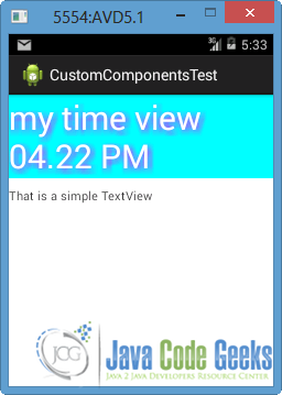
As you can notice, the time is set and styled as we defined it in the constructor of TimeView, and as we specified the values of the attributes in the XML layout. Also, the TextView is very simple, as we defined it in the layout.
Download Eclipse Project
This was an example of Custom Component in Android. Download the Eclipse Project of this example: CustomComponentsTest.zip
