This is a JavaFX Effects Example. An effect is a filter that accepts one or more graphical inputs, applies an algorithm on the inputs, and produces an output. Typically, effects are applied to nodes to create visually appealing user interfaces. Examples of effects are shadow, blur, warp, glow, reflection, blending, different types of lighting, among others. Effects are conditional features. They are applied to nodes and will be ignored if they are not available on a platform. An instance of the Effect class represents an effect. The Effect class is the abstract base for all effect classes.
Some effects can be chained with other effects when they are applied in sequence. The output of the first effect becomes the input for the second effect and so on. Effect classes that allow chaining contain an input property to specify the effect that precedes it. If the input is null, the effect is applied to the node on which this effect is set instead of being applied to the preceding input effect.
The following table shows an overview of the whole article:
Table Of Contents
The following examples use Java SE 7 and JavaFX 2.2.
All examples use Sliders for their properties. So you can test the program with different property values dynamically.
1. Shadowing Effects
A shadowing effect draws a shadow and applies it to an input. JavaFX supports three types of shadowing effects:
- DropShadow
- InnerShadow
- Shadow
1.1 The DropShadow Effect
1.1.1 The Code
FxEffectsExample1.java
import javafx.application.Application;
import javafx.scene.Scene;
import javafx.scene.control.ColorPicker;
import javafx.scene.control.ComboBox;
import javafx.scene.control.Label;
import javafx.scene.control.Slider;
import javafx.scene.effect.BlurType;
import javafx.scene.effect.DropShadow;
import javafx.scene.layout.BorderPane;
import javafx.scene.layout.GridPane;
import javafx.scene.paint.Color;
import javafx.scene.shape.Rectangle;
import javafx.stage.Stage;

public class FxEffectsExample1 extends Application
{
	public static void main(String[] args)
	{
		Application.launch(args);
	}

	@Override
	public void start(Stage stage)
	{
		// Create the Effect
		DropShadow shadow = new DropShadow();

		// Create the Rectangle
		Rectangle rect = new Rectangle(100, 50, Color.GRAY);
		// Add the Effect to the Rectangle
		rect.setEffect(shadow);

		// Create the Sliders
		Slider offsetXSlider = new Slider(-200, 200, 0);
		Slider offsetYSlider = new Slider(-200, 200, 0);
		Slider radiusSlider = new Slider(0, 127, 10);
		Slider spreadSlider = new Slider(0.0, 1.0, 0);

		// Create the ColorPicker
		ColorPicker colorPicker = new ColorPicker(Color.BLACK);

		// Create the Box for the Blur-Types
		ComboBox<BlurType> blurTypeList = new ComboBox<>();
		blurTypeList.setValue(shadow.getBlurType());
		blurTypeList.getItems().addAll(BlurType.ONE_PASS_BOX,BlurType.TWO_PASS_BOX,
				BlurType.THREE_PASS_BOX,BlurType.GAUSSIAN);

		// Bind the Properties to the Effect
		shadow.offsetXProperty().bind(offsetXSlider.valueProperty());
		shadow.offsetYProperty().bind(offsetYSlider.valueProperty());
		shadow.radiusProperty().bind(radiusSlider.valueProperty());
		shadow.spreadProperty().bind(spreadSlider.valueProperty());
		shadow.colorProperty().bind(colorPicker.valueProperty());
		shadow.blurTypeProperty().bind(blurTypeList.valueProperty());

		// Create the GridPane
		GridPane pane = new GridPane();
		// Set horizontal and vertical Spaving
		pane.setHgap(5);
		pane.setVgap(10);

		// Add the details to the GridPane
		pane.addRow(0, new Label("OffsetX:"), offsetXSlider, new Label("OffsetY:"), offsetYSlider);
		pane.addRow(1, new Label("Radius:"), radiusSlider,new Label("Spread:"), spreadSlider);
		pane.addRow(2, new Label("Color:"), colorPicker,new Label("Blur Type:"), blurTypeList);

		// Create the BorderPane
		BorderPane root = new BorderPane();
		// Add the children to the BorderPane
		root.setCenter(rect);
		root.setBottom(pane);

		// Set the Padding and Border for the BorderPane
		root.setStyle("-fx-padding: 10;" +
				"-fx-border-style: solid inside;" +
				"-fx-border-width: 2;" +
				"-fx-border-insets: 5;" +
				"-fx-border-radius: 5;" +
				"-fx-border-color: blue;");

		// Create the Scene
		Scene scene = new Scene(root,500,300);
		// Add the Scene to the Stage
		stage.setScene(scene);
		// Set the Title of the Stage
		stage.setTitle("An Example of the DropShadow Effect");
		// Display the Stage
		stage.show();
	}

}
The DropShadow effect draws a shadow (a blurred image) behind the input, so the input seems to be raised. It gives the input a 3D look. The input can be a Node or an Effect in a chain of effects. An instance of the DropShadow class represents a DropShadow effect. The size, location, color, and quality of the effect are controlled by several properties of the DropShadow class:
- offsetX
- offsetY
- color
- blurType
- radius
- spread
- width
- height
- input
The DropShadow class contains several constructors that let you specify the initial values for the properties:
- DropShadow()
- DropShadow(BlurType blurType, Color color, double radius, double spread, double offsetX, double offsetY)
- DropShadow(double radius, Color color)
- DropShadow(double radius, double offsetX, double offsetY, Color color)
// Create the Effect
DropShadow shadow = new DropShadow();
The offsetX and offsetY properties control the position of the shadow in pixels relative to the input. By default, their values are zero. The positive values of offsetX and offsetY move the shadow in the positive x axis and y axis directions, respectively. The negative values move the shadow in the reverse directions.
// Create the Sliders
Slider offsetXSlider = new Slider(-200, 200, 0);
Slider offsetYSlider = new Slider(-200, 200, 0);

// Bind the Properties to the Effect
shadow.offsetXProperty().bind(offsetXSlider.valueProperty());
shadow.offsetYProperty().bind(offsetYSlider.valueProperty());
The color property specifies the color of the shadow. By default, it is Color.BLACK. The following code would set the color:
// Create the ColorPicker
ColorPicker colorPicker = new ColorPicker(Color.BLACK);

shadow.colorProperty().bind(colorPicker.valueProperty());
The blurring in the shadow can be achieved using different algorithms. The blurType property specifies the type of blurring algorithm for the shadow. Its value is one of the following constants of the BlurType enum:
- ONE_PASS_BOX
- TWO_PASS_BOX
- THREE_PASS_BOX
- GAUSSIAN
The ONE_PASS_BOX uses a single pass of the box filter to blur the shadow. The TWO_PASS_BOX uses two passes of the box filter to blur the shadow. The THREE_PASS_BOX uses three passes of the box filter to blur the shadow. The GAUSSIAN uses a Gaussian blur kernel to blur the shadow. The blur quality of the shadow is the least in ONE_PASS_BOX and the best in GAUSSIAN. The default is THREE_PASS_BOX, which is very close to GAUSSIAN in quality.
// Create the Box for the Blur-Types
ComboBox<BlurType> blurTypeList = new ComboBox<>();
blurTypeList.setValue(shadow.getBlurType());
blurTypeList.getItems().addAll(BlurType.ONE_PASS_BOX,BlurType.TWO_PASS_BOX,
		BlurType.THREE_PASS_BOX,BlurType.GAUSSIAN);

shadow.blurTypeProperty().bind(blurTypeList.valueProperty());
The radius property specifies the distance the shadow is spread on each side of the source pixel. If the radius is zero, the shadow has sharp edges. Its value can be between 0 and 127. The default value is 10. The blurring outside the shadow region is achieved by blending the shadow color and the background color. The blur color fades out over the radius distance from the edges.
Slider radiusSlider = new Slider(0, 127, 10);

shadow.radiusProperty().bind(radiusSlider.valueProperty());
The spread property specifies the portion of the radius, which has the same color as the shadow. The color for the remaining portion of the radius is determined by the blur algorithm. Its value is between 0.0 and 1.0. The default is 0.0.
Slider spreadSlider = new Slider(0.0, 1.0, 0);

shadow.spreadProperty().bind(spreadSlider.valueProperty());
The width and height properties specify the horizontal and vertical distances, respectively, from the source pixel up to where the shadow color is spread. Their values are between 0 and 255. Setting their values is equivalent to setting the radius property, so they are equal to (2 * radius + 1). Their default value is 21.0. When you change the radius, the width and height properties are adjusted using the formula if they are not bound. However, setting the width and height changes the radius value, so the average of the width and height is equal to (2 * radius + 1).
1.1.2 The GUI
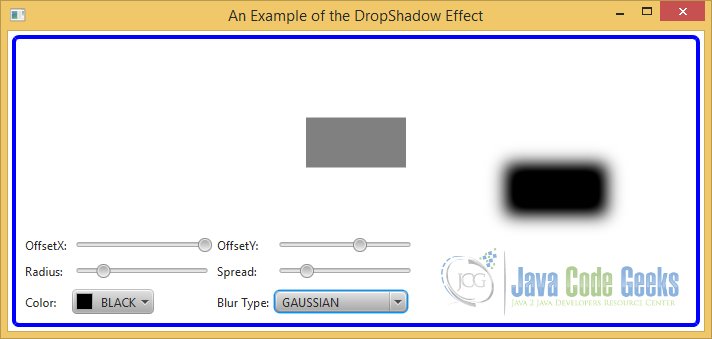
The following Figure shows a rectangle with a DropShadow effect.
1.2 The InnerShadow Effect
1.2.1 The Code
FxEffectsExample2.java
import javafx.application.Application;
import javafx.scene.Scene;
import javafx.scene.control.Label;
import javafx.scene.control.Slider;
import javafx.scene.effect.InnerShadow;
import javafx.scene.layout.GridPane;
import javafx.scene.layout.VBox;
import javafx.scene.paint.Color;
import javafx.scene.shape.Rectangle;
import javafx.scene.text.Font;
import javafx.scene.text.FontWeight;
import javafx.scene.text.Text;
import javafx.stage.Stage;

public class FxEffectsExample2  extends Application
{
	public static void main(String[] args)
	{
		Application.launch(args);
	}

	@Override
	public void start(Stage stage)
	{
		// Create the Effect for the Text
		InnerShadow textShadow = new InnerShadow();

		// Create the Text
		Text text = new Text("Inner Shadow");
		// Set Color and Font of the Text
		text.setFill(Color.RED);
		text.setFont(Font.font(null, FontWeight.BOLD, 36));
		// Set the Effect to the Text
		text.setEffect(textShadow);

		// Create the Rectangle
		Rectangle rectangle = new Rectangle(200, 100, Color.LIGHTGRAY);

		// Create the Sliders for the Text
		Slider textOffsetXSlider = new Slider(-200, 200, 0);
		Slider textOffsetYSlider = new Slider(-200, 200, 0);

		// Bind the Properties to the Text Effect
		textShadow.offsetXProperty().bind(textOffsetXSlider.valueProperty());
		textShadow.offsetYProperty().bind(textOffsetYSlider.valueProperty());

		// Create the Effect for the Rectangle
		InnerShadow rectangleShadow = new InnerShadow();
		rectangleShadow.setColor(Color.GRAY);

		// Create the Sliders for the Rectangle
		Slider rectangleOffsetXSlider = new Slider(-200, 200, 0);
		Slider rectangleOffsetYSlider = new Slider(-200, 200, 0);

		// Bind the Properties to the Rectangle Effect
		rectangleShadow.offsetXProperty().bind(rectangleOffsetXSlider.valueProperty());
		rectangleShadow.offsetYProperty().bind(rectangleOffsetYSlider.valueProperty());

		// Set the Effect to the Rectangle
		rectangle.setEffect(rectangleShadow);

		// Create the TextBox
		VBox textBox = new VBox();
		// Add the Children to the TextBox
		textBox.getChildren().addAll(new Label("TextOffsetX:"), textOffsetXSlider, new Label("TextOffsetY:"), textOffsetYSlider);
		textBox.setSpacing(10);

		// Create the RectangleBox
		VBox rectangleBox = new VBox();
		// Add the Children to the RectangleBox
		rectangleBox.getChildren().addAll(new Label("RectangleOffsetX:"), rectangleOffsetXSlider, new Label("RectangleOffsetY:"), rectangleOffsetYSlider);
		rectangleBox.setSpacing(10);

		// Create the GridPane
		GridPane root = new GridPane();
		// Set horizontal and vertical Spacing
		root.setHgap(5);
		root.setVgap(10);

		// Add the Children to the GridPane
		root.addRow(0, text,textBox);
		root.addRow(1, rectangle,rectangleBox);

		// Set the Padding and Border for the GridPane
		root.setStyle("-fx-padding: 10;" +
			"-fx-border-style: solid inside;" +
			"-fx-border-width: 2;" +
			"-fx-border-insets: 5;" +
			"-fx-border-radius: 5;" +
			"-fx-border-color: blue;");

		// Create the Scene
		Scene scene = new Scene(root);
		// Add the Scene to the Stage
		stage.setScene(scene);
		// Set the Title of the Stage
		stage.setTitle("An Example of the InnerShadow Effect");
		// Display the Stage
		stage.show();
	}

}
The InnerShadow effect works very similar to the DropShadow effect. It draws a shadow (a blurred image) of an input inside the edges of the input, so the input seems to have depth or a 3D look. The input can be a node or an effect in a chain of effects.
An instance of the InnerShadow class represents an InnerShadow effect. The size, location, color, and quality of the effect are controlled by several properties of the InnerShadow class:
- offsetX
- offsetY
- color
- blurType
- radius
- choke
- width
- height
- input
The number of properties of the InnerShadow class is equal to that for the DropShadow class. The spread property in the DropShadow class is replaced by the choke property in the InnerShadow class, which works similar to the spread property in the DropShadow class. The DropShadow class contains several constructors that let you specify the initial values for the properties:
- InnerShadow()
- InnerShadow(BlurType blurType, Color color, double radius, double choke, double offsetX, double offsetY)
- InnerShadow(double radius, Color color)
- InnerShadow(double radius, double offsetX, double offsetY, Color color)
// Create the Effect for the Text
InnerShadow textShadow = new InnerShadow();

// Bind the Properties to the Text Effect
textShadow.offsetXProperty().bind(textOffsetXSlider.valueProperty());
textShadow.offsetYProperty().bind(textOffsetYSlider.valueProperty());

// Create the Effect for the Rectangle
InnerShadow rectangleShadow = new InnerShadow();

// Bind the Properties to the Rectangle Effect
rectangleShadow.offsetXProperty().bind(rectangleOffsetXSlider.valueProperty());
rectangleShadow.offsetYProperty().bind(rectangleOffsetYSlider.valueProperty());
rectangleShadow.setColor(Color.GRAY);
1.2.2 The GUI
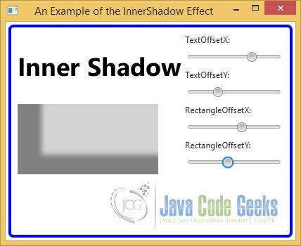
The following Image shows a Text node and a Rectangle node. An InnerShadow is applied to all nodes.
1.3 The Shadow Effect
The Shadow effect creates a shadow with blurry edges of its input. Unlike DropShadow and InnerShadow, it modifies the original input itself to convert it into a shadow. Typically, a Shadow effect is combined with the original input to create a higher-level shadowing effect:
- You can apply a Shadow effect with a light color to a node and superimpose it on a duplicate of the original node to create a glow effect.
- You can create a Shadow effect with a dark color and place it behind the original node to create a DropShadow effect.
An instance of the Shadow class represents a Shadow effect. The size, color, and quality of the effect are controlled by several properties of the Shadow class:
- color
- blurType
- radius
- width
- height
- input
These properties work the same way they work in the DropShadow.
The Shadow class contains several constructors that let you specify the initial values for the properties:
- Shadow()
- Shadow(BlurType blurType, Color color, double radius)
- Shadow(double radius, Color color)
2. Blurring Effects
A blurring effect produces a blurred version of an input. JavaFX lets you apply different types of blurring effects, which differ in the algorithms used to create these effect. JavaFX supports three types of blurring effects:
- BoxBlur
- GaussianBlur
- MotionBlur
2.1 The BoxBlur Effect
2.1.1 The Code
FxEffectsExample3.java
import javafx.application.Application;
import javafx.scene.Scene;
import javafx.scene.control.Label;
import javafx.scene.control.Slider;
import javafx.scene.effect.BoxBlur;
import javafx.scene.layout.BorderPane;
import javafx.scene.layout.HBox;
import javafx.scene.text.Font;
import javafx.scene.text.FontWeight;
import javafx.scene.text.Text;
import javafx.stage.Stage;

public class FxEffectsExample3 extends Application
{
	public static void main(String[] args)
	{
		Application.launch(args);
	}

	@Override
	public void start(Stage stage)
	{
		// Create the Effect
		BoxBlur effect = new BoxBlur();

		// Create the Text
		Text text = new Text("Box Blur");
		// Set the Font for the Text
		text.setFont(Font.font(null, FontWeight.BOLD, 36));
		// Add the Effect to the Text
		text.setEffect(effect);

		// Create the Sliders
		Slider widthSlider = new Slider(0.0, 30.0, 0.0);
		widthSlider.setMajorTickUnit(5);
		widthSlider.setShowTickLabels(true);

		Slider heightSlider = new Slider(0.0, 30.0, 0);
		heightSlider.setMajorTickUnit(5);
		heightSlider.setShowTickLabels(true);

		Slider iterationSlider = new Slider(0, 10, 0);
		iterationSlider.setMajorTickUnit(2);
		iterationSlider.setShowTickLabels(true);

		// Bind the Properties to the Effect
		effect.widthProperty().bind(widthSlider.valueProperty());
		effect.heightProperty().bind(heightSlider.valueProperty());
		effect.iterationsProperty().bind(iterationSlider.valueProperty());

		// Create the HBox for the Sliders
		HBox hbox = new HBox(10);
		// Add the Children to the HBox
		hbox.getChildren().addAll(new Label("Width:"), widthSlider, new Label("Height:"), heightSlider, new Label("Iterations:"), iterationSlider);

		// Create the BorderPane
		BorderPane root = new BorderPane();
		// Add the Text and the HBox to the BorderPane
		root.setCenter(text);
		root.setBottom(hbox);

		// Set the Padding and Border for the BorderPane
		root.setStyle("-fx-padding: 10;" +
				"-fx-border-style: solid inside;" +
				"-fx-border-width: 2;" +
				"-fx-border-insets: 5;" +
				"-fx-border-radius: 5;" +
				"-fx-border-color: blue;");

		// Create the Scene
		Scene scene = new Scene(root);
		// Add the Scene to the Stage
		stage.setScene(scene);
		// Set the Title of the Stage
		stage.setTitle("An Example of the BoxBlur Effect");
		// Display the Stage
		stage.show();
	}

}
The BoxBlur effect uses a box filter kernel to produce a blurring effect. An instance of the BoxBlur class represents a BoxBlur effect. The size and quality of the effect can be configured using these properties of the class:
- width
- height
- iterations
- input
The width and height properties specify the horizontal and vertical size of the effect, respectively. Imagine a box defined by the width and height centered on a pixel of the input. The color information of the pixel is spread within the box during the blurring process. The values of these properties are between 5.0 and 255.0. The default values are 5.0. A value of less than or equal to 1.0 does not produce the blurring effect in the corresponding direction.
The iterations property specifies the number of times the blurring effect is applied. A higher value produces a better quality blur. Its value can be between 0 and 3. The default is 1. The value of 3 produces the blur quality comparable to the Gaussian blur. The value of zero produces no blur at all.
// Create the Sliders
Slider widthSlider = new Slider(0.0, 30.0, 0.0);
widthSlider.setMajorTickUnit(5);
widthSlider.setShowTickLabels(true);

Slider heightSlider = new Slider(0.0, 30.0, 0);
heightSlider.setMajorTickUnit(5);
heightSlider.setShowTickLabels(true);

Slider iterationSlider = new Slider(0, 10, 0);
iterationSlider.setMajorTickUnit(2);
iterationSlider.setShowTickLabels(true);

// Bind the Properties to the Effect
effect.widthProperty().bind(widthSlider.valueProperty());
effect.heightProperty().bind(heightSlider.valueProperty());
effect.iterationsProperty().bind(iterationSlider.valueProperty());
The BoxBlur class contains two constructors:
- BoxBlur()
- BoxBlur(double width, double height, int iterations)
// Create the Effect
BoxBlur effect = new BoxBlur();
The no-args constructor creates a BoxBlur object with the width and height of 5.0 pixels and iterations of 1. The other constructor lets you specify the initial value for the width, height, and iterations properties.
2.1.1 The GUI
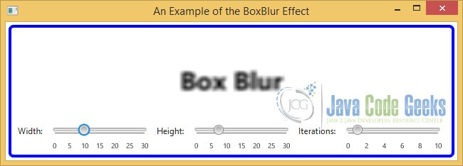
The following figure shows an example of the BoxBlur effects applied to a Text node.
2.2 The GaussianBlur Effect
2.2.1 The Code
FxEffectsExample4.java
import javafx.application.Application;
import javafx.scene.Scene;
import javafx.scene.control.Label;
import javafx.scene.control.Slider;
import javafx.scene.effect.GaussianBlur;
import javafx.scene.layout.BorderPane;
import javafx.scene.layout.HBox;
import javafx.scene.text.Font;
import javafx.scene.text.FontWeight;
import javafx.scene.text.Text;
import javafx.stage.Stage;

public class FxEffectsExample4 extends Application
{
	public static void main(String[] args)
	{
		Application.launch(args);
	}

	@Override
	public void start(Stage stage)
	{
		// Create the Effect
		GaussianBlur effect = new GaussianBlur();

		// Create the Text
		Text text = new Text("Gaussian Blur");
		// Set the Font for the Text
		text.setFont(Font.font(null, FontWeight.BOLD, 36));
		// Add the Effect to the Text
		text.setEffect(effect);

		// Create the Sliders
		Slider radiusSlider = new Slider(0.0, 30.0, 0.0);
		radiusSlider.setMajorTickUnit(10);
		radiusSlider.setShowTickLabels(true);

		// Bind the Properties to the Effect
		effect.radiusProperty().bind(radiusSlider.valueProperty());

		// Create the HBox for the Sliders
		HBox hbox = new HBox(10);
		// Add the Children to the HBox
		hbox.getChildren().addAll(new Label("Radius:"), radiusSlider);

		// Create the BorderPane
		BorderPane root = new BorderPane();
		// Add the Text and the HBox to the BorderPane
		root.setCenter(text);
		root.setBottom(hbox);

		// Set the Padding and Border for the BorderPane
		root.setStyle("-fx-padding: 10;" +
				"-fx-border-style: solid inside;" +
				"-fx-border-width: 2;" +
				"-fx-border-insets: 5;" +
				"-fx-border-radius: 5;" +
				"-fx-border-color: blue;");

		// Create the Scene
		Scene scene = new Scene(root,400,150);
		// Add the Scene to the Stage
		stage.setScene(scene);
		// Set the Title of the Stage
		stage.setTitle("An Example of the GaussianBlur Effect");
		// Display the Stage
		stage.show();
	}

}
The GaussianBlur effect uses a Gaussian convolution kernel to produce a blurring effect. An instance of the GaussianBlur class represents a GaussianBlur effect. The effect can be configured using two properties of the class:
- radius
- input
The radius property controls the distribution of the blur in pixels from the source pixel. The greater this value, the more the blur effect. Its value can be between 0.0 and 63.0. The default value is 10.0. A radius of zero pixels produces no blur effect.
// Create the Sliders
Slider radiusSlider = new Slider(0.0, 30.0, 0.0);
radiusSlider.setMajorTickUnit(10);
radiusSlider.setShowTickLabels(true);

// Bind the Properties to the Effect
effect.radiusProperty().bind(radiusSlider.valueProperty());
The GaussianBlur class contains two constructors:
- GaussianBlur()
- GaussianBlur(double radius)
// Create the Effect
GaussianBlur effect = new GaussianBlur();
The no-args constructor creates a GaussianBlur object with a default radius of 10.0px. The other constructor lets you specify the initial value for the radius.
2.2.2 The GUI
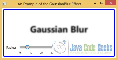
The following figure shows an example of the GaussianBlur effects applied to a Text node.
2.3 The MotionBlur Effect
2.3.1 The Code
FxEffectsExample5.java
import javafx.application.Application;
import javafx.scene.Scene;
import javafx.scene.control.Label;
import javafx.scene.control.Slider;
import javafx.scene.effect.MotionBlur;
import javafx.scene.layout.BorderPane;
import javafx.scene.layout.HBox;
import javafx.scene.text.Font;
import javafx.scene.text.FontWeight;
import javafx.scene.text.Text;
import javafx.stage.Stage;

public class FxEffectsExample5 extends Application
{
	public static void main(String[] args)
	{
		Application.launch(args);
	}

	@Override
	public void start(Stage stage)
	{
		// Create the Effect
		MotionBlur effect = new MotionBlur();

		// Create the Text
		Text text = new Text("Motion Blur");
		// Set the Font for the Text
		text.setFont(Font.font(null, FontWeight.BOLD, 36));
		// Add the Effect to the Text
		text.setEffect(effect);

		// Create the Sliders
		Slider radiusSlider = new Slider(0.0, 30.0, 0.0);
		radiusSlider.setMajorTickUnit(10);
		radiusSlider.setShowTickLabels(true);

		Slider angleSlider = new Slider(0.0, 360.0, 0);
		angleSlider.setMajorTickUnit(10);
		angleSlider.setShowTickLabels(true);

		// Bind the Properties to the Effect
		effect.radiusProperty().bind(radiusSlider.valueProperty());
		effect.angleProperty().bind(angleSlider.valueProperty());

		// Create the HBox for the Sliders
		HBox hbox = new HBox(10);
		// Add the Children to the HBox
		hbox.getChildren().addAll(new Label("Radius:"), radiusSlider, new Label("Angle:"), angleSlider);

		// Create the BorderPane
		BorderPane root = new BorderPane();
		// Add the Text and the HBox to the BorderPane
		root.setCenter(text);
		root.setBottom(hbox);

		// Set the Padding and Border for the BorderPane
		root.setStyle("-fx-padding: 10;" +
				"-fx-border-style: solid inside;" +
				"-fx-border-width: 2;" +
				"-fx-border-insets: 5;" +
				"-fx-border-radius: 5;" +
				"-fx-border-color: blue;");

		// Create the Scene
		Scene scene = new Scene(root);
		// Add the Scene to the Stage
		stage.setScene(scene);
		// Set the Title of the Stage
		stage.setTitle("An Example of the MotionBlur Effect");
		// Display the Stage
		stage.show();
	}

}
The MotionBlur effect produces a blurring effect by motion. The input looks as if you are seeing it while it is moving. A Gaussian convolution kernel is used with a specified angle to produce the effect. An instance of the MotionBlur class represents a MotionBlur effect. The effect can be configured using the three properties of the class:
- radius
- angle
- input
The radius and input properties work the same as respective properties for the GaussianBlur class, as described in the previous section. The angle property specifies the angle of the motion in degrees. By default, the angle is zero.
// Create the Sliders
Slider radiusSlider = new Slider(0.0, 30.0, 0.0);
radiusSlider.setMajorTickUnit(10);
radiusSlider.setShowTickLabels(true);

Slider angleSlider = new Slider(0.0, 360.0, 0);
angleSlider.setMajorTickUnit(10);
angleSlider.setShowTickLabels(true);

// Bind the Properties to the Effect
effect.radiusProperty().bind(radiusSlider.valueProperty());
effect.angleProperty().bind(angleSlider.valueProperty());
The MotionBlur class contains two constructors:
- MotionBlur()
- MotionBlur(double angle, double radius)
// Create the Effect
MotionBlur effect = new MotionBlur();
The no-args constructor creates a MotionBlur object with a default radius of 10.0px and an angle of 0.0 degrees. The other constructor lets you specify the initial value for the angle and radius.
2.3.2 The GUI
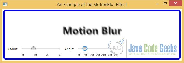
The following figure shows an example of the MotionBlur effects applied to a Text node.
3. The Bloom Effect
3.1 The Code
FxEffectsExample6.java
import javafx.application.Application;
import javafx.scene.Scene;
import javafx.scene.control.Label;
import javafx.scene.control.Slider;
import javafx.scene.effect.Bloom;
import javafx.scene.layout.GridPane;
import javafx.scene.layout.VBox;
import javafx.scene.paint.Color;
import javafx.scene.text.Font;
import javafx.scene.text.FontWeight;
import javafx.scene.text.Text;
import javafx.stage.Stage;

public class FxEffectsExample6 extends Application
{
	public static void main(String[] args)
	{
		Application.launch(args);
	}

	@Override
	public void start(Stage stage)
	{
		// Create the Effect
		Bloom bloom = new Bloom();

		// Create the Text
		Text text = new Text("Bloom");
		// Set Color and Font of the Text
		text.setFill(Color.RED);
		text.setFont(Font.font(null, FontWeight.BOLD, 36));
		// Set the Effect to the Text
		text.setEffect(bloom);

		// Create the Sliders
		Slider thresholdSlider = new Slider(0.0, 1.0, 0);

		// Bind the Properties to the Effect
		bloom.thresholdProperty().bind(thresholdSlider.valueProperty());

		// Create the VBox for the Slider
		VBox vbox = new VBox();
		// Add the Children to the VBox
		vbox.getChildren().addAll(new Label("Threshold:"), thresholdSlider);
		// Set Vertical Spacing to the VBox
		vbox.setSpacing(10);

		// Create the GridPane
		GridPane root = new GridPane();
		// Set horizontal and vertical Spacing
		root.setHgap(5);
		root.setVgap(10);

		// Add the Children to the GridPane
		root.addRow(0, text, vbox);

		// Set the Padding and Border for the GridPane
		root.setStyle("-fx-padding: 10;" +
				"-fx-border-style: solid inside;" +
				"-fx-border-width: 2;" +
				"-fx-border-insets: 5;" +
				"-fx-border-radius: 5;" +
				"-fx-border-color: blue;");

		// Create the Scene
		Scene scene = new Scene(root,350,150);
		// Add the Scene to the Stage
		stage.setScene(scene);
		// Set the Title of the Stage
		stage.setTitle("An Example of the Bloom Effect");
		// Display the Stage
		stage.show();
	}

}
The Bloom effect adds a glow to the pixels of its input that have a luminosity greater than or equal to a specified limit. Note that not all pixels in a Bloom effect are made to glow.
An instance of the Bloom class represents a Bloom effect. It contains two properties:
- threshold
- input
// Create the Sliders
Slider thresholdSlider = new Slider(0.0, 1.0, 0);

// Bind the Properties to the Effect
bloom.thresholdProperty().bind(thresholdSlider.valueProperty());
The threshold property is a number between 0.0 and 1.0. Its default value is 0.30. All pixels in the input having a luminosity greater than or equal to the threshold property are made to glow. The brightness of a pixel is determined by its luminosity. A pixel with a luminosity of 0.0 is not bright at all. A pixel with a luminosity of 1.0 is 100% bright. By default, all pixels having a luminosity greater than or equal to 0.3 are made to glow. A threshold of 0.0 makes all of the pixels glow. A threshold of 1.0 makes almost no pixels glow.
The Bloom class contains two constructors:
- Bloom()
- Bloom(double threshold)
// Create the Effect
Bloom bloom = new Bloom();
The no-args constructor creates a Bloom object with a default threshold of 0.30. The other constructor lets you specify the threshold value.
3.2 The GUI
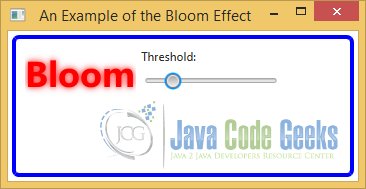
The following image shows a Text node with a Bloom effects that can have different threshold values:
4. The Glow Effect
4.1 The Code
FxEffectsExample7.java
import javafx.application.Application;
import javafx.scene.Scene;
import javafx.scene.control.Label;
import javafx.scene.control.Slider;
import javafx.scene.effect.Glow;
import javafx.scene.layout.GridPane;
import javafx.scene.layout.VBox;
import javafx.scene.paint.Color;
import javafx.scene.text.Font;
import javafx.scene.text.FontWeight;
import javafx.scene.text.Text;
import javafx.stage.Stage;

public class FxEffectsExample7 extends Application
{
	public static void main(String[] args)
	{
		Application.launch(args);
	}

	@Override
	public void start(Stage stage)
	{
		// Create the Effect
		Glow glow = new Glow();

		// Create the Text
		Text text = new Text("Glow");
		// Set Color and Font of the Text
		text.setFill(Color.BLUE);
		text.setFont(Font.font(null, FontWeight.BOLD, 36));
		// Set the Effect to the Text
		text.setEffect(glow);

		// Create the Slider
		Slider levelSlider = new Slider(0.0, 1.0, 0);

		// Bind the Properties to the Effect
		glow.levelProperty().bind(levelSlider.valueProperty());

		// Create the VBox for the Slider
		VBox vbox = new VBox();
		// Add the Children to the VBox
		vbox.getChildren().addAll(new Label("Level:"), levelSlider);
		// Set Vertical Spacing to the VBox
		vbox.setSpacing(10);

		// Create the GridPane
		GridPane root = new GridPane();
		// Set horizontal and vertical Spacing
		root.setHgap(5);
		root.setVgap(10);

		// Add the Children to the GridPane
		root.addRow(0, text, vbox);

		// Set the Padding and Border for the GridPane
		root.setStyle("-fx-padding: 10;" +
				"-fx-border-style: solid inside;" +
				"-fx-border-width: 2;" +
				"-fx-border-insets: 5;" +
				"-fx-border-radius: 5;" +
				"-fx-border-color: blue;");

		// Create the Scene
		Scene scene = new Scene(root,350,150);
		// Add the Scene to the Stage
		stage.setScene(scene);
		// Set the Title of the Stage
		stage.setTitle("An Example of the Glow Effect");
		// Display the Stage
		stage.show();
	}
}
The Glow effect makes the bright pixels of the input brighter. An instance of the Glow class represents a Glow effect. It contains two properties:
- level
- input
// Create the Slider
Slider levelSlider = new Slider(0.0, 1.0, 0);

// Bind the Properties to the Effect
glow.levelProperty().bind(levelSlider.valueProperty());
The level property specifies the intensity of the Glow effect. It is a number between 0.0 and 1.0, and its default value is 0.30. A level of 0.0 adds no glow and a level of 1.0 adds the maximum glow.
The Glow class contains two constructors:
- Glow()
- Glow(double level)
// Create the Effect
Glow glow = new Glow();
The no-args constructor creates a Glow object with a default level of 0.30. The other constructor lets you specify the level value.
4.2 The GUI
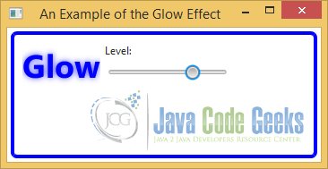
The following image shows a Text node with a Glow effects that can have different level values:
5. The Reflection Effect
5.1 The Code
FxEffectsExample8.java
import javafx.application.Application;
import javafx.scene.Scene;
import javafx.scene.control.Label;
import javafx.scene.control.Slider;
import javafx.scene.effect.Reflection;
import javafx.scene.layout.GridPane;
import javafx.scene.layout.VBox;
import javafx.scene.paint.Color;
import javafx.scene.text.Font;
import javafx.scene.text.FontWeight;
import javafx.scene.text.Text;
import javafx.stage.Stage;

public class FxEffectsExample8 extends Application
{
	public static void main(String[] args)
	{
		Application.launch(args);
	}

	@Override
	public void start(Stage stage)
	{
		// Create the Effect
		Reflection reflection = new Reflection();

		// Create the Text
		Text text = new Text("Reflection");
		// Set Color and Font of the Text
		text.setFill(Color.BLACK);
		text.setFont(Font.font(null, FontWeight.BOLD, 36));
		// Set the Effect to the Text
		text.setEffect(reflection);

		// Create the Sliders
		Slider topOffsetSlider = new Slider(0.0, 1.0, 0);
		Slider fractionSlider = new Slider(0.0, 1.0, 0);
		Slider topOpacitySlider = new Slider(0.0, 1.0, 0);
		Slider bottomOpacitySlider = new Slider(0.0, 1.0, 0);

		// Bind the Properties to the Effect
		reflection.topOffsetProperty().bind(topOffsetSlider.valueProperty());
		reflection.fractionProperty().bind(fractionSlider.valueProperty());
		reflection.topOpacityProperty().bind(topOpacitySlider.valueProperty());
		reflection.bottomOpacityProperty().bind(bottomOpacitySlider.valueProperty());

		// Create the VBox for the Slider
		VBox vbox = new VBox();
		// Add the Children to the VBox
		vbox.getChildren().addAll(new Label("TopOffset:"), topOffsetSlider,new Label("Fraction:"), fractionSlider,
				new Label("TopOpacity:"), topOpacitySlider,new Label("BottomOpacity:"), bottomOpacitySlider);
		vbox.setSpacing(10);

		// Create the GridPane
		GridPane root = new GridPane();
		// Set horizontal and vertical Spacing
		root.setHgap(5);
		root.setVgap(10);

		// Add the Children to the GridPane
		root.addRow(0, text, vbox);

		// Set the Padding and Border for the GridPane
		root.setStyle("-fx-padding: 10;" +
				"-fx-border-style: solid inside;" +
				"-fx-border-width: 2;" +
				"-fx-border-insets: 5;" +
				"-fx-border-radius: 5;" +
				"-fx-border-color: blue;");

		// Create the Scene
		Scene scene = new Scene(root,400,250);
		// Add the Scene to the Stage
		stage.setScene(scene);
		// Set the Title of the Stage
		stage.setTitle("An Example of the Reflection Effect");
		// Display the Stage
		stage.show();
	}
}
The Reflection effect adds a reflection of the input below the input. An instance of the Reflection class represents a reflection effect. The position, size, and opacity of the reflection are controlled by various properties:
- topOffset
- fraction
- topOpacity
- bottomOpacity
- input
// Create the Sliders
Slider topOffsetSlider = new Slider(0.0, 1.0, 0);
Slider fractionSlider = new Slider(0.0, 1.0, 0);
Slider topOpacitySlider = new Slider(0.0, 1.0, 0);
Slider bottomOpacitySlider = new Slider(0.0, 1.0, 0);

// Bind the Properties to the Effect
reflection.topOffsetProperty().bind(topOffsetSlider.valueProperty());
reflection.fractionProperty().bind(fractionSlider.valueProperty());
reflection.topOpacityProperty().bind(topOpacitySlider.valueProperty());
reflection.bottomOpacityProperty().bind(bottomOpacitySlider.valueProperty());
The topOffset specifies the distance in pixels between the bottom of the input and the top of the reflection. By default, it is 0.0. The fraction property specifies the faction of the input height that is visible in the reflection. It is measured from the bottom. Its value can be between 0.0 and 1.0. A value of 0.0 means no reflection. A value of 1.0 means the entire input is visible in the reflection. A value of 0.25 means 25% of the input from the bottom is visible in the reflection. The default value is 0.75. The topOpacity and bottomOpacity properties specify the opacity of the reflection at its top and bottom extremes. Their values can be between 0.0 and 1.0. The default value is 0.50 for the topOpacity and 0.0 for the bottomOpacity.
The Reflection class contains two constructors:
- Reflection()
- Reflection(double topOffset, double fraction, double topOpacity,double bottomOpacity)
// Create the Effect
Reflection reflection = new Reflection();
The no-args constructor creates a Reflection object with the default initial values for its properties. The other constructor lets you specify the initial values for the properties.
5.2 The GUI
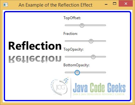
The following image shows a Text node with Reflection effect configured differently:
6. The SepiaTone Effect
6.1 The Code
FxEffectsExample9.java
import javafx.application.Application;
import javafx.scene.Scene;
import javafx.scene.control.Label;
import javafx.scene.control.Slider;
import javafx.scene.effect.SepiaTone;
import javafx.scene.layout.GridPane;
import javafx.scene.layout.VBox;
import javafx.scene.paint.Color;
import javafx.scene.text.Font;
import javafx.scene.text.FontWeight;
import javafx.scene.text.Text;
import javafx.stage.Stage;

public class FxEffectsExample9 extends Application
{
	public static void main(String[] args)
	{
		Application.launch(args);
	}

	@Override
	public void start(Stage stage)
	{
		// Create the Effect
		SepiaTone sepia = new SepiaTone();

		// Create the Text
		Text text = new Text("Sepia Tone");
		// Set Color and Font of the Text
		text.setFill(Color.GREEN);
		text.setFont(Font.font(null, FontWeight.BOLD, 36));
		// Set the Effect to the Text
		text.setEffect(sepia);

		// Create the Sliders
		Slider levelSlider = new Slider(0.0, 1.0, 0);

		// Bind the Properties to the Effect
		sepia.levelProperty().bind(levelSlider.valueProperty());

		// Create the VBox for the Slider
		VBox vbox = new VBox();
		// Add the Children to the VBox
		vbox.getChildren().addAll(new Label("Level:"), levelSlider);
		vbox.setSpacing(10);

		// Create the GridPane
		GridPane root = new GridPane();
		// Set horizontal and vertical Spacing
		root.setHgap(5);
		root.setVgap(10);

		// Add the Children to the GridPane
		root.addRow(0, text, vbox);

		// Set the Padding and Border for the BorderPane
		root.setStyle("-fx-padding: 10;" +
				"-fx-border-style: solid inside;" +
				"-fx-border-width: 2;" +
				"-fx-border-insets: 5;" +
				"-fx-border-radius: 5;" +
				"-fx-border-color: blue;");

		// Create the Scene
		Scene scene = new Scene(root,400,150);
		// Add the Scene to the Stage
		stage.setScene(scene);
		// Set the Title of the Stage
		stage.setTitle("An Example of the SepiaTone Effect");
		// Display the Stage
		stage.show();
	}

}
Sepia is a reddish-brown color. Sepia toning is performed on black-and-white photographic prints to give them a warmer tone. An instance of the SepiaTone class represents a SepiaTone effect. It contains two properties:
- level
- input
// Create the Sliders
Slider levelSlider = new Slider(0.0, 1.0, 0);

// Bind the Properties to the Effect
sepia.levelProperty().bind(levelSlider.valueProperty());
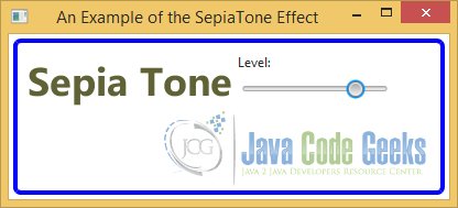
The level property specifies the intensity of the SepiaTone effect. It is a number between 0.0 and 1.0. Its defaults value is 1.0. A level of 0.0 adds no sepia toning and a level of 1.0 adds the maximum sepia toning.
The SepiaTone class contains two constructors:
- SepiaTone()
- SepiaTone(double level)
// Create the Effect
SepiaTone sepia = new SepiaTone();
The no-args constructor creates a SepiaTone object with a default level of 1.0. The other constructor lets you specify the level value.
6.2 The GUI
The following GUI shows a Text node with the SepiaTone effect. Notice that the higher the level value, the higher the sepia toning effect:
7. The DisplacementMap Effect
7.1 The Code
FxEffectsExample10.java
import javafx.application.Application;
import javafx.scene.Scene;
import javafx.scene.effect.DisplacementMap;
import javafx.scene.effect.FloatMap;
import javafx.scene.layout.HBox;
import javafx.scene.text.Font;
import javafx.scene.text.Text;
import javafx.stage.Stage;

public class FxEffectsExample10 extends Application
{
	public static void main(String[] args)
	{
		Application.launch(args);
	}

	@Override
	public void start(Stage stage)
	{
		// Create the Effect
		DisplacementMap effect = new DisplacementMap();

		// Define width and height for the FloatMap
		int width = 250;
		int height = 50;

		// Create the FloatMap
		FloatMap map = new FloatMap(width, height);

		double xDisplacement = 1.0;

		for (int i = 0; i < width; i++)
		{
			for (int j = 0; j < height; j++)
			{
				double u = xDisplacement;

				if (j < height / 2)
				{
					// Move the top-half pixels to the right (a nagative value)
					u = -1.0 * (u * xDisplacement / width);
				}
				else
				{
					// Move the bottom-half pixels to the left (a positive value)
					u = u * xDisplacement / width;
				}

				// Set values for band 0 and 1
				map.setSamples(i, j, (float)u, 0.0f);
			}
		}

		// Create the Text
		Text text = new Text("A Displaced Text Example");
		// Set Font of the Text
		text.setFont(Font.font(null,36));
		// Set the Effect to the Text
		text.setEffect(effect);

		// Set the Map to the Effect
		effect.setMapData(map);

		// Create the HBox
		HBox root = new HBox();
		// Add the Text to the HBox
		root.getChildren().add(text);

		// Set the Padding and Border for the HBox
		root.setStyle("-fx-padding: 10;" +
				"-fx-border-style: solid inside;" +
				"-fx-border-width: 2;" +
				"-fx-border-insets: 5;" +
				"-fx-border-radius: 5;" +
				"-fx-border-color: blue;");

		// Create the Scene
		Scene scene = new Scene(root,450,150);
		// Add the Scene to the Stage
		stage.setScene(scene);
		// Set the Title of the Stage
		stage.setTitle("An Example of the DisplacementMap Effect");
		// Display the Stage
		stage.show();
	}
}
The DisplacementMap effect shifts each pixel in the input to produce an output. The name has two parts: “Displacement” and “Map.” The first part implies that the effect displaces the pixels in the input. The second part implies that the displacement is based on a map that provides a displacement factor for each pixel in the output.
An instance of the DisplacementMap class represents a DisplacementMap. The class contains several properties to configure the effect:
- mapData
- scaleX
- scaleY
- offsetX
- offsetY
- wrap
- input
The mapData property is an instance of the FloatMap class. A FloatMap is a data structure that stores up to four values for each point in a rectangular area represented by its width and height properties. For example, you can use a FloatMap to store four components of the color (red, green, blue, and alpha) for each pixel in a two-dimensional rectangle. Each of the four values associated with a pair of numbers in the
FloatMap are said to be in a band numbered 0, 1, 2, and 3. The actual meaning of the values in each band is context dependent.
Now you need to populate the FloatMap with band values for each pair of numbers. You can use one of the following methods of the FloatMap class to populate it with the data:
- setSample(int x, int y, int band, float value)
- setSamples(int x, int y, float s0)
- setSamples(int x, int y, float s0, float s1)
- setSamples(int x, int y, float s0, float s1, float s2)
- setSamples(int x, int y, float s0, float s1, float s2, float s3)
// Define width and height for the FloatMap
int width = 250;
int height = 50;

// Create the FloatMap
FloatMap map = new FloatMap(width, height);
The setSample() method sets the specified value in the specified band for the specified (x, y) location. The setSamples() methods sets the specified values in the bands determined by the positions of the values in the method call. That is, the first value is set for band 0, the second value for band 1, and so forth:
double xDisplacement = 1.0;

for (int i = 0; i < width; i++)
{
	for (int j = 0; j < height; j++)
	{
		double u = xDisplacement;

		if (j < height / 2)
		{
			// Move the top-half pixels to the right (a nagative value)
			u = -1.0 * (u * xDisplacement / width);
		}
		else
		{
			// Move the bottom-half pixels to the left (a positive value)
			u = u * xDisplacement / width;
		}

		// Set values for band 0 and 1
		map.setSamples(i, j, (float)u, 0.0f);
	}
}
The DisplacementMap class requires that you set the mapData property to a FloatMap that contains values for band 0 and band 1 for each pixel in the output. The scaleX, scaleY, offsetX, and offsetY are double properties. The scaleX and scaleY properties have 1.0 as their default values. The offsetX and offsetY properties have 0.0 as their default values.
// Create the Effect
DisplacementMap effect = new DisplacementMap();

// Set the Map to the Effect
effect.setMapData(map);
7.2 The GUI
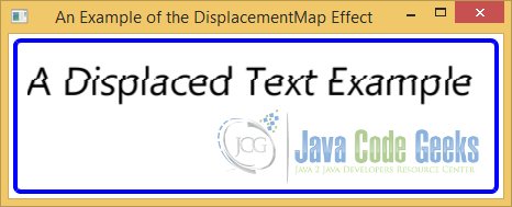
The following image shows a Text node and adds a DisplacementMap effect to the Node:
8. The ColorAdjust Effect
8.1 The Code
FxEffectsExample11.java
import javafx.application.Application;
import javafx.scene.Scene;
import javafx.scene.control.Label;
import javafx.scene.control.Slider;
import javafx.scene.effect.ColorAdjust;
import javafx.scene.image.Image;
import javafx.scene.image.ImageView;
import javafx.scene.layout.BorderPane;
import javafx.scene.layout.GridPane;
import javafx.stage.Stage;

public class FxEffectsExample11 extends Application
{
	public static void main(String[] args)
	{
		Application.launch(args);
	}

	@Override
	public void start(Stage stage)
	{
		// Create the Effect
		ColorAdjust effect = new ColorAdjust();

		// Create the Image
		String file = "file:///Path-To-Your-File/JavaFx.jpg";
		Image image = new Image(file);

		// Create the ImageView
		ImageView imageView = new ImageView();
        imageView.setImage(image);
		// Set the Effect to the ImageView
        imageView.setEffect(effect);

        // Create the Sliders
		Slider hueSlider = new Slider(-1.0, 1.0, 0.0);
		Slider saturationSlider = new Slider(-1.0, 1.0, 0.0);
		Slider brightnessSlider = new Slider(-1.0, 1.0, 0.0);
		Slider contrastSlider = new Slider(-1.0, 1.0, 0.0);

		// Bind the Properties to the Effect
		effect.hueProperty().bind(hueSlider.valueProperty());
		effect.saturationProperty().bind(saturationSlider.valueProperty());
		effect.brightnessProperty().bind(brightnessSlider.valueProperty());
		effect.contrastProperty().bind(contrastSlider.valueProperty());

		// Create Array of Sliders
		Slider[] sliders = new Slider[]
		{
				hueSlider, saturationSlider,
				brightnessSlider, contrastSlider
		};

		// Define Properties for the Sliders
		for (Slider s : sliders)
		{
			s.setPrefWidth(300);
			s.setMajorTickUnit(0.10);
			s.setShowTickMarks(true);
			s.setShowTickLabels(true);
		}

		// Create the GridPane
		GridPane pane = new GridPane();
		// Set horizontal and vertical Spacing
		pane.setHgap(5);
		pane.setVgap(10);

		// Add the Children to the GridPane
		pane.addRow(0, new Label("Hue:"), hueSlider);
		pane.addRow(1, new Label("Saturation:"), saturationSlider);
		pane.addRow(2, new Label("Brightness:"), brightnessSlider);
		pane.addRow(3, new Label("Contrast:"), contrastSlider);

		// Create the BorderPane
		BorderPane root = new BorderPane();
		// Add the Children to the BorderPane
		root.setCenter(imageView);
		root.setBottom(pane);

		// Set the Padding and Border for the BorderPane
		root.setStyle("-fx-padding: 10;" +
				"-fx-border-style: solid inside;" +
				"-fx-border-width: 2;" +
				"-fx-border-insets: 5;" +
				"-fx-border-radius: 5;" +
				"-fx-border-color: blue;");

		// Create the Scene
		Scene scene = new Scene(root);
		// Add the Scene to the Stage
		stage.setScene(scene);
		// Set the Title of the Stage
		stage.setTitle("An Example of the ColorAdjust Effect");
		// Display the Stage
		stage.show();
	}

}
The ColorAdjust effect adjusts the hue, saturation, brightness, and contrast of pixels by the specified delta amount. Typically, the effect is used on an ImageView node to adjust the color of an image. An instance of the ColorAdjust class represents the ColorAdjust effect. The class contains five properties that define the location, size, and the paint for the rectangular region:
- hue
- saturation
- brightness
- contrast
- input
// Create the Sliders
Slider hueSlider = new Slider(-1.0, 1.0, 0.0);
Slider saturationSlider = new Slider(-1.0, 1.0, 0.0);
Slider brightnessSlider = new Slider(-1.0, 1.0, 0.0);
Slider contrastSlider = new Slider(-1.0, 1.0, 0.0);

// Bind the Properties to the Effect
effect.hueProperty().bind(hueSlider.valueProperty());
effect.saturationProperty().bind(saturationSlider.valueProperty());
effect.brightnessProperty().bind(brightnessSlider.valueProperty());
effect.contrastProperty().bind(contrastSlider.valueProperty());
The hue, saturation, brightness, and contrast properties specify the delta amount by which these components are adjusted for all pixels. They range from -1.0 to 1.0. Their default values are 0.0.
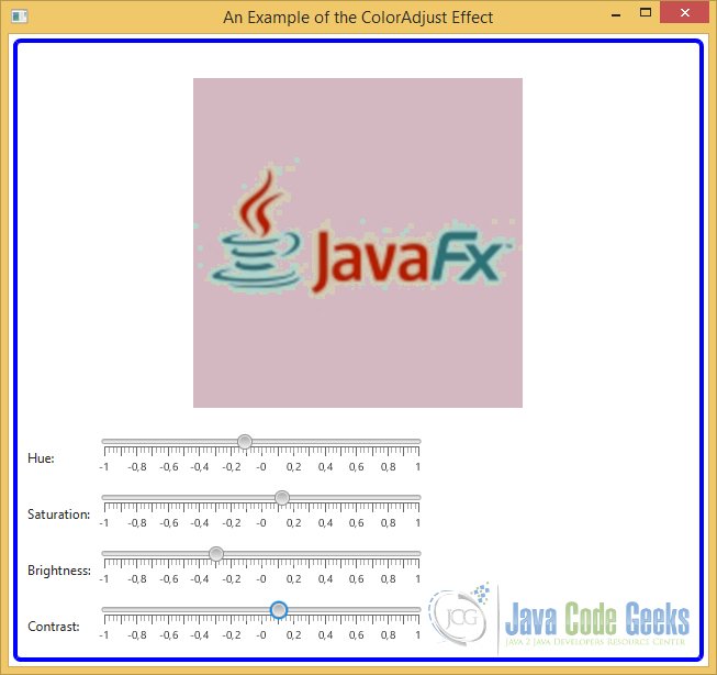
8.2 The GUI
The following GUI shows how to use the ColorAdjust effect on an image. It displays an image and four sliders to change the properties of the ColorAdjust effect.
9. The Blend Effect
9.1 The Code
FxEffectsExample12.java
import javafx.application.Application;
import javafx.scene.Scene;
import javafx.scene.control.ComboBox;
import javafx.scene.control.Label;
import javafx.scene.control.Slider;
import javafx.scene.effect.Blend;
import javafx.scene.effect.BlendMode;
import javafx.scene.effect.ColorInput;
import javafx.scene.layout.GridPane;
import javafx.scene.layout.HBox;
import javafx.scene.paint.Color;
import javafx.scene.shape.Rectangle;
import javafx.stage.Stage;

public class FxEffectsExample12 extends Application
{
	public static void main(String[] args)
	{
		Application.launch(args);
	}

	@Override
	public void start(Stage stage)
	{
		// Create the ColorInputs
		ColorInput topInput = new ColorInput(0, 0, 100, 50, Color.LIGHTGREEN);
		ColorInput bottomInput = new ColorInput(50, 25, 100, 50, Color.PURPLE);

		// Create the Effect
		Blend effect = new Blend();
		// Add the ColorInputs to the Effect
		effect.setTopInput(topInput);
		effect.setBottomInput(bottomInput);

		// Create the Rectangle
		Rectangle rect = new Rectangle(150, 75);
		// Set the Effect to the Rectangle
		rect.setEffect(effect);

		// Create the ComboBox for the BlendModes
		ComboBox<BlendMode> blendModeList = new ComboBox<>();
		blendModeList.setValue(effect.getMode());
		blendModeList.getItems().addAll(BlendMode.values());

		// Create the Slider
		Slider opacitySlider = new Slider (0, 1.0, 1.0);
		opacitySlider.setMajorTickUnit(0.10);
		opacitySlider.setShowTickMarks(true);
		opacitySlider.setShowTickLabels(true);

		// Bind the Properties to the Effect
		effect.modeProperty().bind(blendModeList.valueProperty());
		effect.opacityProperty().bind(opacitySlider.valueProperty());

		// Create the GridPane
		GridPane pane = new GridPane();
		// Set horizontal and vertical Spacing
		pane.setHgap(5);
		pane.setVgap(10);

		// Add the Children to the GridPane
		pane.addRow(0, new Label("Blend Mode:"), blendModeList);
		pane.addRow(1, new Label("Opacity:"), opacitySlider);

		// Create the HBox
		HBox root = new HBox();
		// Add Rectangle and GridPane to the HBox
		root.getChildren().addAll(rect, pane);
		// Define Spacing
		root.setSpacing(30);

		// Set the Padding and Border for the HBox
		root.setStyle("-fx-padding: 10;" +
				"-fx-border-style: solid inside;" +
				"-fx-border-width: 2;" +
				"-fx-border-insets: 5;" +
				"-fx-border-radius: 5;" +
				"-fx-border-color: blue;");

		// Create the Scene
		Scene scene = new Scene(root);
		// Add the Scene to the Stage
		stage.setScene(scene);
		// Set the Title of the Stage
		stage.setTitle("An Example of the Blend Effect");
		// Display the Stage
		stage.show();
	}

}
Blending combines two pixels at the same location from two inputs to produce one composite pixel in the output. The Blend effect takes two input effects and blends the overlapping pixels of the inputs to produce an output. The blending of two inputs is controlled by a blending mode.
An instance of the Blend class represents the Blend effect. The class contains properties to specify the:
- topInput
- bottomInput
- mode
- opacity
// Create the ColorInputs
ColorInput topInput = new ColorInput(0, 0, 100, 50, Color.LIGHTGREEN);
ColorInput bottomInput = new ColorInput(50, 25, 100, 50, Color.PURPLE);

// Add the ColorInputs to the Effect
effect.setTopInput(topInput);
effect.setBottomInput(bottomInput);

// Create the Slider
Slider opacitySlider = new Slider (0, 1.0, 1.0);
opacitySlider.setMajorTickUnit(0.10);
opacitySlider.setShowTickMarks(true);
opacitySlider.setShowTickLabels(true);

effect.opacityProperty().bind(opacitySlider.valueProperty());
The topInput and bottomInput properties specify the top and bottom effects, respectively. They are null by default. The mode property specifies the blending mode, which is one of the constants defined in the BlendMode enum. The default is BlendMode.SRC_OVER.
// Create the ComboBox for the BlendModes
ComboBox blendModeList = new ComboBox();
blendModeList.setValue(effect.getMode());
blendModeList.getItems().addAll(BlendMode.values());

// Bind the Properties to the Effect
effect.modeProperty().bind(blendModeList.valueProperty());
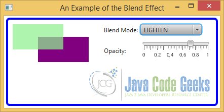
9.2 The GUI
The following GUI shows two ColorInput effects of the same size. Their x and y properties are set in such a way that they overlap. These two effects are used as top and bottom inputs to the Blend effect. A combo box and a slider are provided to select the blending mode and the opacity of the top input.
10. Download Java Source Code
This was an example of javafx.scene.effect
You can download the full source code of this example here: JavaFxEffectsExample.zip
