Android ToggleButton Example
Sometimes you may want the user to select whether he wants a specific action or operation of your Android Application to be switched on or off. In Android, this is very easy using the ToggleButton component. A ToggleButton has simply two states : ON or OFF.
In this tutorial we are going to see how to set up and display ToggleButtons with default and customized labels that represent their state. When the user presses a ToggleButton, its label changes automatically.
For this tutorial, we will use the following tools in a Windows 64-bit platform:
- JDK 1.7
- Eclipse 4.2 Juno
- Android SKD 4.2
1. Create a new Android Project
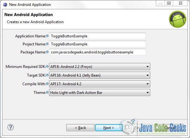
Open Eclipse IDE and go to File -> New -> Project -> Android -> Android Application Project. You have to specify the Application Name, the Project Name and the Package name in the appropriate text fields and then click Next.
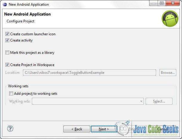
In the next window make sure the “Create activity” option is selected in order to create a new activity for your project, and click Next. This is optional as you can create a new activity after creating the project, but you can do it all in one step.
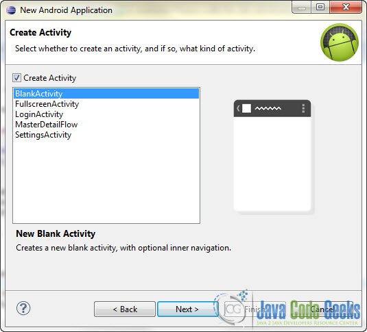
Select “BlankActivity” and click Next.
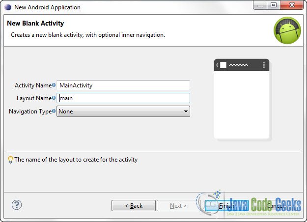
You will be asked to specify some information about the new activity. In the Layout Name text field you have to specify the name of the file that will contain the layout description of your app. In our case the file res/layout/main.xml will be created. Then, click Finish.
2. Adding resources
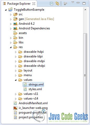
Use the Package Explorer in Eclipse to navigate to res/values/strings.xml
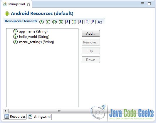
When you open the strings.xml file, Eclipse will display the graphical Resources View editor :
That’s a nice and easy tool you can use to add several resources to your application like strings, integers, color values etc. But we are going to use the traditional way and that is editing the strings.xml file by hand. In the bottom of the screen, press the string.xml tab and paste the following code :
<?xml version="1.0" encoding="utf-8"?>
<resources>

    <string name="app_name">ToggleButtonExample</string>
    <string name="hello_world">Hello world!</string>
    <string name="menu_settings">Settings</string>
    <string name="turn_on">Turn On</string>
    <string name="turn_off">Turn Off</string>
    <string name="display">Display</string>
    <string name="toggle_button_label">ToggleButton</string>
</resources>
So, we’ve just created some string resources that we can use in many ways and in many places in our app.
3. Creating ToggleButtons
Open res/layout/main.xml file :
And paste the following code :
<?xml version="1.0" encoding="utf-8"?>
<LinearLayout xmlns:android="http://schemas.android.com/apk/res/android"
    android:layout_width="fill_parent"
    android:layout_height="fill_parent"
    android:orientation="vertical" >

    <ToggleButton
        android:id="@+id/toggleButton1"
        android:layout_width="wrap_content"
        android:layout_height="wrap_content"
        android:text="@string/toggle_button_label" />

    <ToggleButton
        android:id="@+id/toggleButton2"
        android:layout_width="wrap_content"
        android:layout_height="wrap_content"
        android:textOn="@string/turn_on"
        android:textOff="@string/turn_off"
        android:checked="true" />

    <Button
        android:id="@+id/btnDisplay"
        android:layout_width="wrap_content"
        android:layout_height="wrap_content"
        android:text="@string/display" />

</LinearLayout>
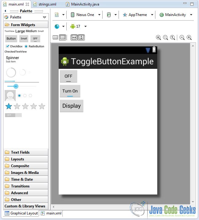
In the code of the second ToggleButton notice the use of the android:textOn="@string/turn_on" and android:textOff="@string/turn_off" attributes. Use this when you want your ToggleButton to have your own customized label reflecting its value, and not just “ON/OFF”. Additionally, notice the android:checked="true" attribute. You may use this when you want an option to be selected by default. So, now the second ToggleButton will be turned on by default. Now you may open the Graphical layout editor to preview the User Interface you created:
4. Adding a ClickListener to the main Button
Go to the java file that contains the code of the activity you’ve just created and paste the following code:
package com.javacodegeeks.android.togglebuttonexample;

import android.app.Activity;
import android.os.Bundle;
import android.view.View;
import android.view.View.OnClickListener;
import android.widget.Button;
import android.widget.Toast;
import android.widget.ToggleButton;

public class MainActivity extends Activity {

  private ToggleButton togButton1, togButton2;
  private Button mainButtony;

  @Override
  public void onCreate(Bundle savedInstanceState) {
	super.onCreate(savedInstanceState);
	setContentView(R.layout.main);

	addMainButtonListener();

  }

  public void addMainButtonListener() {

	togButton1 = (ToggleButton) findViewById(R.id.toggleButton1);
	togButton2 = (ToggleButton) findViewById(R.id.toggleButton2);

	mainButtony = (Button) findViewById(R.id.btnDisplay);

	mainButtony.setOnClickListener(new OnClickListener() {

		@Override
		public void onClick(View v) {

		   StringBuffer message_output = new StringBuffer();

		   message_output.append("toggleButton1 : ").append(togButton1.getText());
		   message_output.append("\ntoggleButton2 : ").append(togButton2.getText());

		   Toast.makeText(MainActivity.this, message_output.toString(), Toast.LENGTH_SHORT).show();

		}

	});

  }
}
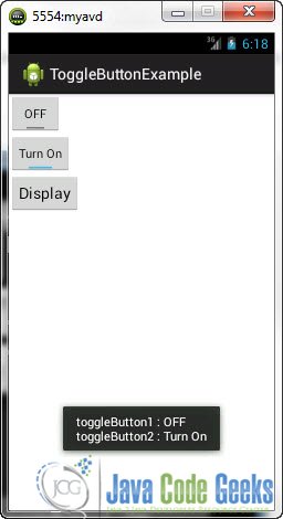
Now, when the main Button is pressed a message will be displayed that will show the state of the ToggleButtons. When a ToggleButton is pressed, its label changes automatically. The new label is representative of the state that the button has moved into (by default “ON/OFF”). So, when you want to check whether the user has chosen to activate a specific action/operation of your application or not, you can use the getText()and check the value of the label.
5. Run the application
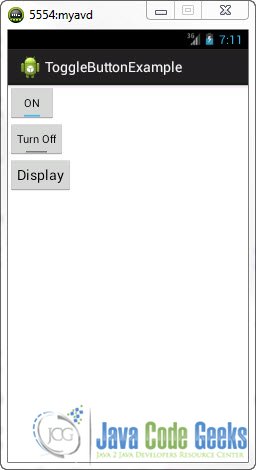
This is the main screen of our Application. You can see that the second ToggleButton is turned on by default:
Now, press the two ToggleButtons :
And when you press the main Button:
Download Eclipse Project
This was an Android ToggleButton Example. Download the Eclipse Project of this tutorial: AndroidToggleButtonExample.zip

