Android RelativeLayout Example
In Android there are may ways you can arrange the components of your Application on the screen. One of the most common layouts is the RelativeLayout. In this tutorial we are going to see how RelativeLayout works with some input components.
There is a good reason why it’s called RelativeLayout. That’s because it let’s you arrange the components on your screen in positions relative to each other. For example, you have button1 on your screen and you want to put button2 , on top or right or left of button1. RelativeLayout uses android:layout_below, android:layout_toRightOf etc… to let you do that. It’s one of the most flexible layouts out there.
For this tutorial, we will use the following tools in a Windows 64-bit platform:
- JDK 1.7
- Eclipse 4.2 Juno
- Android SKD 4.2
1. Create a new Android Project
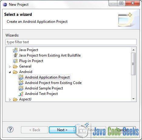
Open Eclipse IDE and go to File -> New -> Project -> Android -> Android Application Project and click Next.
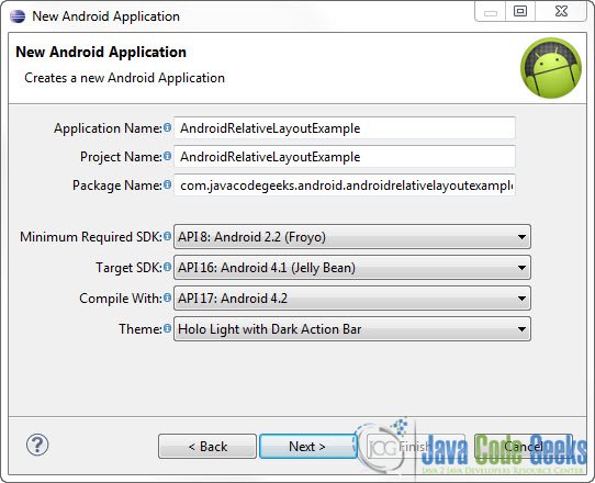
You have to specify the Application Name, the Project Name and the Package name in the appropriate text fields and then click Next.
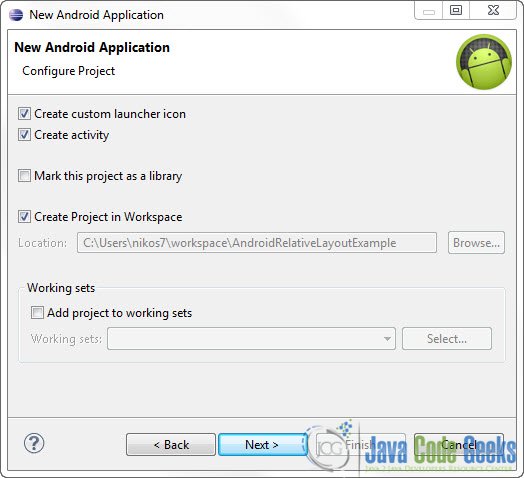
In the next window make sure the “Create activity” option is selected in order to create a new activity for your project, and click Next. This is optional as you can create a new activity after creating the project, but you can do it all in one step.
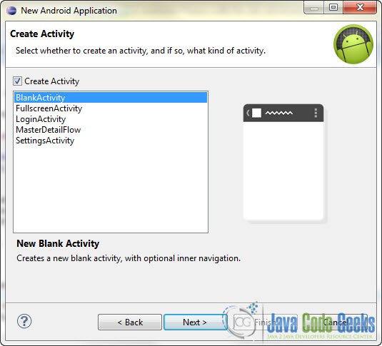
Select “BlankActivity” and click Next.
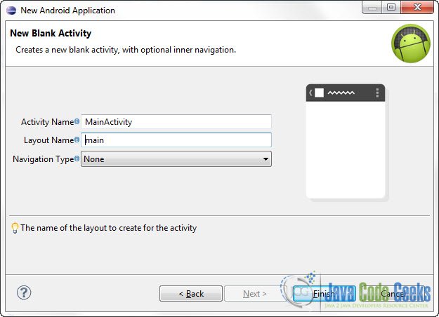
You will be asked to specify some information about the new activity. In the Layout Name text field you have to specify the name of the file that will contain the layout description of your app. In our case the file res/layout/main.xml will be created. Then, click Finish.
2. RelativeLayout example
Open res/layout/main.xml file :
And paste the following code :
<?xml version="1.0" encoding="utf-8"?>
<RelativeLayout xmlns:android="http://schemas.android.com/apk/res/android"
    android:layout_width="fill_parent"
    android:layout_height="fill_parent" >

    <Button
        android:id="@+id/button1"
        android:layout_width="wrap_content"
        android:layout_height="wrap_content"
        android:text="Button 1"/>

     <TextView
         android:id="@+id/textView"
         android:layout_width="wrap_content"
         android:layout_height="wrap_content"
         android:layout_below="@+id/button3"
         android:layout_marginTop="65dp"
         android:text="Username :"
         android:textAppearance="?android:attr/textAppearanceLarge" />

     <EditText
         android:id="@+id/editText"
         android:layout_width="wrap_content"
         android:layout_height="wrap_content"
         android:layout_alignParentRight="true"
         android:layout_alignTop="@+id/textView"
         android:layout_toRightOf="@+id/button2"
         android:inputType="text" />

     <Button
         android:id="@+id/button0"
         android:layout_width="wrap_content"
         android:layout_height="wrap_content"
         android:layout_alignParentRight="true"
         android:layout_below="@+id/editText"
         android:text="Submit" />

     <Button
         android:id="@+id/button3"
         android:layout_width="wrap_content"
         android:layout_height="wrap_content"
         android:layout_alignParentLeft="true"
         android:layout_below="@+id/button1"
         android:text="Button 3" />

     <Button
         android:id="@+id/button2"
         android:layout_width="wrap_content"
         android:layout_height="wrap_content"
         android:layout_below="@+id/button1"
         android:layout_toRightOf="@+id/button1"
         android:text="Button 2" />

</RelativeLayout>
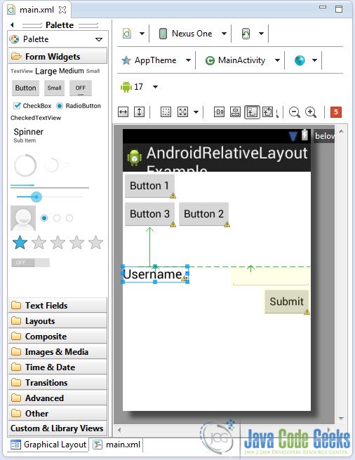
I think that the above code is pretty self explanatory, but there are one or two attributes that need a bit more of your attention. The android:layout_below, android:layout_toRightOf attributes have a very clear role, as we explained in the introduction of this tutorial. Now let’s take a look at the “Submit” button and the android:layout_alignParentRight attribute. The parent of this element is the element that we used to relatively position the button. In this case the @+id/editText item. The android:layout_alignParentRight dictates that the button will be right-alligned on the bottom of the editText component, as you can see below on the Graphical Layout editor:
Now you can drag these items around the screen using your mouse and then turn back to the xml mode to see the new values of the attributes. This will help you to understand RelativeLayout much better.
3. Run the application
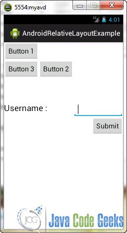
We don’t really have to write any code for this tutorial, so go ahead and run the application to see how the layout looks on your emulator:
Download Eclipse Project
This was an Android RelativeLayout Example. Download the Eclipse Project of this tutorial: AndroidRelativeLayoutExample.zip

