In this example we will learn about GWT Widgets. User interfaces in GWT applications are constructed using widgets that are contained within panels. Widgets allow you to interact with the user. Panels control the placement of user interface elements on the page. Tools and technologies used in this example are Java 1.8, Eclipse Luna 4.4.2, Eclipse GWT Plugin 2.6
Table Of Contents
1. Introduction
Widgets define your applications input and output with the user. Examples of widgets are Buttons, TextBox TextArea etc. Visual styles are applied to widgets using Cascading Style Sheets (CSS). Besides the default browser supplied definitions, each GWT widget and panel has pre-defined style sheet class definitions documented in the class reference documentation. Widgets and panels work the same way on all browsers; by using them, you eliminate the need to write specialized code for each browser.
The way will approach this tutorial is that we will build a standard class called GWTWidgets. This will have the onModuleLoad() method. All the individual widgets will be constructed in their separate classes. GWTWidgets class will invoke the methods of these individual widget class to add them in the rood panel.
2. GWT Widgets
In this section we will see the various common widgets used in GWT application.
2.1 Button
This class extends the com.google.gwt.user.client.ui.ButtonBase class and is a standard push button widget.

Below we show the source code for a simple GWT button class.
GWTButton
package com.javacodegeeks.client;

import com.google.gwt.event.dom.client.ClickEvent;
import com.google.gwt.event.dom.client.ClickHandler;
import com.google.gwt.user.client.Window;
import com.google.gwt.user.client.ui.Button;

public class GWTButton {

 public static Button createButton() {
   final Button button = new Button("Test Button");
   // Add a click handler to this button
   button.addClickHandler(new ClickHandler() {
     @Override
     public void onClick(ClickEvent event) {
       // Text to be displayed when the button is clicked.
       Window.confirm("GWT Button click handler");
     }
   });
 return button;
  }
}
2.2 Radio button
public class RadioButton extends CheckBox
A mutually-exclusive selection radio button widget. Fires ClickEvents when the radio button is clicked, and ValueChangeEvents when the button becomes checked. Note, however, that browser limitations prevent ValueChangeEvents from being sent when the radio button is cleared as a side effect of another in the group being clicked.
This widget is capable of automatically adjusting its direction according to its content. This feature is controlled by CheckBox.setDirectionEstimator(boolean) or passing a DirectionEstimator parameter to the constructor, and is off by default.
GWTRadioButton
package com.javacodegeeks.client;

import com.google.gwt.user.client.ui.FlowPanel;
import com.google.gwt.user.client.ui.RadioButton;

public class GWTRadioButton {

  public static FlowPanel createRadioButton() {
    RadioButton radioButtonMale = new RadioButton("group", "Male");
    RadioButton radioButtonFemale = new RadioButton("group", "Female");

    radioButtonMale.setValue(true);

    FlowPanel flowPanel = new FlowPanel();
    flowPanel.add(radioButtonMale);
    flowPanel.add(radioButtonFemale);
    return flowPanel;
  }
}
2.3 CheckBox
public class CheckBox extends ButtonBase implements HasName, HasValue<java.lang.Boolean>, HasWordWrap, HasDirectionalSafeHtml, HasDirectionEstimator, IsEditor<LeafValueEditor<java.lang.Boolean>>
A standard check box widget. This class also serves as a base class for RadioButton.

GWTCheckBox
package com.javacodegeeks.client;

import com.google.gwt.event.dom.client.ClickEvent;
import com.google.gwt.event.dom.client.ClickHandler;
import com.google.gwt.user.client.Window;
import com.google.gwt.user.client.ui.CheckBox;

public class GWTCheckBox {

 public static CheckBox createCheckBox() {
 CheckBox checkbox = new CheckBox("GWT Checkbox");
 checkbox.setValue(true);

 // Hook up a handler to find out when it's clicked.
 checkbox.addClickHandler(new ClickHandler() {
   @Override
   public void onClick(ClickEvent event) {
     boolean checked = ((CheckBox) event.getSource()).getValue();
     Window.confirm("Checked: " + (checked ? "Checked" : "Unchecked"));
     }
   });
 return checkbox;
 }
}
2.4 DatePicker
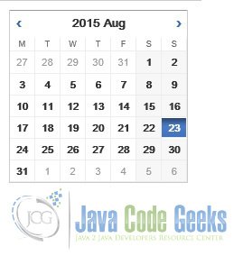
This is standard GWT date picker class. It extends the com.google.gwt.user.client.ui.Composite class.
GWTDatePicker
package com.javacodegeeks.client;

import java.util.Date;

import com.google.gwt.event.logical.shared.ValueChangeEvent;
import com.google.gwt.event.logical.shared.ValueChangeHandler;
import com.google.gwt.user.client.Window;
import com.google.gwt.user.datepicker.client.DatePicker;

public class GWTDatePicker {

  public static DatePicker createDatePicker() {
    DatePicker datePicker = new DatePicker();
    datePicker.addValueChangeHandler(new ValueChangeHandler<Date>() {
      public void onValueChange(ValueChangeEvent<Date> event) {
        Window.confirm(event.getValue().toString());
      }
    });
    datePicker.setValue(new Date(), true);
    return datePicker;
  }
}
2.5 ToggleButton
A ToggleButton is a stylish stateful button which allows the user to toggle between up and down states.
GWTToggleButton
package com.javacodegeeks.client;

import com.google.gwt.event.dom.client.ClickEvent;
import com.google.gwt.event.dom.client.ClickHandler;
import com.google.gwt.user.client.Window;
import com.google.gwt.user.client.ui.ToggleButton;

public class GWTToggleButton {

public static ToggleButton createToggleButton() {
  final ToggleButton toggleButton = new ToggleButton("ButtonUp", "ButtonDown");
  toggleButton.setWidth("40");
  toggleButton.addClickHandler(new ClickHandler() {
    public void onClick(ClickEvent event) {
      if (toggleButton.isDown()) {
        Window.confirm("Toggle down");
      } else {
        Window.confirm("Toggle up");
      }
    }
  });
  return toggleButton;
  }
}
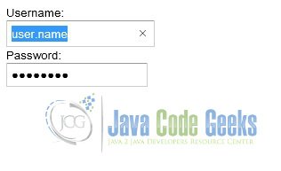
2.6 TextBox, PasswordTextBox
A standard single-line text box. This widget is capable of automatically adjusting its direction according to the input text. This feature is controlled by ValueBoxBase.setDirectionEstimator(boolean), and is available by default when at least one of the application’s locales is right-to-left. A password text box is a text box that visually masks its input to prevent eavesdropping.
GWTTextBox
package com.javacodegeeks.client;

import com.google.gwt.event.dom.client.BlurEvent;
import com.google.gwt.event.dom.client.BlurHandler;
import com.google.gwt.user.client.ui.PasswordTextBox;
import com.google.gwt.user.client.ui.TextBox;
import com.google.gwt.user.client.ui.VerticalPanel;

public class GWTTextBox {

  public static VerticalPanel createTextBox() {
    TextBox textBox = new TextBox();
    textBox.setName("User name");
    PasswordTextBox passwordTextBox = new PasswordTextBox();
    passwordTextBox.setName("Password");
    textBox.addBlurHandler(new BlurHandler() {

      @Override
      public void onBlur(BlurEvent event) {
        // Do something...
      }
    });

    // Add them to the root panel.
    VerticalPanel panel = new VerticalPanel();
    panel.add(new Label("Username: "));
    panel.add(textBox);
    panel.add(new Label("Password: "));
    panel.add(passwordTextBox);
    return panel;
  }
}
2.7 TextArea, RichTextArea
A text box that allows multiple lines of text to be entered. This widget is capable of automatically adjusting its direction according to the input text. This feature is controlled by ValueBoxBase.setDirectionEstimator(boolean), and is available by default when at least one of the application’s locales is right-to-left.
A rich text area is a rich text editor that allows complex styling and formatting. Because some browsers do not support rich text editing, and others support only a limited subset of functionality, there are two formatter interfaces, accessed via getBasicFormatter() and getExtendedFormatter(). A browser that does not support rich text editing at all will return null for both of these, while one that supports only the basic functionality will return null for the latter.
2.8 HyperLink
A widget that serves as an “internal” hyperlink. That is, it is a link to another state of the running application. When clicked, it will create a new history frame using History.newItem(java.lang.String), but without reloading the page. If you want an HTML hyperlink (<a> tag) without interacting with the history system, use Anchor instead. Being a true hyperlink, it is also possible for the user to “right-click, open link in new window”, which will cause the application to be loaded in a new window at the state specified by the hyperlink. This widget is capable of automatically adjusting its direction according to its content. This feature is controlled by setDirectionEstimator(boolean) or passing a DirectionEstimator parameter to the constructor, and is off by default.
GWTHyperLink
package com.javacodegeeks.client;

import com.google.gwt.user.client.ui.Hyperlink;
import com.google.gwt.user.client.ui.RootPanel;
import com.google.gwt.user.client.ui.VerticalPanel;

public class GWTHyperLink {

  public static VerticalPanel createHyperLink() {
    Hyperlink hyperlink = new Hyperlink("GWT hyperlink example", "Hyperlink");
    VerticalPanel panel = new VerticalPanel();
    panel.add(hyperlink);
    RootPanel.get().add(panel);

    return panel;
  }
}
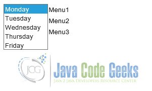
2.9 ListBox, MenuBar
A widget that presents a list of choices to the user, either as a list box or as a drop-down list. A menu bar can contain any number of menu items, each of which can either fire a Scheduler.ScheduledCommand or open a cascaded menu bar.
GWTListBox
package com.javacodegeeks.client;

import com.google.gwt.user.client.Command;
import com.google.gwt.user.client.Window;
import com.google.gwt.user.client.ui.HorizontalPanel;
import com.google.gwt.user.client.ui.ListBox;
import com.google.gwt.user.client.ui.MenuBar;

public class GWTListBox {

 public static HorizontalPanel createListBox() {
 ListBox listBox = new ListBox();
 listBox.addItem("Monday");
 listBox.addItem("Tuesday");
 listBox.addItem("Wednesday");
 listBox.addItem("Thursday");
 listBox.addItem("Friday");

 listBox.setVisibleItemCount(5);

 MenuBar menuBar = new MenuBar(true);
 menuBar.addItem("Menu1", getCommand("Menu1 command"));
 menuBar.addItem("Menu2", getCommand("Menu2 command"));
 menuBar.addItem("Menu3", getCommand("Menu3 command"));

 HorizontalPanel panel = new HorizontalPanel();
 panel.add(listBox);
 panel.add(menuBar);

 return panel;
 }

 private static Command getCommand(final String text) {
 return new Command() {
 public void execute() {
 Window.alert(text);
 }
 };
 }
}
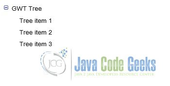
2.10 Tree, CellTree
A tree is a standard hierarchical tree widget. The tree contains a hierarchy of TreeItems that the user can open, close, and select. A CellTree is a view of a tree. This widget will only work in standards mode, which requires that the HTML page in which it is run have an explicit <!DOCTYPE> declaration.
GWTTree
package com.javacodegeeks.client;

import com.google.gwt.user.client.ui.Tree;
import com.google.gwt.user.client.ui.TreeItem;

public class GWTTree {

  public static Tree createTree() {
    TreeItem treeItem = new TreeItem();
    treeItem.setText("GWT Tree");
    treeItem.addTextItem("Tree item 1");
    treeItem.addTextItem("Tree item 2");
    treeItem.addTextItem("Tree item 3");
    Tree tree = new Tree();
    tree.addItem(treeItem);
    return tree;
  }
}
2.11 SuggestBox
A SuggestBox is a text box or text area which displays a pre-configured set of selections that match the user’s input. Each SuggestBoxis associated with a single SuggestOracle. The SuggestOracle is used to provide a set of selections given a specific query string. By default, the SuggestBox uses a MultiWordSuggestOracle as its oracle. Below we show how a MultiWordSuggestOracle can be configured:
MultiWordSuggestOracle multiWordSuggestOracle = new MultiWordSuggestOracle();
multiWordSuggestOracle.add("United States");
multiWordSuggestOracle.add("United Kingdom");
multiWordSuggestOracle.add("India");

SuggestBox suggestBox = new SuggestBox(multiWordSuggestOracle);
Using the example above, if the user types “U” into the text widget, the oracle will configure the suggestions with the “United States” and “United Kingdom” suggestions. Specifically, whenever the user types a key into the text widget, the value is submitted to the MultiWordSuggestOracle.
Note that there is no method to retrieve the “currently selected suggestion” in a SuggestBox, because there are points in time where the currently selected suggestion is not defined. For example, if the user types in some text that does not match any of the SuggestBox’s suggestions, then the SuggestBox will not have a currently selected suggestion. It is more useful to know when a suggestion has been chosen from the SuggestBox’s list of suggestions. A SuggestBox fires SelectionEvents whenever a suggestion is chosen, and handlers for these events can be added using the addSelectionHandler(SelectionHandler) method.
2.12 FlexTable, Grid and CellTable
A flexible table is a table that creates cells on demand. It can be jagged (that is, each row can contain a different number of cells) and individual cells can be set to span multiple rows or columns. A grid is a rectangular grid that can contain text, html, or a child Widget within its cells. It must be resised explicitly to the desired number of rows and columns. A cell table is a tabular view that supports paging and columns. The Column class defines the Cell used to render a column. Implement Column.getValue(Object) to retrieve the field value from the row object that will be rendered in the Cell. A Header can be placed at the top (header) or bottom (footer) of the CellTable. You can specify a header as text using AbstractCellTable.addColumn(Column, String), or you can create a custom Header that can change with the value of the cells, such as a column total. The Header will be rendered every time the row data changes or the table is redrawn. If you pass the same header instance (==) into adjacent columns, the header will span the columns.
2.13 CellBrowser, TabBar, DialogBox
A “browsable” view of a tree in which only a single node per level may be open at one time. This widget will only work in standards mode, which requires that the HTML page in which it is run have an explicit <!DOCTYPE> declaration. A TabBar is a horizontal bar of folder-style tabs, most commonly used as part of a TabPanel. A DialogBox is a form of popup that has a caption area at the top and can be dragged by the user. Unlike a PopupPanel, calls to PopupPanel.setWidth(String) and PopupPanel.setHeight(String) will set the width and height of the dialog box itself, even if a widget has not been added as yet.
3. Creating custom widgets
GWT makes it easy to create custom user interface elements. There are three general strategies to follow:
- Create a widget that is a composite of existing widgets.
- Create an entirely new widget written in the Java language.
- Create a widget that wraps JavaScript using JSNI methods.
There are numerous third party libraries that provide widgets you can integrate into your GWT module that were created using the strategies listed above.
3.1 Building Composites
The most effective way to create new widgets is to extend the Composite class. A composite is a specialized widget that can contain another component (typically, a Panel) but behaves as if it were its contained widget. You can easily combine groups of existing widgets into a composite that is itself a reusable widget. Some of the UI components provided in GWT are composites: for example, the TabPanel (a composite of a TabBar and a DeckPanel) and the SuggestBox.
Rather than create complex widgets by subclassing Panel or another Widget type, it’s better to create a composite because a composite usually wants to control which methods are publicly accessible without exposing those methods that it would inherit from its Panel superclass.
3.2 New widget using Java
It is also possible to create a widget from scratch, although it is trickier since you have to write code at a lower level. Many of the basic widgets are written this way, such as Button and TextBox.
To understand how to create your own, refer to the implementations of these widgets in the com.google.gwt.user.client.ui package. The source code is in gwt-user.jar.
3.3 Create a widget that wraps JavaScript using JSNI methods
When implementing a custom widget that derives directly from the Widget base class, you may also write some of the widget’s methods using JavaScript. This should generally only be done as a last resort, as it becomes necessary to consider the cross-browser implications of the native methods that you write, and also becomes more difficult to debug. For an example of this pattern in practice, see the TextBox widget and the underlying JavaScript implementation of some of its methods in the TextBoxImpl class. You should use deferred binding to isolate browser specific code.
Deferred Binding is a feature of the GWT compiler that works by generating many versions of code at compile time, only one of which needs to be loaded by a particular client during bootstrapping at runtime. Each version is generated on a per browser basis, along with any other axis that your application defines or uses. For example, if you were to internationalize your application using GWT’s Internationalization module, the GWT compiler would generate various versions of your application per browser environment, such as “Firefox in English”, “Firefox in French”, “Internet Explorer in English”, and so forth. As a result, the deployed JavaScript code is compact and quicker to download than hand coded JavaScript, containing only the code and resources it needs for a particular browser environment.
4. JavaScript Native Interface
Often, you will need to integrate GWT with existing handwritten JavaScript or with a third-party JavaScript library. Occasionally you may need to access low-level browser functionality not exposed by the GWT class API’s. The JavaScript Native Interface (JSNI) feature of GWT can solve both of these problems by allowing you to integrate JavaScript directly into your application’s Java source code.
The GWT compiler translates Java source into JavaScript. Sometimes it’s very useful to mix handwritten JavaScript into your Java source code. For example, the lowest-level functionality of certain core GWT classes are handwritten in JavaScript. GWT borrows from the Java Native Interface (JNI) concept to implement JavaScript Native Interface (JSNI). Writing JSNI methods is a powerful technique, but should be used sparingly because writing bulletproof JavaScript code is notoriously tricky. JSNI code is potentially less portable across browsers, more likely to leak memory, less amenable to Java tools, and harder for the compiler to optimize.
4.1 Build widgets using JSNI
JSNI methods are declared native and contain JavaScript code in a specially formatted comment block between the end of the parameter list and the trailing semicolon. A JSNI comment block begins with the exact token /*-{ and ends with the exact token }-*/. JSNI methods are called just like any normal Java method. They can be static or instance methods. The JSNI syntax is a directive to the Java-to-JavaScript Compiler to accept any text between the comment statements as valid JS code and inject it inline in the generated GWT files. At compile time, the GWT compiler performs some syntax checks on the JavaScript inside the method, then generates interface code for converting method arguments and return values properly.
As of the GWT 1.5 release, the Java varargs construct is supported. The GWT compiler will translate varargs calls between 2 pieces of Java code. However, calling a varargs JavaScript method from Java will result in the callee receiving the arguments in an array. Below is a simple example of how to code a JSNI method that puts up a JavaScript alert dialog:
public static native void alert(String msg) /*-{
  $wnd.alert(msg);
}-*/;
Note that the code did not reference the JavaScript window object directly inside the method. When accessing the browser’s window and document objects from JSNI, you must reference them as $wnd and $doc, respectively. Your compiled script runs in a nested frame, and $wnd and $doc are automatically initialized to correctly refer to the host page’s window and document.
NOTE: Since JSNI code is just regular JavaScript, you will not be able to use Java debugging tools inside your JSNI methods when running in development mode. However, you can set a breakpoint on the source line containing the opening brace of a JSNI method, allowing you to see invocation arguments. Also, the Java compiler and GWT compiler do not perform any syntax or semantic checks on JSNI code, so any errors in the JavaScript body of the method will not be seen until run time.
5. External libraries for creating GWT widgets
There are several libraries available in the market which can be used for creating the GWT widgets. In this section we will discuss about some of those commonly used libraries.
5.1 GWT Portlets
GWT Portlets is a free open source web framework for building GWT (Google Web Toolkit) applications. It defines a very simple & productive, yet powerful programming model to build good looking, modular GWT applications.
The programming model is somewhat similar to writing JSR168 portlets for a portal server (Liferay, JBoss Portal etc.). The “portal” is your application built using the GWT Portlets framework as a library. Application functionality is developed as loosely coupled Portlets each with an optional server side DataProvider. The framework includes useful portlets and the widgets needed for its own UI (to avoid having to depend on other GWT libraries). The aim of the GWT Portlets framework is to make it easier to produce modular, decoupled business applications using GWT, not to create a widget library.
5.1.1 Dialog and CssButton
Dialog is a replacement for the standard GWT dialog box. It includes a title bar with maximize/restore and close buttons, content area, button bar, is styled using CSS and image sprites, is themable, prevents the application from receiving events (even mouse overs and so on) when modal, triggers close when escape is presssed and absolutely positions its contents.
CssButton is a Button subclass styled using a CSS background image sprite. It is lightweight (rendered using a single BUTTON element) and supports rollover. It selects different background sprites based on the width of the button avoiding scaling effects.
The content area of the dialog can be populated with a single widget by calling setWidget (like a standard GWT DialogBox) or multiple widgets can be added (getContent().add(Widget,...)). The setWidget method wraps widgets with a TABLE element in a SimplePanel (DIV) styled to add 4px padding.
<h45.1.2 FormBuilder
5.1.2 FormBuilder
FormBuilder is not actually a widget itself, it creates a form (labels and fields etc.) based on a GWT FlexTable. It keeps track of the current row and column in the table and creates labels and fields using standard styles. Some methods add new cells and others operate on the most recently added cell. FormBuilder styles the table so that the spacing between TDs inside is even (default is 4px) but the outer TDs (first row, last row, first column and last column) do not have any padding on the outside. This makes it easier to nest forms, to maintain consistent spacing and avoid problems with tables and spacing inside scrolling regions.
5.1.3 ToolButton and ShadowPanel
ToolButton displays a small icon defined by a CSS background image sprite with rollover and disabled support.
ToolButton edit = new ToolButton(ToolButton.CONFIGURE, "Edit Page", new ClickListener() {
 public void onClick(Widget sender) {...}
});
ShadowPanel adds a fuzzy shadow to a single widget. The look of the shadow is controlled by the theme.
5.2 GWT Mosaic
GWT Mosaic is a feature rich toolkit for creating graphical Rich Internet Applications. Offering a complete set of widgets, GWT Mosaic is suitable for projects ranging from small one-off projects to complete application suites
5.3 Sencha GXT
Sencha GXT is one of the most comprehensive Java framework for building feature-rich web applications. It uses the GWT compiler, allowing developers to write applications in Java and compile their code into highly optimized cross-platform HTML5 code. Sencha GXT features high-performance UI widgets that are interoperable with native GWT components, templates, and layout manager — giving you powerful control over your display. An advanced charting package allows you to visualize large quantities of data. The framework includes built-in support for RPC, RequestFactory, and JSON, so you can feed data to your applications using any data source. Sencha GXT also offers complete theming support, allowing you to build web applications that reflect your company branding guidelines.
Sencha GXT provides a comprehensive collection of high-performance widgets that are completely customizable. These widgets include HTML5 grids, trees, lists, forms, menus, toolbars, panels, windows, and much more. Sencha GXT widgets are highly customizable. The framework comes with a robust theme builder for creating entirely new themes — including those that reflect a specific brand identity. The theme builder uses a simple config system that exposes hundreds of variables that can be altered to design custom themes.
Sencha GXT includes a flexible layout manager to help organize the display of data and content across multiple browsers, devices, and screen sizes. It helps you control the display of components, even for the most complex user interfaces. Sencha GXT templates include advanced features such as autofilling arrays.
The Sencha GXT charting package allows you to visually represent data with a broad range of chart types — including line, bar, and pie charts. The charts use surfaces and sprites developed with a drawing package implemented using SVG, VML, and Canvas technologies. Browser variations are handled automatically so that the charts always display correctly.
A robust data framework included in Sencha GXT allows you to decouple the UI widgets from the service layer. The data framework allows client-side collections of data using highly functional models that offer features such as sorting and filtering. The data framework is protocol agnostic, and has out-of-the-box support for RPC, RequestFactory, and JSON.
6. Download the source file
This was an example of GWT Widgets.
You can download the full source code of this example here: GWT Widgets