This is a JavaFX DatePicker Example. A DatePicker is a combo-box style control. The user can enter a date as text or select a date from a calendar. The calendar is displayed as a pop-up for the control.
The following table shows an overview of the whole article:
Table Of Contents
The following examples uses Java SE 8.
1. The Converter
The DatePicker class contains a converter property that uses a StringConverter to convert a LocalDate to a String and vice versa. Its value property stores the date as LocalDate and its editor displays it as a String, which is the formatted date. When you enter a date as text, the converter converts it to a LocalDate and stores it in the value property. When you pick a date from the calendar pop-up, the converter creates a LocalDate to store in the value property and it converts it to a String to display in the editor.
1.1 The Code
FxDatePickerConverter.java
import java.time.LocalDate;
import java.time.format.DateTimeFormatter;

import javafx.util.StringConverter;

public class FxDatePickerConverter extends StringConverter
{
	// Default Date Pattern
	private String pattern = "MM/dd/yyyy";
	// The Date Time Converter
	private DateTimeFormatter dtFormatter;

	public FxDatePickerConverter()
	{
		dtFormatter = DateTimeFormatter.ofPattern(pattern);
	}

	public FxDatePickerConverter(String pattern)
	{
		this.pattern = pattern;
		dtFormatter = DateTimeFormatter.ofPattern(pattern);
	}

	// Change String to LocalDate
	public LocalDate fromString(String text)
	{
		LocalDate date = null;

		if (text != null && !text.trim().isEmpty())
		{
			date = LocalDate.parse(text, dtFormatter);
		}

		return date;
	}

	// Change LocalDate to String
	public String toString(LocalDate date)
	{
		String text = null;

		if (date != null)
		{
			text = dtFormatter.format(date);
		}

		return text;
	}
}
By default, it formats dates in MM/dd/yyyy format. You can pass a different format in its constructor.
2. Usage of the DatePicker Control
The default converter uses the default Locale and chronology to format the date. When you enter a date as text, the default converter expects the text in the default Locale and chronology format.
2.1 The Code
FxDatePickerExample1.java
import java.time.LocalDate;
import java.time.DayOfWeek;
import javafx.application.Application;
import javafx.event.ActionEvent;
import javafx.event.EventHandler;
import javafx.scene.Scene;
import javafx.scene.control.DateCell;
import javafx.scene.control.DatePicker;
import javafx.scene.control.Label;
import javafx.scene.control.TextArea;
import javafx.scene.layout.HBox;
import javafx.scene.layout.VBox;
import javafx.scene.paint.Color;
import javafx.stage.Stage;
import javafx.util.Callback;

public class FxDatePickerExample1 extends Application
{
	// Create the TextArea
	private final TextArea textArea = new TextArea();

	public static void main(String[] args)
	{
		Application.launch(args);
	}

	@Override
	public void start(Stage stage)
	{
		// Date Pattern
		String pattern = "MM/dd/yyyy";

		// Create the DatePicker
		final DatePicker datePicker = new DatePicker();
		// Make the DatePicker non-editable
		datePicker.setEditable(false);

		// Print the new date in the TextArea
		datePicker.setOnAction(new EventHandler<ActionEvent>()
		{
			@Override
		     public void handle(ActionEvent event)
		     {
		         LocalDate date = datePicker.getValue();
		         writeMessage("Selected date: " + date);
		     }
		});

		// Create the DateConverter
		FxDatePickerConverter converter = new FxDatePickerConverter(pattern);
		// Add the Converter to the DatePicker
		datePicker.setConverter(converter);
		// Set the Date in the Prompt
		datePicker.setPromptText(pattern.toLowerCase());

		// Create a day cell factory
		Callback<DatePicker, DateCell> dayCellFactory = new Callback<DatePicker, DateCell>()
		{
			public DateCell call(final DatePicker datePicker)
			{
				return new DateCell()
				{
					@Override
					public void updateItem(LocalDate item, boolean empty)
					{
						// Must call super
						super.updateItem(item, empty);

						// Show Weekends in blue color
						DayOfWeek day = DayOfWeek.from(item);
						if (day == DayOfWeek.SATURDAY || day == DayOfWeek.SUNDAY)
						{
							this.setTextFill(Color.BLUE);
						}
					}
				};
			}
		};

		// Set the day cell factory to the DatePicker
		datePicker.setDayCellFactory(dayCellFactory);

		// Create the Label
		Label selection = new Label("Select your Date:");
		// Create the HBox for the DatePicker
		HBox pickerBox = new HBox(selection, datePicker);

		// Set the preferred number of text rows
		textArea.setPrefRowCount(15);
		// Set the preferred number of text columns
		textArea.setPrefColumnCount(25);

		// Create the VBox
		VBox root = new VBox();
		// Add the TreeView to the VBox
		root.getChildren().addAll(pickerBox,textArea);
		// Set the Style of the VBox
		root.setStyle("-fx-padding: 10;" +
			"-fx-border-style: solid inside;" +
			"-fx-border-width: 2;" +
			"-fx-border-insets: 5;" +
			"-fx-border-radius: 5;" +
			"-fx-border-color: blue;");

		// Create the Scene
		Scene scene = new Scene(root);
		// Add the Scene to the Stage
		stage.setScene(scene);
		// Set the Title
		stage.setTitle("A DatePicker Control Example");
		// Display the Stage
		stage.show();
		// Set the Size of the Window to the Stage
		stage.sizeToScene();
	}

	// Method for Logging
	private void writeMessage(String msg)
	{
		this.textArea.appendText(msg + "\n");
	}
}
You can create a DatePicker using its default constructor.
// Create the DatePicker
final DatePicker datePicker = new DatePicker();
Thereafter you can make the DatePicker non-editable:
// Make the DatePicker non-editable
datePicker.setEditable(false);
2.2 Adding an EventHandler to the DatePicker
The DatePicker control fires an ActionEvent when its value property changes. The value property may change when a user enters a date, selects a date from the pop-up, or a date is set programmatically, as provided in the following code:
// Print the new date in the TextArea
datePicker.setOnAction(new EventHandler<ActionEvent>()
{
	@Override
	 public void handle(ActionEvent event)
	 {
		 LocalDate date = datePicker.getValue();
		 writeMessage("Selected date: " + date);
	 }
});
In our case, the message will be written in a TextArea.
// Method for Logging
private void writeMessage(String msg)
{
	this.textArea.appendText(msg + "\n");
}
2.3 Adding a Date Converter to the DatePicker
The following code snippet creates a DateConverter, which we have discussed above. After Creation, the converter will be added to the DatePicker.
// Create the DateConverter
FxDatePickerConverter converter = new FxDatePickerConverter(pattern);
// Add the Converter to the DatePicker
datePicker.setConverter(converter);
2.4 Adding a Day Cell Factory to the DatePicker
Each day cell in the pop-up calendar is an instance of the DateCell class. The dayCellFactory property of the DatePicker class lets you provide a custom day cell factory. The following statement creates a day cell factory. It changes the text color of weekend cells to blue. Thereafter the factory will be added to the DatePicker.
// Create a day cell factory
Callback<DatePicker, DateCell> dayCellFactory = new Callback<DatePicker, DateCell>()
{
	public DateCell call(final DatePicker datePicker)
	{
		return new DateCell()
		{
			@Override
			public void updateItem(LocalDate item, boolean empty)
			{
				// Must call super
				super.updateItem(item, empty);

				// Show Weekends in blue color
				DayOfWeek day = DayOfWeek.from(item);
				if (day == DayOfWeek.SATURDAY || day == DayOfWeek.SUNDAY)
				{
					this.setTextFill(Color.BLUE);
				}
			}
		};
	}
};
After creating the Cell Factory, it will be add to the DatePicker Control.
// Set the day cell factory to the DatePicker
datePicker.setDayCellFactory(dayCellFactory);
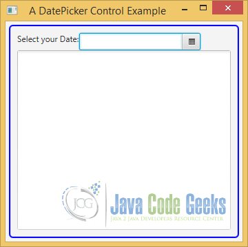
2.5 The GUI
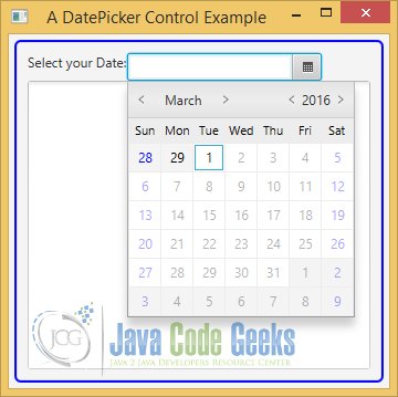
After starting the application, the following image appears:
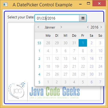
If you click on the Calendar Symbol, the calendar will be shown:
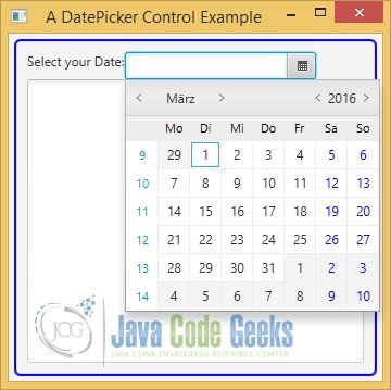
The first row of the pop-up displays the month and year. You can scroll through months and years using the arrows. The second row displays the short names of weeks. The first column displays the week number of the year. By default, the week numbers column is not displayed. You can use the context menu on the pop-up to display it or you can set the showWeekNumbers property of the control to show it.
The calendar always displays dates for 42 days. Dates not applicable to the current month are disabled for selection. Each day cell is an instance of the DateCell class. You can provide a cell factory to use your custom cells. Right-clicking the first row, week names, week number column, or disabled dates displays the context menu. The context menu also contains a Show Today menu item, which scrolls the calendar to the current date.
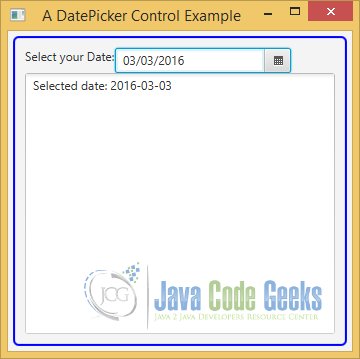
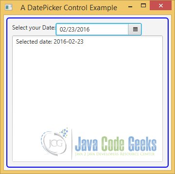
After choosing a day from the calendar, the TextField of the DatePicker contains the value formatted by the given pattern. A message will be also written to the TextArea.
3. Setting an Initial Date to the DatePicker Control
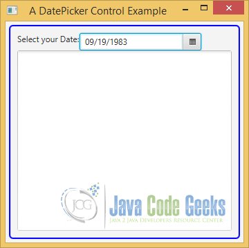
In the example above, the Initial Date of the Calendar was the current day. But it is possible, to set another date as Initial Date.
3.1 The Code
FxDatePickerExample2.java
import java.time.DayOfWeek;
import java.time.LocalDate;

import javafx.application.Application;
import javafx.event.ActionEvent;
import javafx.event.EventHandler;
import javafx.scene.Scene;
import javafx.scene.control.DateCell;
import javafx.scene.control.DatePicker;
import javafx.scene.control.Label;
import javafx.scene.control.TextArea;
import javafx.scene.layout.HBox;
import javafx.scene.layout.VBox;
import javafx.scene.paint.Color;
import javafx.stage.Stage;
import javafx.util.Callback;

public class FxDatePickerExample2 extends Application
{
	// Create the TextArea
	private final TextArea textArea = new TextArea();

	public static void main(String[] args)
	{
		Application.launch(args);
	}

	@Override
	public void start(Stage stage)
	{
		// Date Pattern
		String pattern = "MM/dd/yyyy";

		// Create the DatePicker with a given Date
		final DatePicker datePicker = new DatePicker(LocalDate.of(1983, 9, 19));
		// Make the DatePicker non-editable
		datePicker.setEditable(false);

		// Print the new date in the TextArea
		datePicker.setOnAction(new EventHandler<ActionEvent>()
		{
			@Override
		     public void handle(ActionEvent event)
		     {
		         LocalDate date = datePicker.getValue();
		         writeMessage("Selected date: " + date);
		     }
		});

		// Create the DateConverter
		FxDatePickerConverter converter = new FxDatePickerConverter(pattern);
		// Add the Converter to the DatePicker
		datePicker.setConverter(converter);
		// Set the Date in the Prompt
		datePicker.setPromptText(pattern.toLowerCase());

		// Create a day cell factory
		Callback<DatePicker, DateCell> dayCellFactory = new Callback<DatePicker, DateCell>()
		{
			public DateCell call(final DatePicker datePicker)
			{
				return new DateCell()
				{
					@Override
					public void updateItem(LocalDate item, boolean empty)
					{
						// Must call super
						super.updateItem(item, empty);

						// Show Weekends in blue color
						DayOfWeek day = DayOfWeek.from(item);
						if (day == DayOfWeek.SATURDAY || day == DayOfWeek.SUNDAY)
						{
							this.setTextFill(Color.BLUE);
						}
					}
				};
			}
		};

		// Set the day cell factory to the DatePicker
		datePicker.setDayCellFactory(dayCellFactory);

		// Create the Label
		Label selection = new Label("Select your Date:");
		// Create the HBox for the DatePicker
		HBox pickerBox = new HBox(selection, datePicker);

		// Set the preferred number of text rows
		textArea.setPrefRowCount(15);
		// Set the preferred number of text columns
		textArea.setPrefColumnCount(25);

		// Create the VBox
		VBox root = new VBox();
		// Add the TreeView to the VBox
		root.getChildren().addAll(pickerBox,textArea);
		// Set the Style of the VBox
		root.setStyle("-fx-padding: 10;" +
			"-fx-border-style: solid inside;" +
			"-fx-border-width: 2;" +
			"-fx-border-insets: 5;" +
			"-fx-border-radius: 5;" +
			"-fx-border-color: blue;");

		// Create the Scene
		Scene scene = new Scene(root);
		// Add the Scene to the Stage
		stage.setScene(scene);
		// Set the Title
		stage.setTitle("A DatePicker Control Example");
		// Display the Stage
		stage.show();
		// Set the Size of the Window to the Stage
		stage.sizeToScene();
	}

	// Method for Logging
	private void writeMessage(String msg)
	{
		this.textArea.appendText(msg + "\n");
	}
}
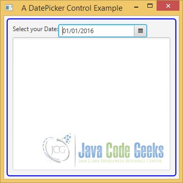
You can also pass a LocalDate to another constructor as the initial value, as in the following code:
// Create the DatePicker with a given Date
final DatePicker datePicker = new DatePicker(LocalDate.of(1983, 9, 19));
3.2 The GUI
After starting the application, the following image appears:
After choosing a day from the calendar, the TextField of the DatePicker contains the value formatted by the given pattern. A message will be also written to the TextArea.
4. Setting the Locale of the DatePicker
It is also possible, to override the default Locale of the DatePicker.
4.1 The Code
FxDatePickerExample3.java

import java.time.DayOfWeek;
import java.time.LocalDate;
import java.util.Locale;

import javafx.application.Application;
import javafx.event.ActionEvent;
import javafx.event.EventHandler;
import javafx.scene.Scene;
import javafx.scene.control.DateCell;
import javafx.scene.control.DatePicker;
import javafx.scene.control.Label;
import javafx.scene.control.TextArea;
import javafx.scene.layout.HBox;
import javafx.scene.layout.VBox;
import javafx.scene.paint.Color;
import javafx.stage.Stage;
import javafx.util.Callback;

public class FxDatePickerExample3 extends Application
{
	// Create the TextArea
	private final TextArea textArea = new TextArea();

	public static void main(String[] args)
	{
		Application.launch(args);
	}

	@Override
	public void start(Stage stage)
	{
		// Date Pattern
		String pattern = "MM/dd/yyyy";

		// Set the Locale to US
		Locale.setDefault(Locale.US);

		// Create the DatePicker
		final DatePicker datePicker = new DatePicker();
		// Make the DatePicker non-editable
		datePicker.setEditable(false);

		// Print the new date in the TextArea
		datePicker.setOnAction(new EventHandler<ActionEvent>()
		{
			@Override
		     public void handle(ActionEvent event)
		     {
		         LocalDate date = datePicker.getValue();
		         writeMessage("Selected date: " + date);
		     }
		});

		// Create the DateConverter
		FxDatePickerConverter converter = new FxDatePickerConverter(pattern);
		// Add the Converter to the DatePicker
		datePicker.setConverter(converter);
		// Set the Date in the Prompt
		datePicker.setPromptText(pattern.toLowerCase());

		// Create a day cell factory
		Callback<DatePicker, DateCell> dayCellFactory = new Callback<DatePicker, DateCell>()
		{
			public DateCell call(final DatePicker datePicker)
			{
				return new DateCell()
				{
					@Override
					public void updateItem(LocalDate item, boolean empty)
					{
						// Must call super
						super.updateItem(item, empty);

						// Show Weekends in blue color
						DayOfWeek day = DayOfWeek.from(item);
						if (day == DayOfWeek.SATURDAY || day == DayOfWeek.SUNDAY)
						{
							this.setTextFill(Color.BLUE);
						}

						// Disable all future date cells
						if (item.isAfter(LocalDate.now()))
						{
							this.setDisable(true);
						}
					}
				};
			}
		};

		// Set the day cell factory to the DatePicker
		datePicker.setDayCellFactory(dayCellFactory);

		// Create the Label
		Label selection = new Label("Select your Date:");
		// Create the HBox for the DatePicker
		HBox pickerBox = new HBox(selection, datePicker);

		// Set the preferred number of text rows
		textArea.setPrefRowCount(15);
		// Set the preferred number of text columns
		textArea.setPrefColumnCount(25);

		// Create the VBox
		VBox root = new VBox();
		// Add the TreeView to the VBox
		root.getChildren().addAll(pickerBox,textArea);
		// Set the Style of the VBox
		root.setStyle("-fx-padding: 10;" +
			"-fx-border-style: solid inside;" +
			"-fx-border-width: 2;" +
			"-fx-border-insets: 5;" +
			"-fx-border-radius: 5;" +
			"-fx-border-color: blue;");

		// Create the Scene
		Scene scene = new Scene(root);
		// Add the Scene to the Stage
		stage.setScene(scene);
		// Set the Title
		stage.setTitle("A DatePicker Control Example");
		// Display the Stage
		stage.show();
		// Set the Size of the Window to the Stage
		stage.sizeToScene();
	}

	// Method for Logging
	private void writeMessage(String msg)
	{
		this.textArea.appendText(msg + "\n");
	}
}
You can change the default Locale for the current instance of the JVM and the DatePicker will use the date format and chronology for the default Locale:
// Set the Locale to US
Locale.setDefault(Locale.US);
Another new feature is the fact, that we have configured the DatePicker, that it is not possible to choose a day from the future. The following code snippet disables this option:
// Disable all future date cells
if (item.isAfter(LocalDate.now()))
{
	this.setDisable(true);
}
4.2 The GUI
After starting the application, the following image appears:
After choosing a day from the calendar, the TextField of the DatePicker contains the value formatted by the given pattern. A message will be also written to the TextArea.
5. Making the DatePicker editable
In the previous examples, it was not possible to edit the DatePicker. In the following example, we will create a class, which contains an editable DatePicker.
5.1 The Code
FxDatePickerExample4.java
import java.time.DayOfWeek;
import java.time.LocalDate;

import javafx.application.Application;
import javafx.event.ActionEvent;
import javafx.event.EventHandler;
import javafx.scene.Scene;
import javafx.scene.control.DateCell;
import javafx.scene.control.DatePicker;
import javafx.scene.control.Label;
import javafx.scene.control.TextArea;
import javafx.scene.layout.HBox;
import javafx.scene.layout.VBox;
import javafx.scene.paint.Color;
import javafx.stage.Stage;
import javafx.util.Callback;

public class FxDatePickerExample4 extends Application
{
	// Create the TextArea
	private final TextArea textArea = new TextArea();

	public static void main(String[] args)
	{
		Application.launch(args);
	}

	@Override
	public void start(Stage stage)
	{
		// Date Pattern
		String pattern = "MM/dd/yyyy";

		// Create the DatePicker with a given Date
		final DatePicker datePicker = new DatePicker(LocalDate.of(2016, 1, 1));
		// Make the DatePicker editable
		datePicker.setEditable(true);

		// Print the new date in the TextArea
		datePicker.setOnAction(new EventHandler<ActionEvent>()
		{
			@Override
		     public void handle(ActionEvent event)
		     {
		         LocalDate date = datePicker.getValue();
		         writeMessage("Selected date: " + date);
		     }
		});

		// Create the DateConverter
		FxDatePickerConverter converter = new FxDatePickerConverter(pattern);
		// Add the Converter to the DatePicker
		datePicker.setConverter(converter);
		// Set the Date in the Prompt
		datePicker.setPromptText(pattern.toLowerCase());

		// Create a day cell factory
		Callback<DatePicker, DateCell> dayCellFactory = new Callback<DatePicker, DateCell>()
		{
			public DateCell call(final DatePicker datePicker)
			{
				return new DateCell()
				{
					@Override
					public void updateItem(LocalDate item, boolean empty)
					{
						// Must call super
						super.updateItem(item, empty);

						// Show Weekends in blue color
						DayOfWeek day = DayOfWeek.from(item);
						if (day == DayOfWeek.SATURDAY || day == DayOfWeek.SUNDAY)
						{
							this.setTextFill(Color.BLUE);
						}

						// Disable all future date cells
						if (item.isBefore(LocalDate.now()))
						{
							this.setDisable(true);
						}
					}
				};
			}
		};

		// Set the day cell factory to the DatePicker
		datePicker.setDayCellFactory(dayCellFactory);

		// Create the Label
		Label selection = new Label("Select your Date:");
		// Create the HBox for the DatePicker
		HBox pickerBox = new HBox(selection, datePicker);

		// Set the preferred number of text rows
		textArea.setPrefRowCount(15);
		// Set the preferred number of text columns
		textArea.setPrefColumnCount(25);

		// Create the VBox
		VBox root = new VBox();
		// Add the TreeView to the VBox
		root.getChildren().addAll(pickerBox,textArea);
		// Set the Style of the VBox
		root.setStyle("-fx-padding: 10;" +
			"-fx-border-style: solid inside;" +
			"-fx-border-width: 2;" +
			"-fx-border-insets: 5;" +
			"-fx-border-radius: 5;" +
			"-fx-border-color: blue;");

		// Create the Scene
		Scene scene = new Scene(root);
		// Add the Scene to the Stage
		stage.setScene(scene);
		// Set the Title
		stage.setTitle("A DatePicker Control Example");
		// Display the Stage
		stage.show();
		// Set the Size of the Window to the Stage
		stage.sizeToScene();
	}

	// Method for Logging
	private void writeMessage(String msg)
	{
		this.textArea.appendText(msg + "\n");
	}

}
The DatePicker control provides a TextField to enter a date as text. Its editor property stores the reference of the TextField. The property is read-only. If you do not want users to enter a date, you can set the editable property of the DatePicker to false, as in the following code:
// Make the DatePicker editable
datePicker.setEditable(true);
5.2 The GUI
After starting the application, the following image appears:
Then we select the TextField of the DatePicker:
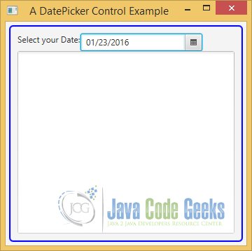
Now we can insert a specific date from the future:
After choosing a day from the calendar, the TextField of the DatePicker contains the value formatted by the given pattern. A message will be also written to the TextArea.

6. Download Java Source Code
This was an example of javafx.scene.control.DatePicker
You can download the full source code of this example here: JavaFxDatePickerExample.zip
